By Alja Horvat SS23
Almost a year has passed since our last release, and looking back, it's been a transformative journey. A year ago, I doubted the collection's future, unsure if I could muster the creative energy after a less-than-hoped-for reception of our first collection. But your overwhelming support for our second release was a revelation, and I'm deeply grateful to stand where we are today. But it’s here, our spring/summer 2023 collection, inspired by the fashion of the sixties and seventies.
Through the years, I've come to realize that you relish the stories behind the prints, the inspiration that breathes life into each design. Hence, I've decided to pull back the curtain and share the behind-the-scenes journey of every print in this collection.
Prints are usually either created in-house by the textile designer, outsourced through freelance designers or bought from print studios.
Fashion brand owners usually don't create their own prints, and this is what makes this brand special as I create both prints for my fashion label and design clothes.
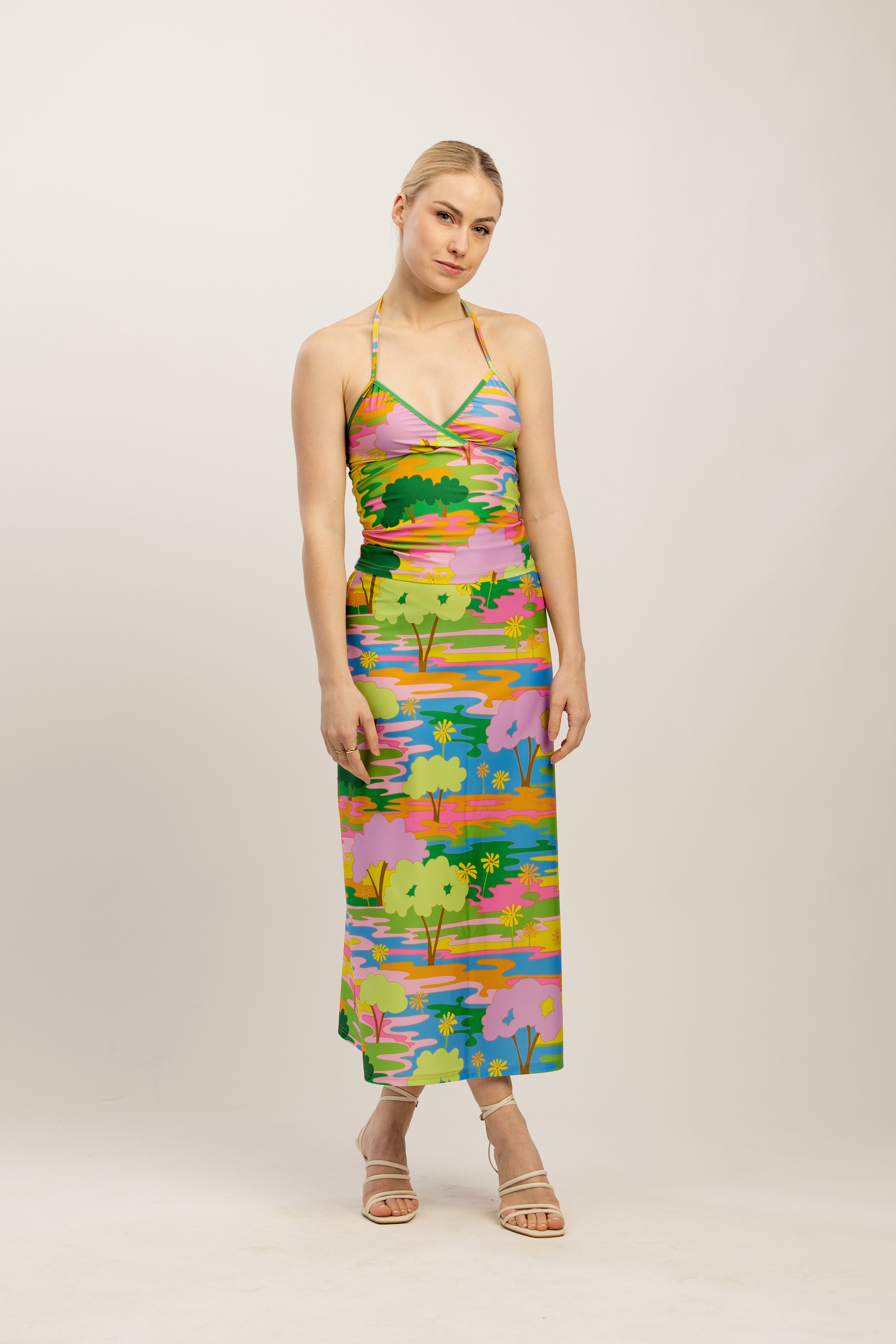
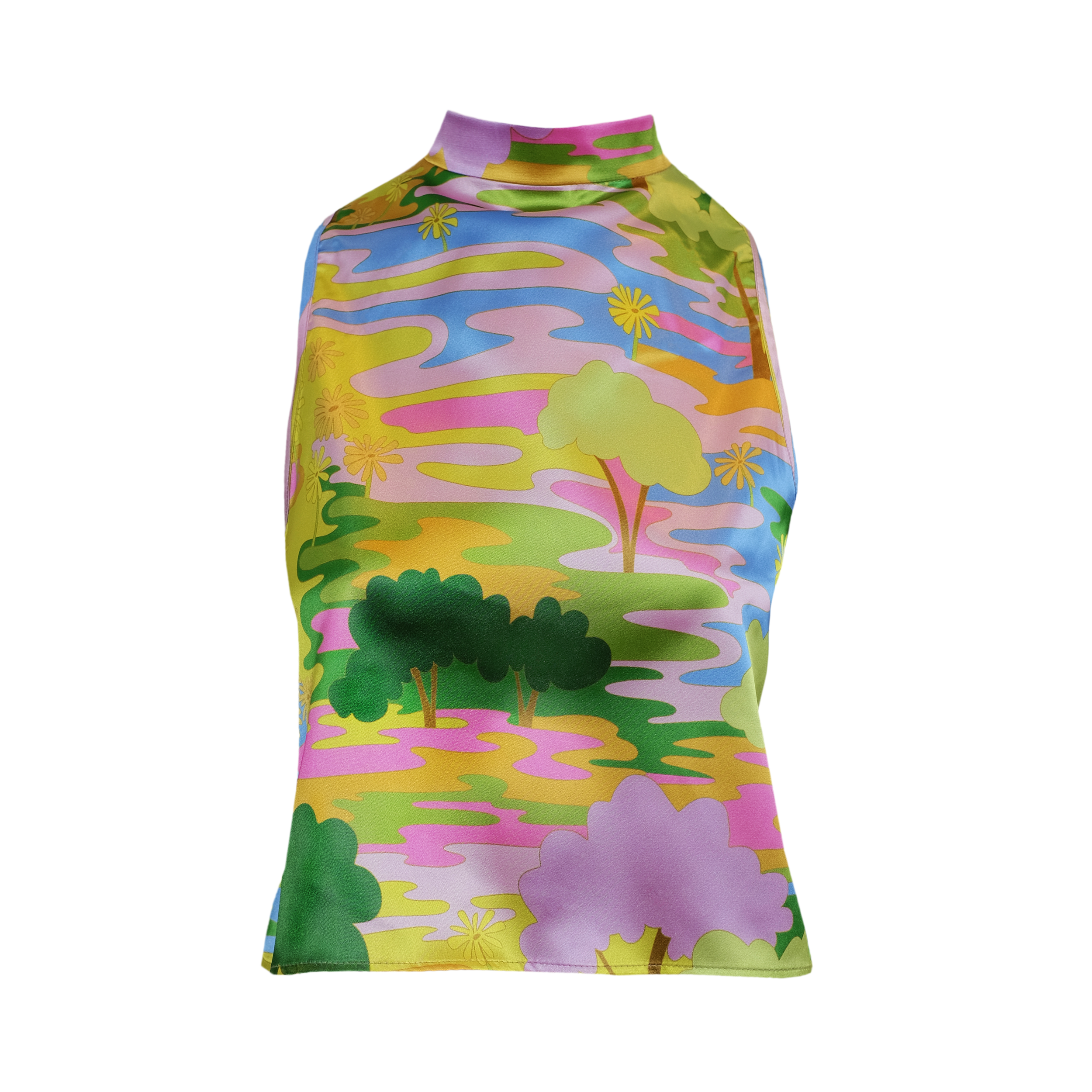
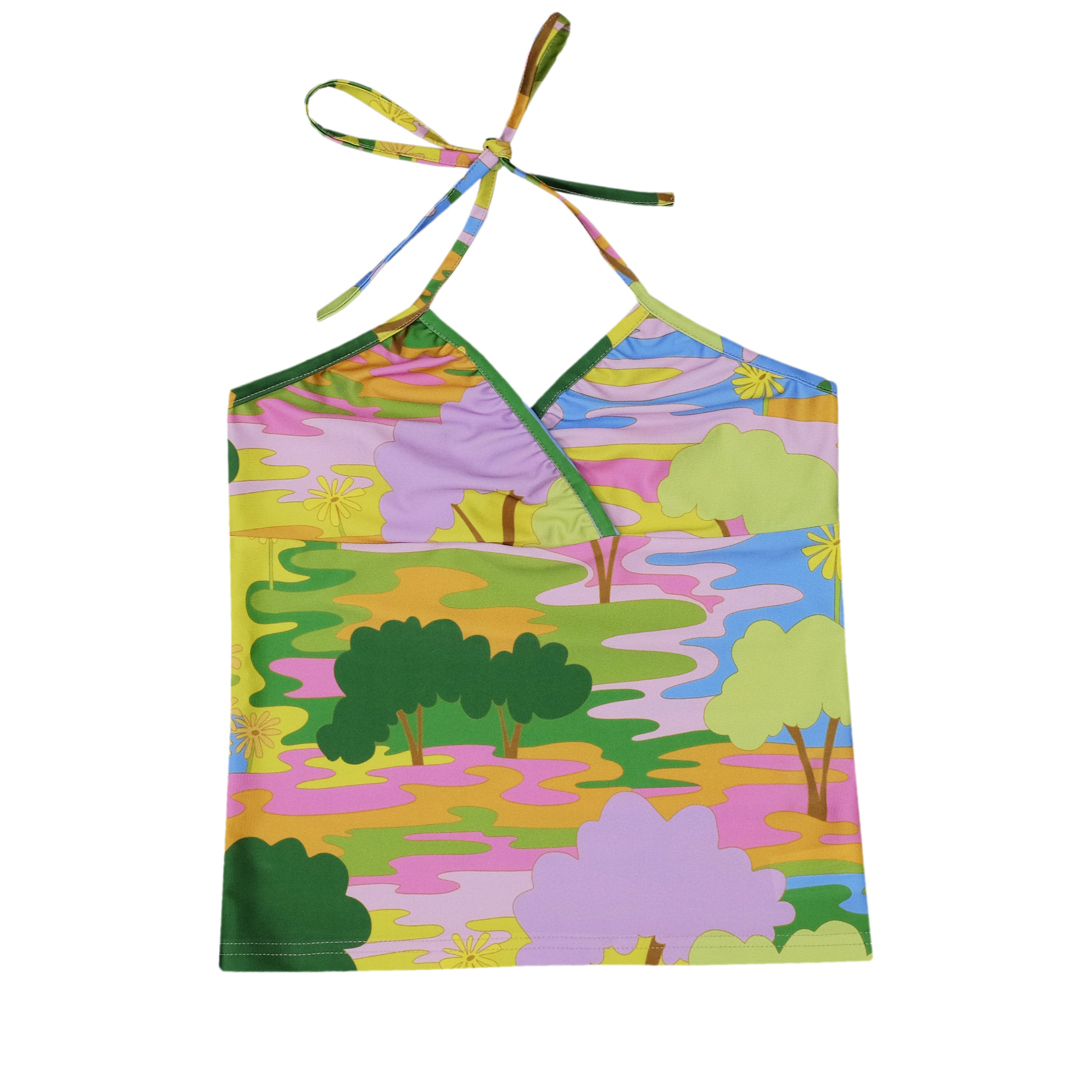
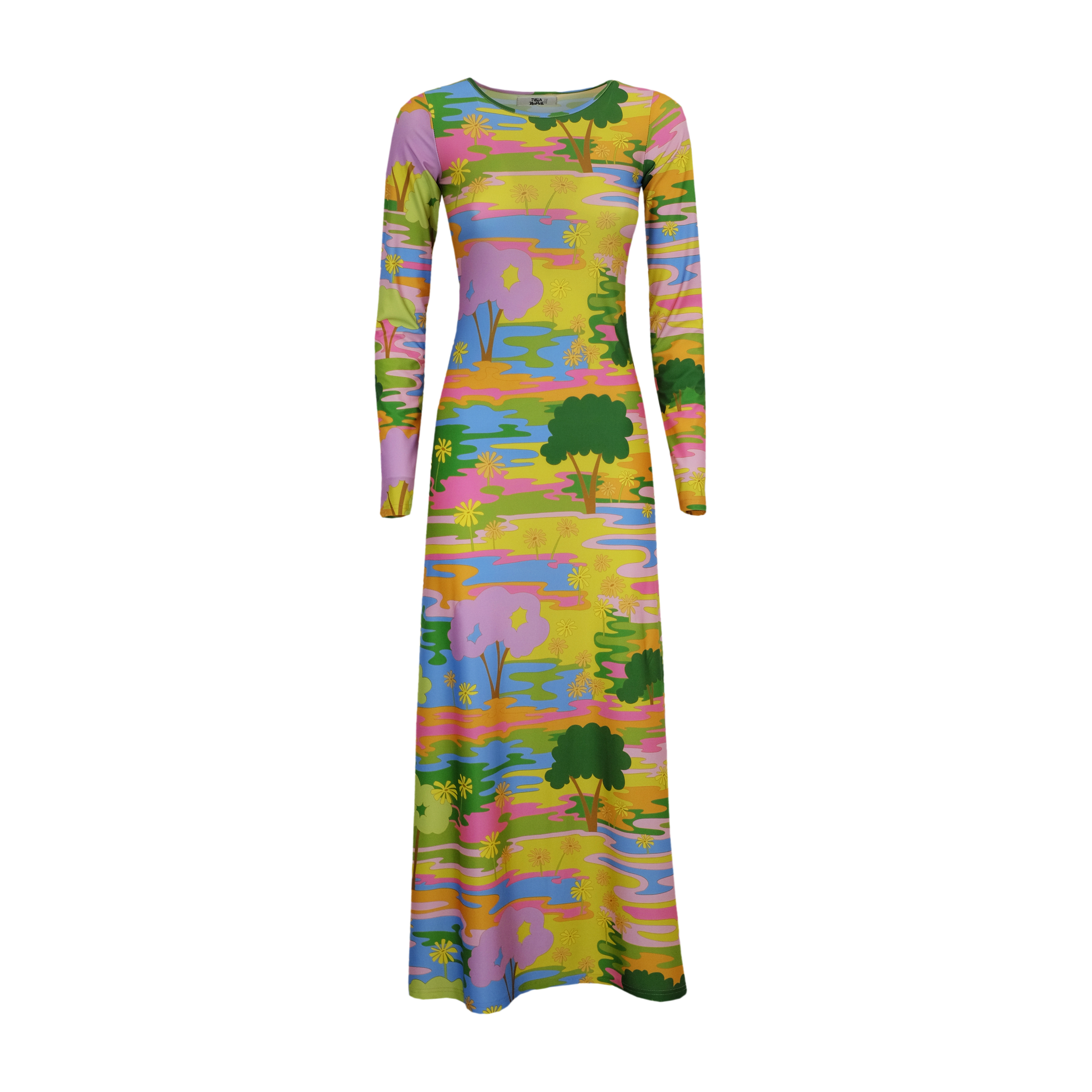
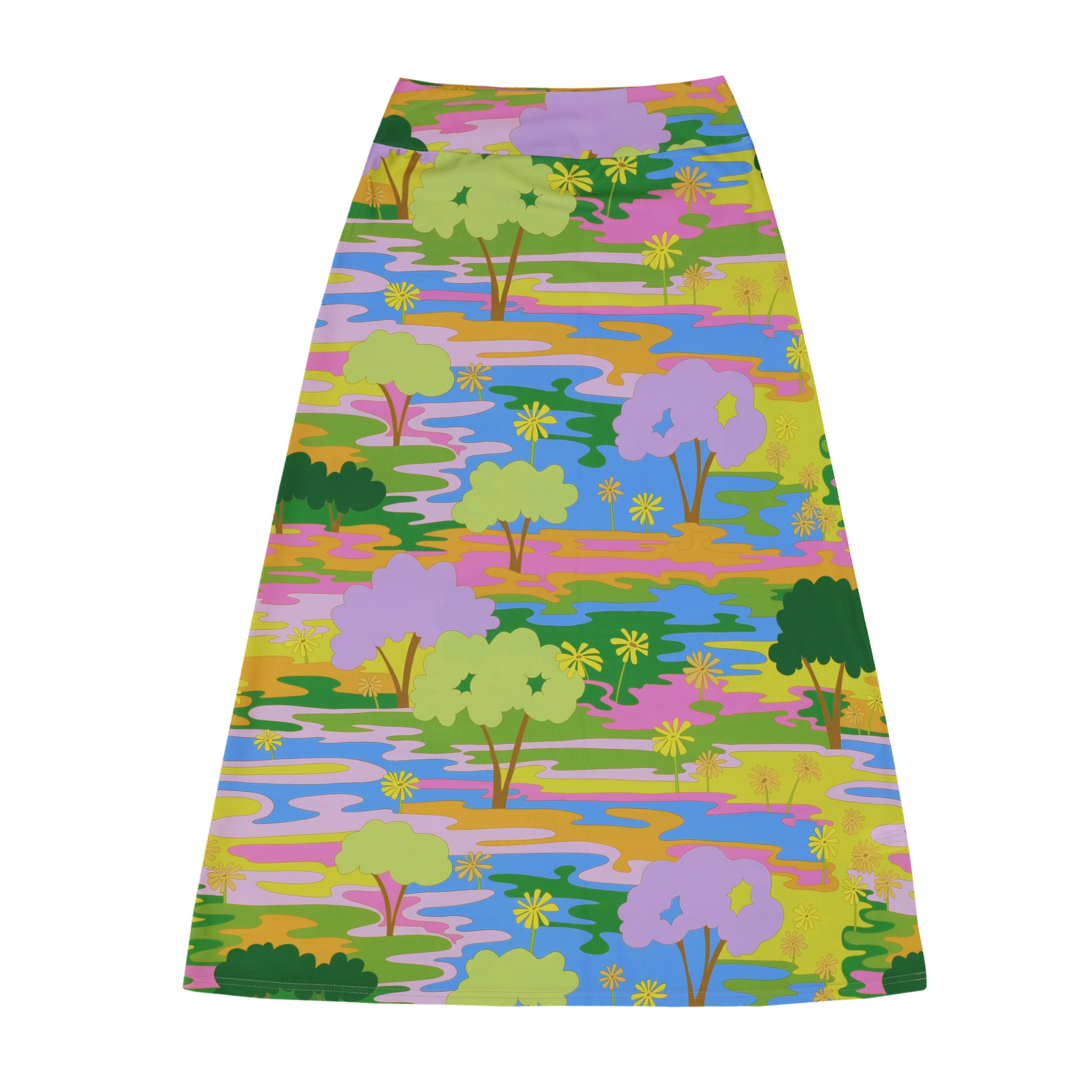
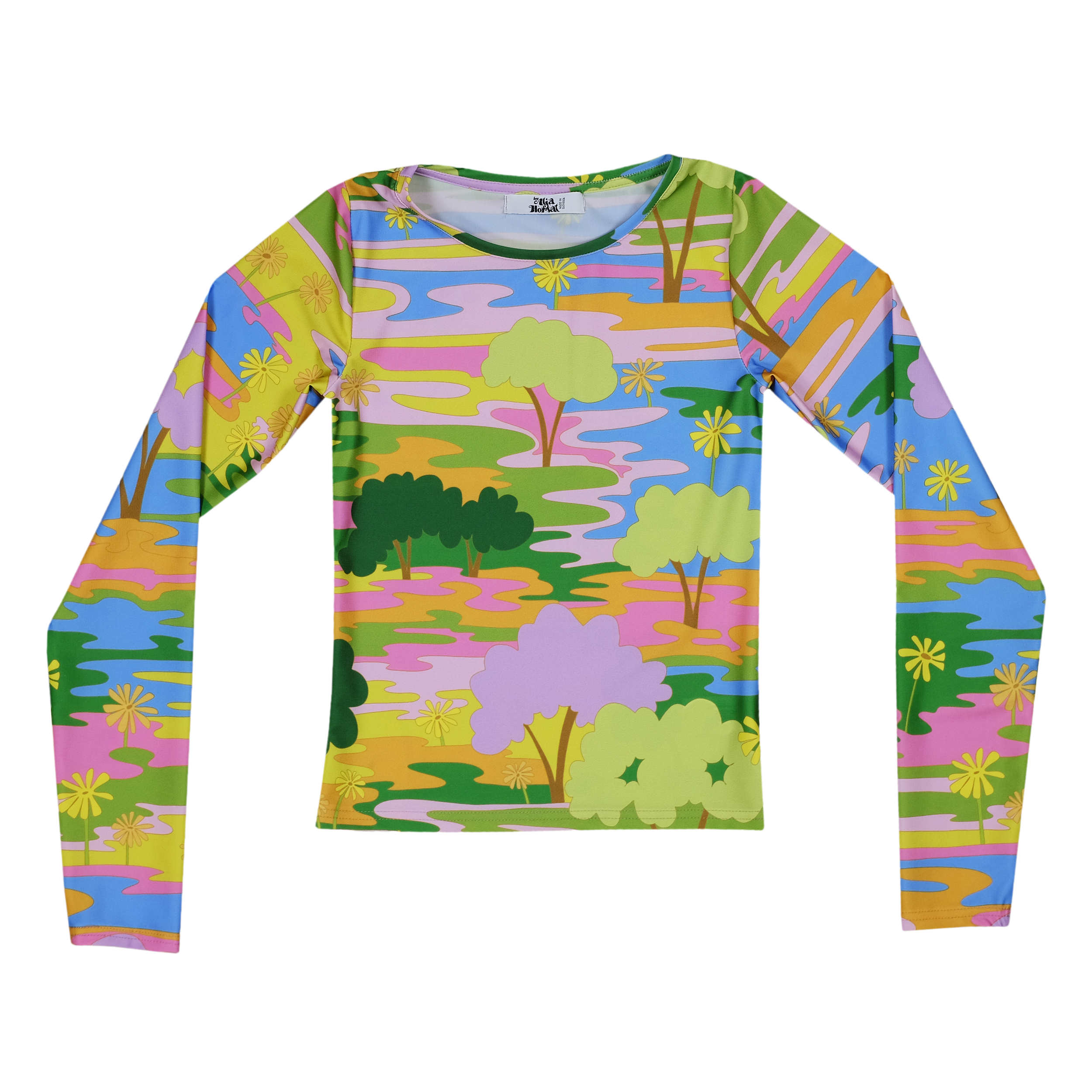
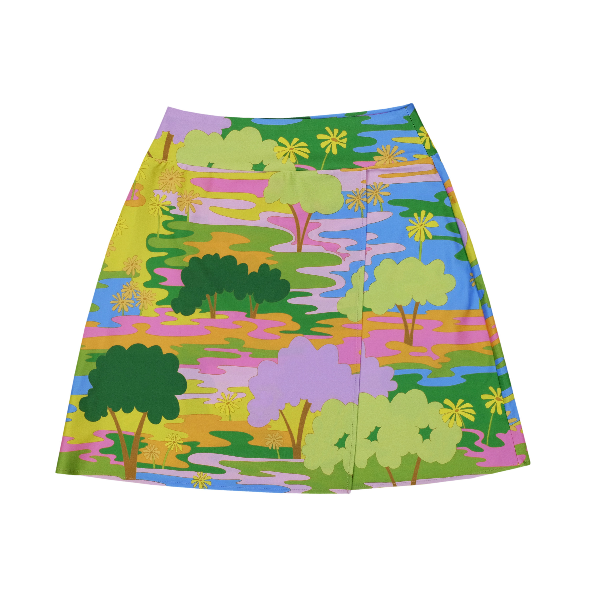
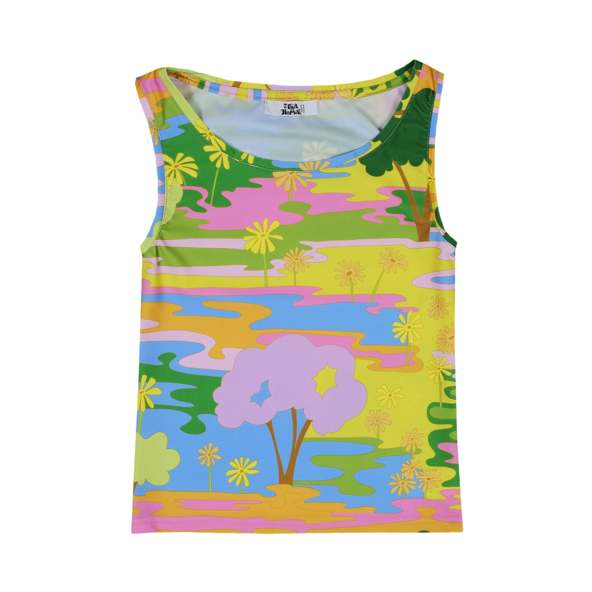
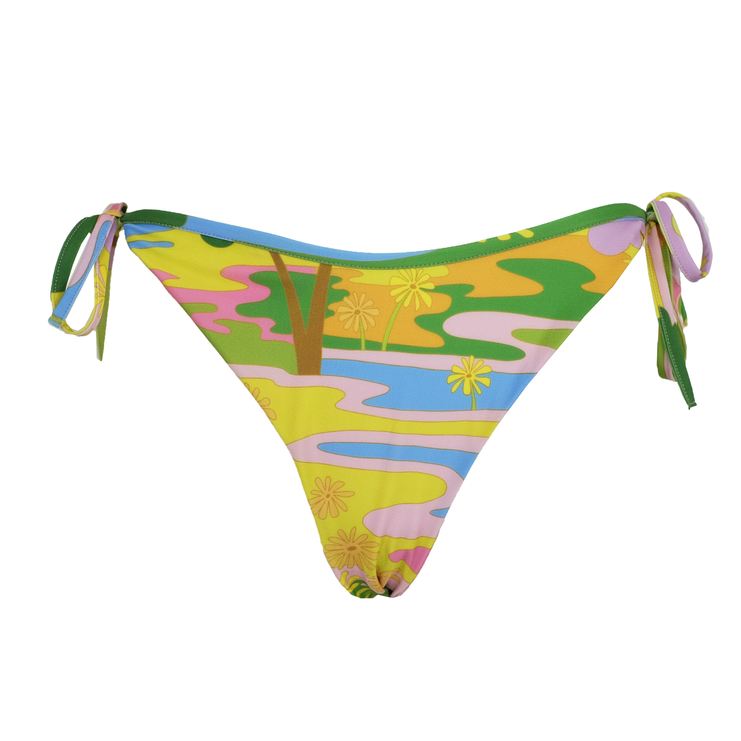
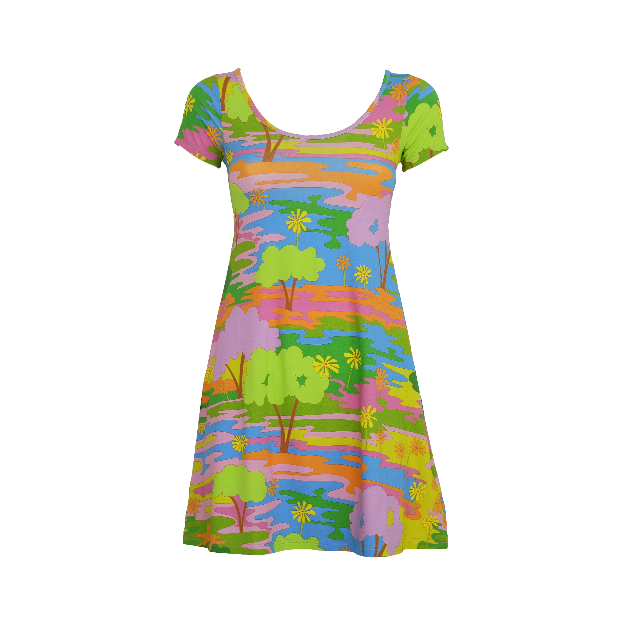
PENNY LANE
First print of the collection is called Penny Lane,
after The Beatles song “Penny Lane”
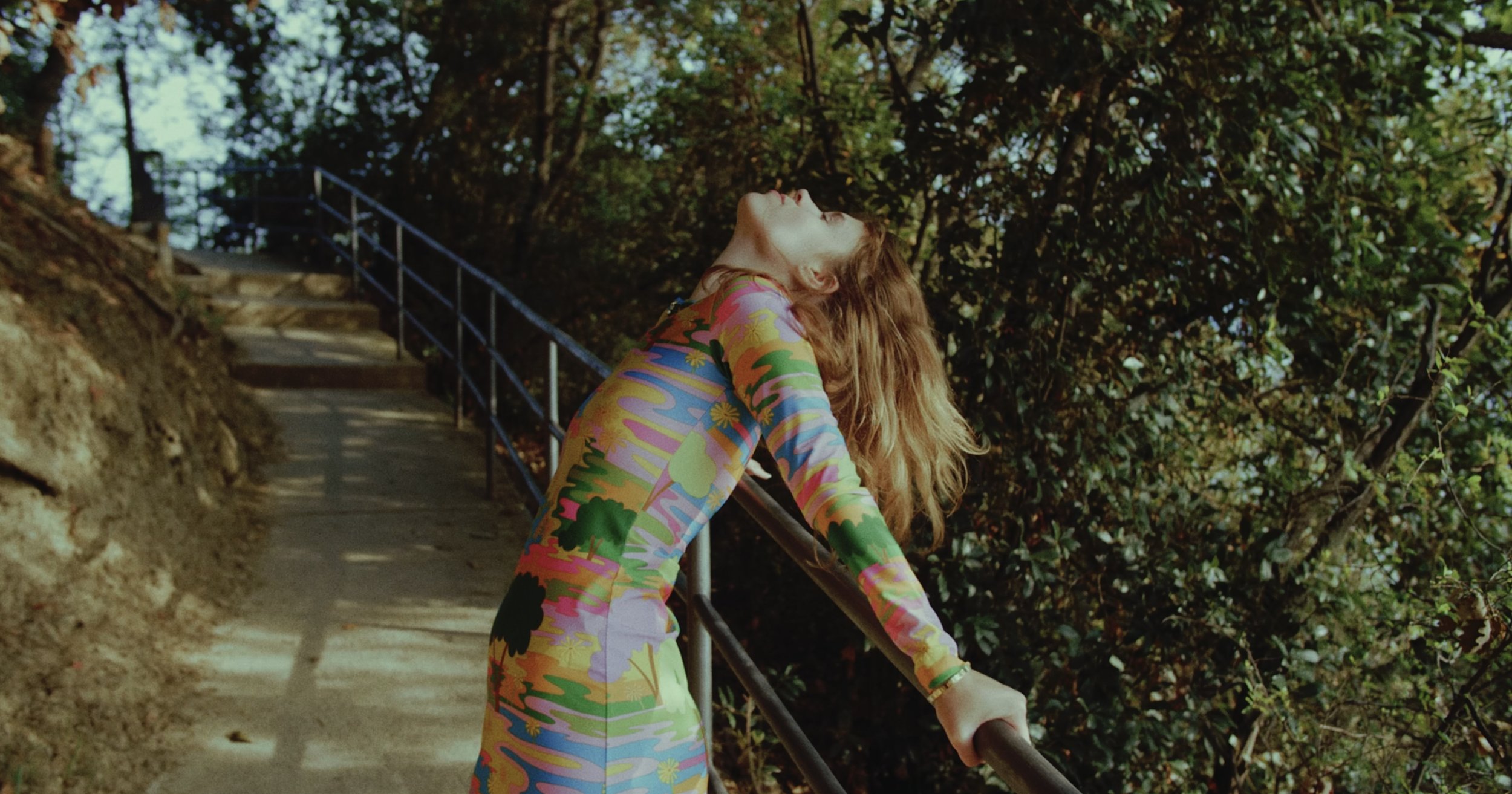
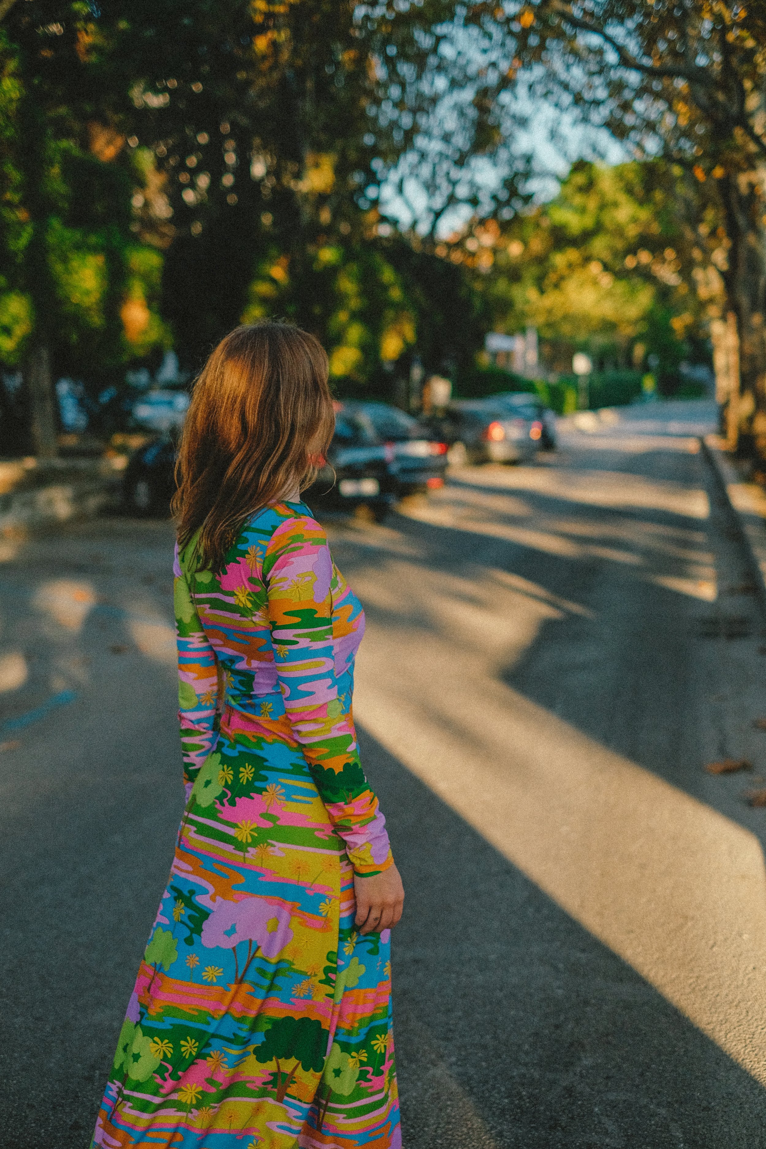
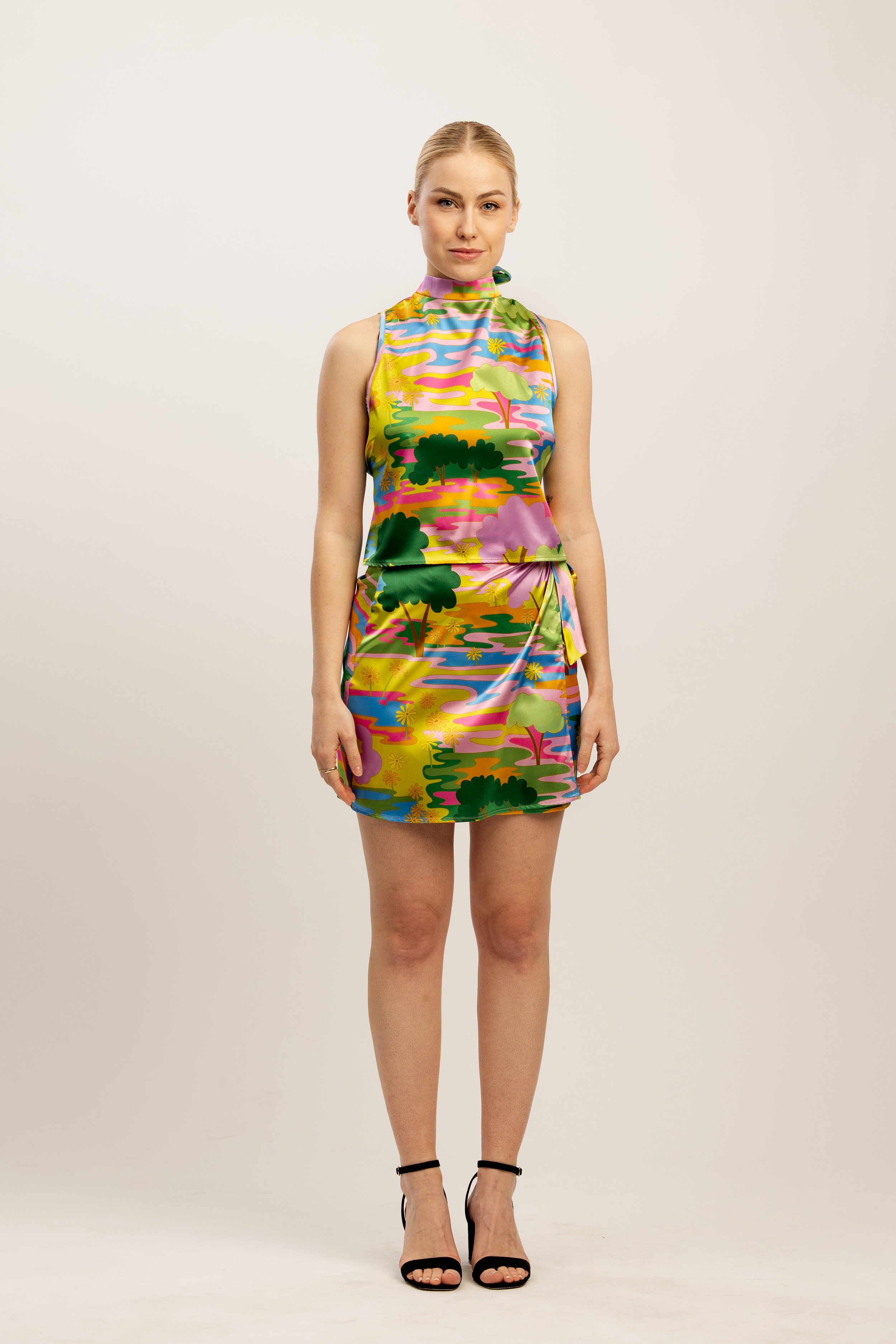
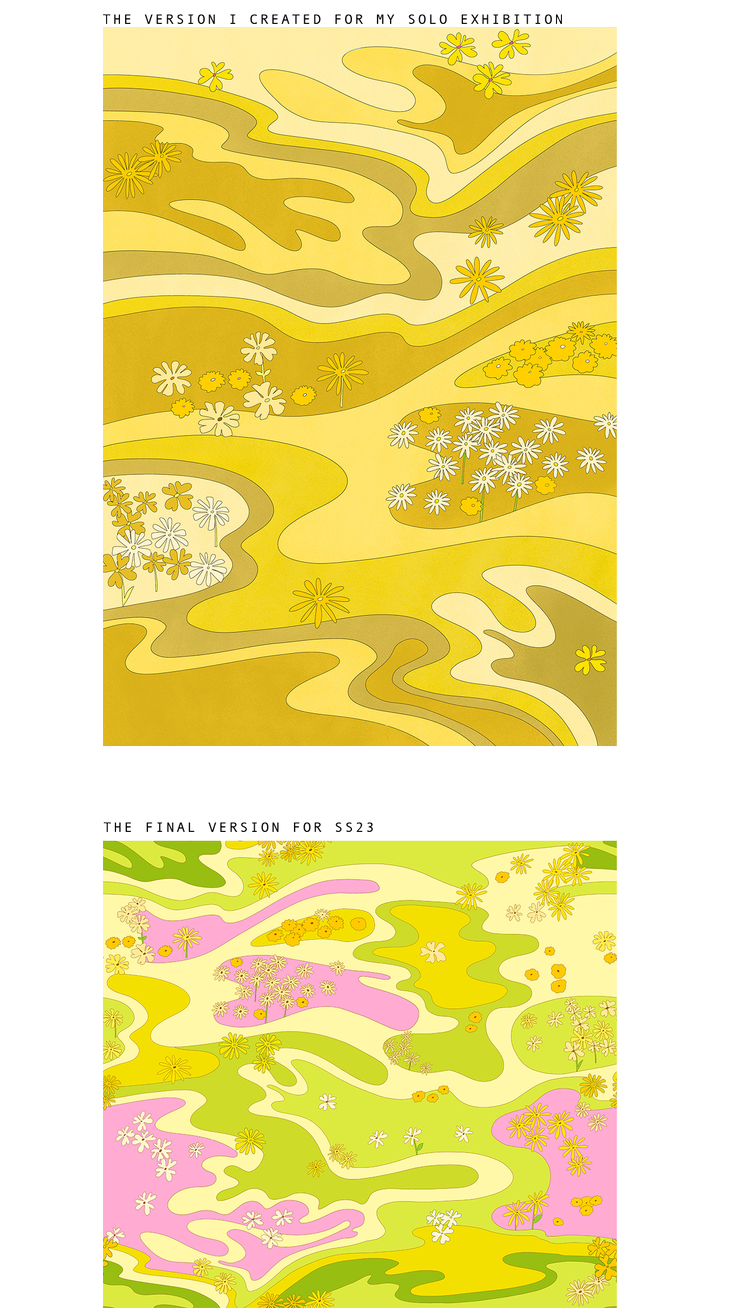
Penny Lane print is actually the print that I’ve reimagined. This print was created after the illustration I created for my solo exhibition that I had during the summer in Ljubljana. It’s very similar, but in a completely different colour palette (see picture below). As there are three other prints in collection, and none of them is super “colourful”, I wanted this one to resemble the spirit of the sixties. I also loved the green version that I’ve created for my solo exhibition, but I felt it wouldn’t translate well to clothes.
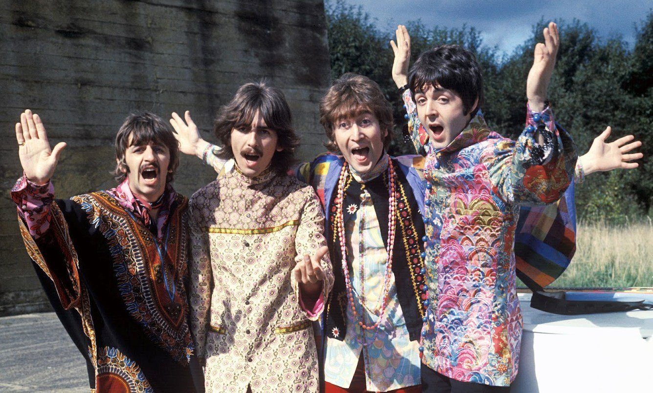
The main inspiration for colour palette were The Beatles in their video for “Hello,Goodbye”. I always found their outfits in this video super fascinating. Big inspiration were also the outfits they wore during the Magical Mystery Tour album and overall during the late sixties.
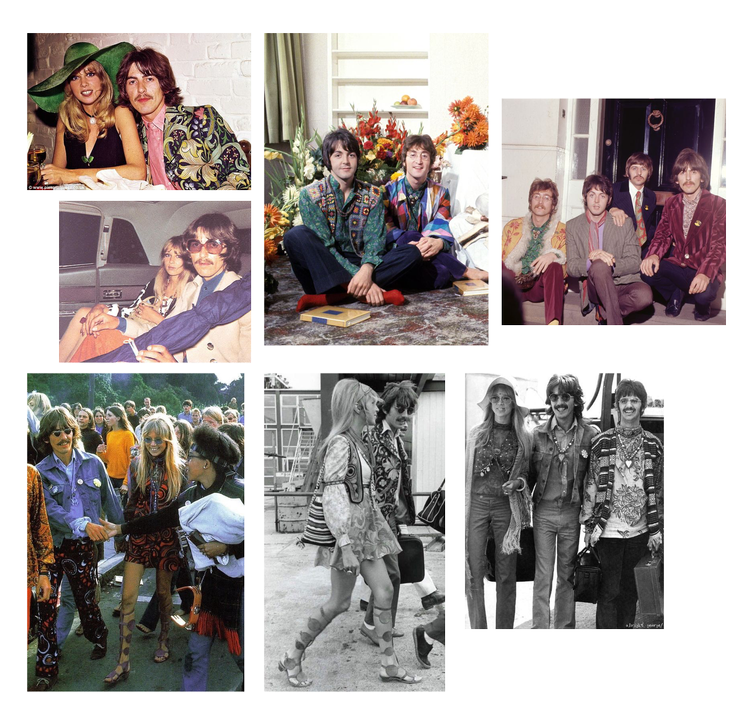
You can see below some of the outfits I love the most (mostly from Pattie and George)
I wanted to create of a feeling being a teenager in the sixties, walking through a field of flowers and wearing super colourful hippie outfits.
Another inspiration was the nature. I wanted to create an abstract scene, that someone picking up the flowers on the summer evening is experiencing. I hope I managed to take you back to the sixties and seventies with this print.
I was also inspired by “Summer of Love”, a social phenomenon that occurred during the summer of 1976. I love the song “San Francisco (Be Sure To Wear Flowers in Your Hair)” which John Phillips from ban The Mamas & The Papas wrote for his friend Scott Mckenzie. The song promoted the Monterey Pop Festival that Philipps helped organise.
“If you're going to San Francisco, be sure to wear some flowers in your hair”
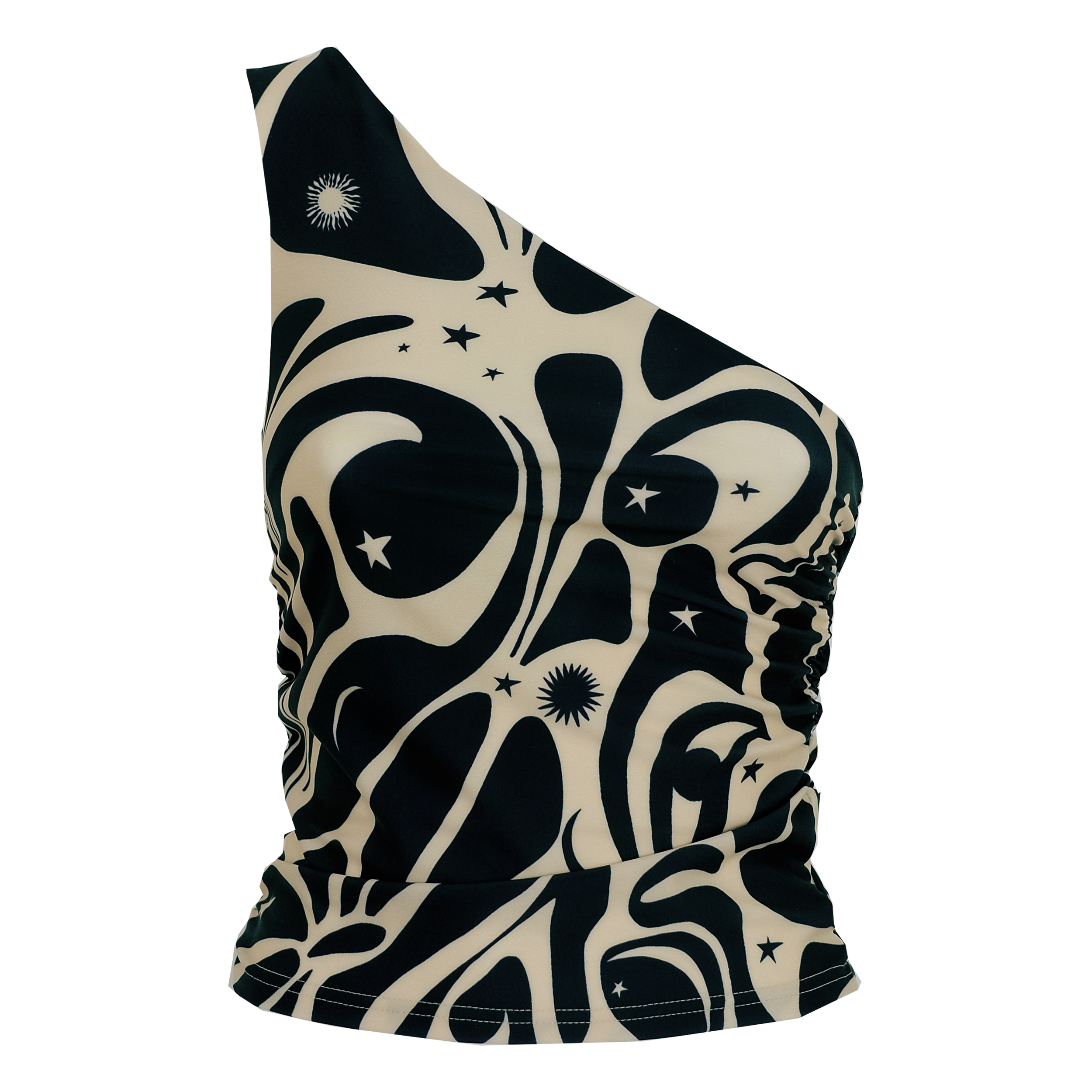
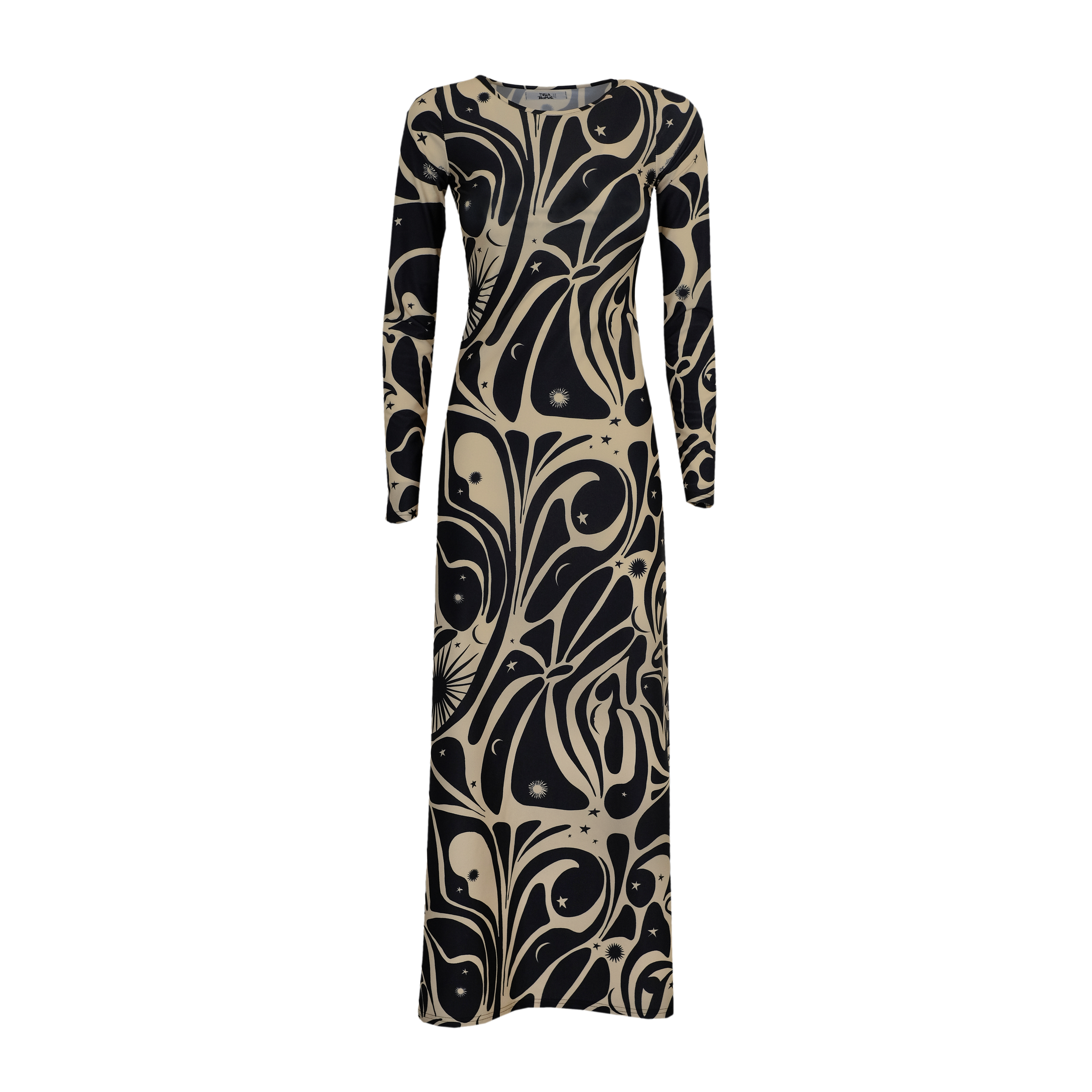
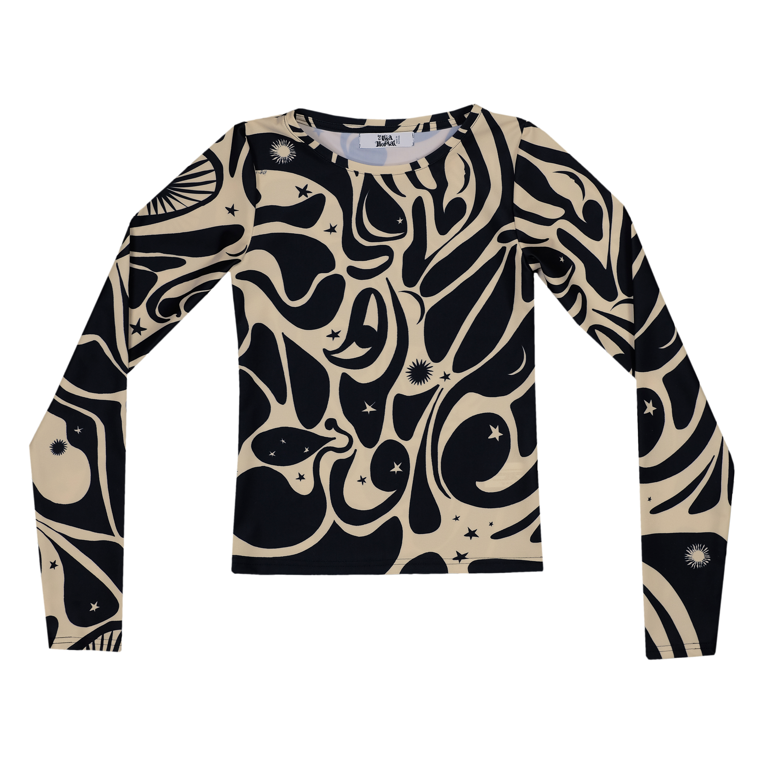
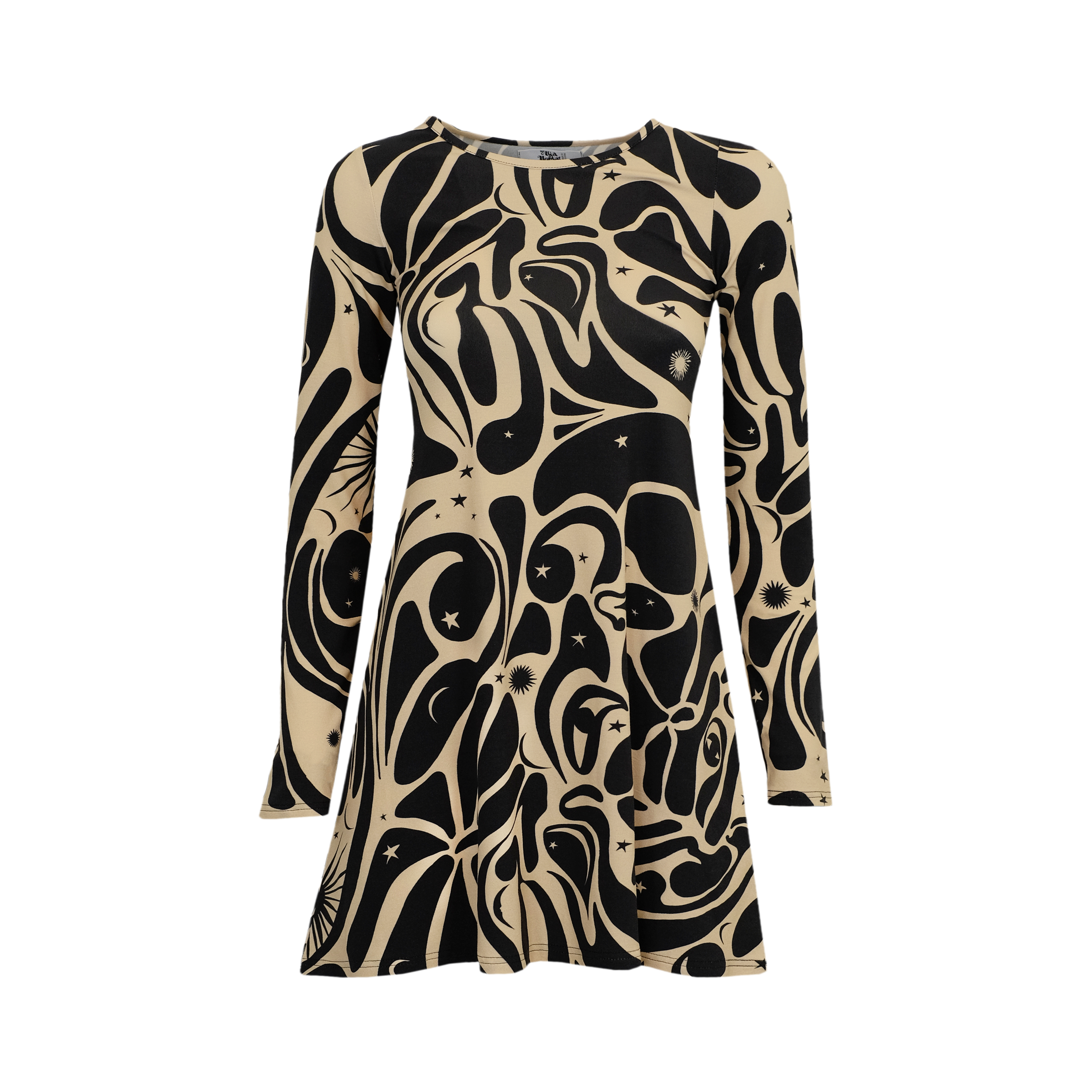
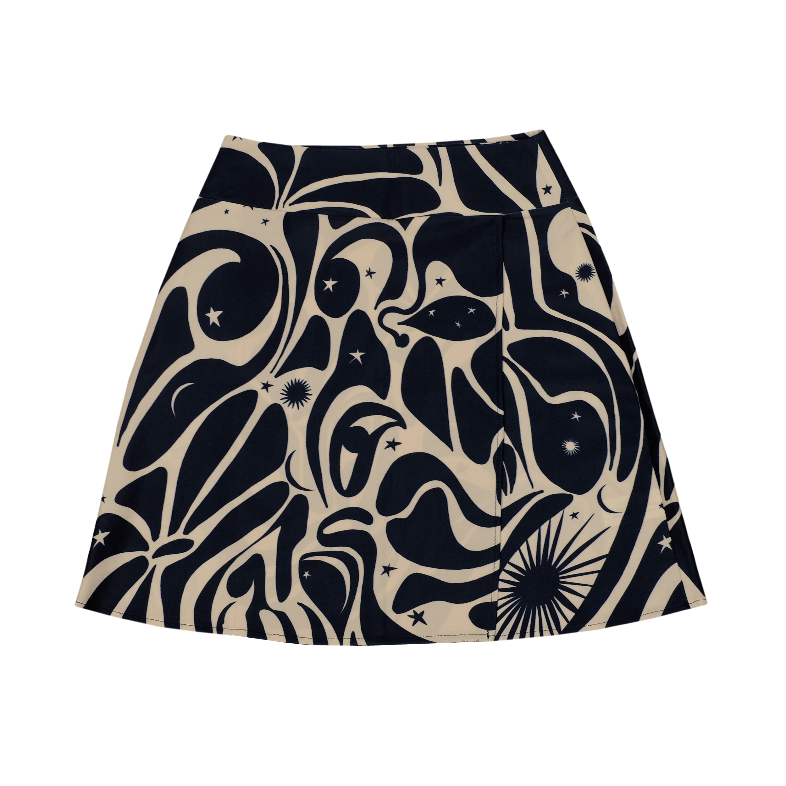
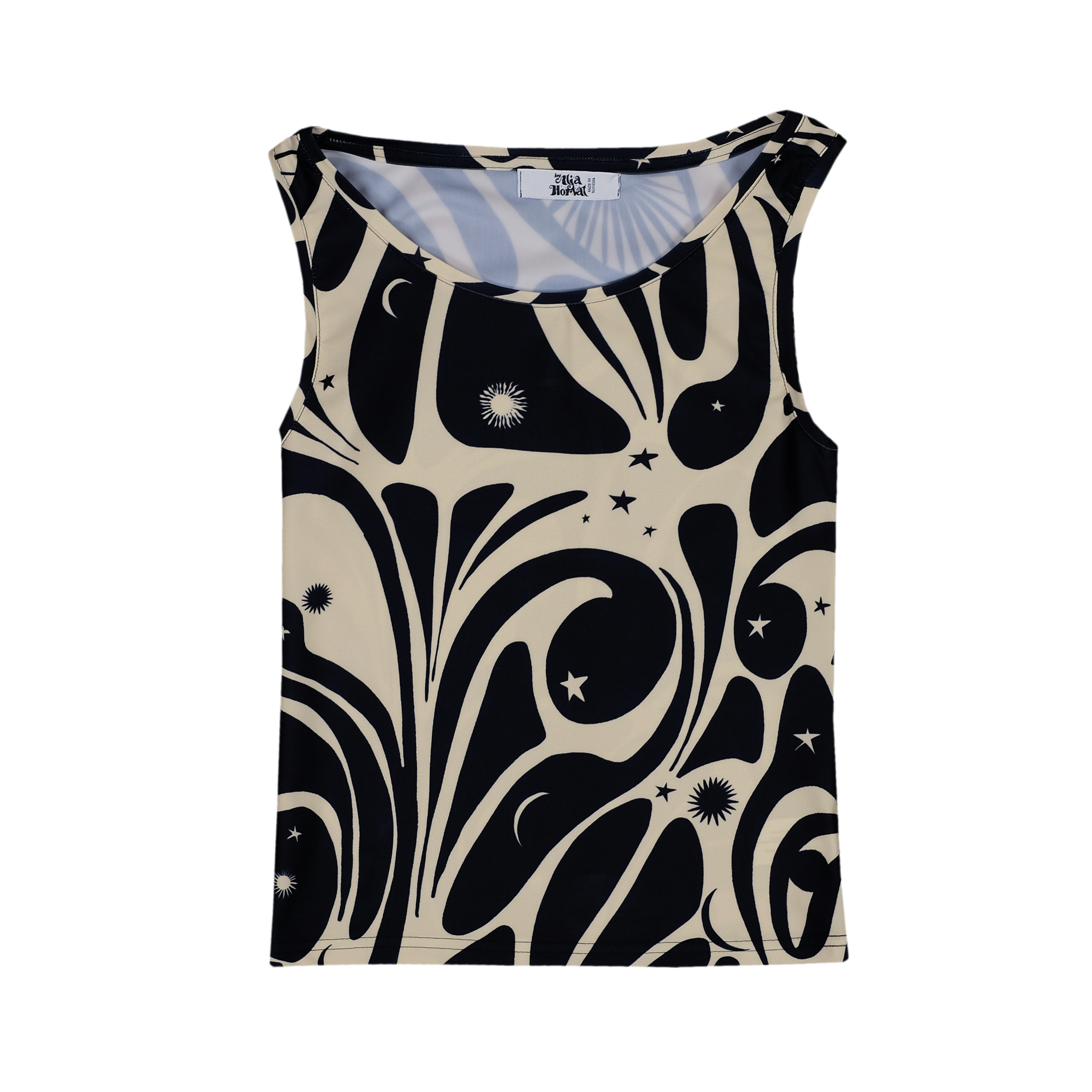
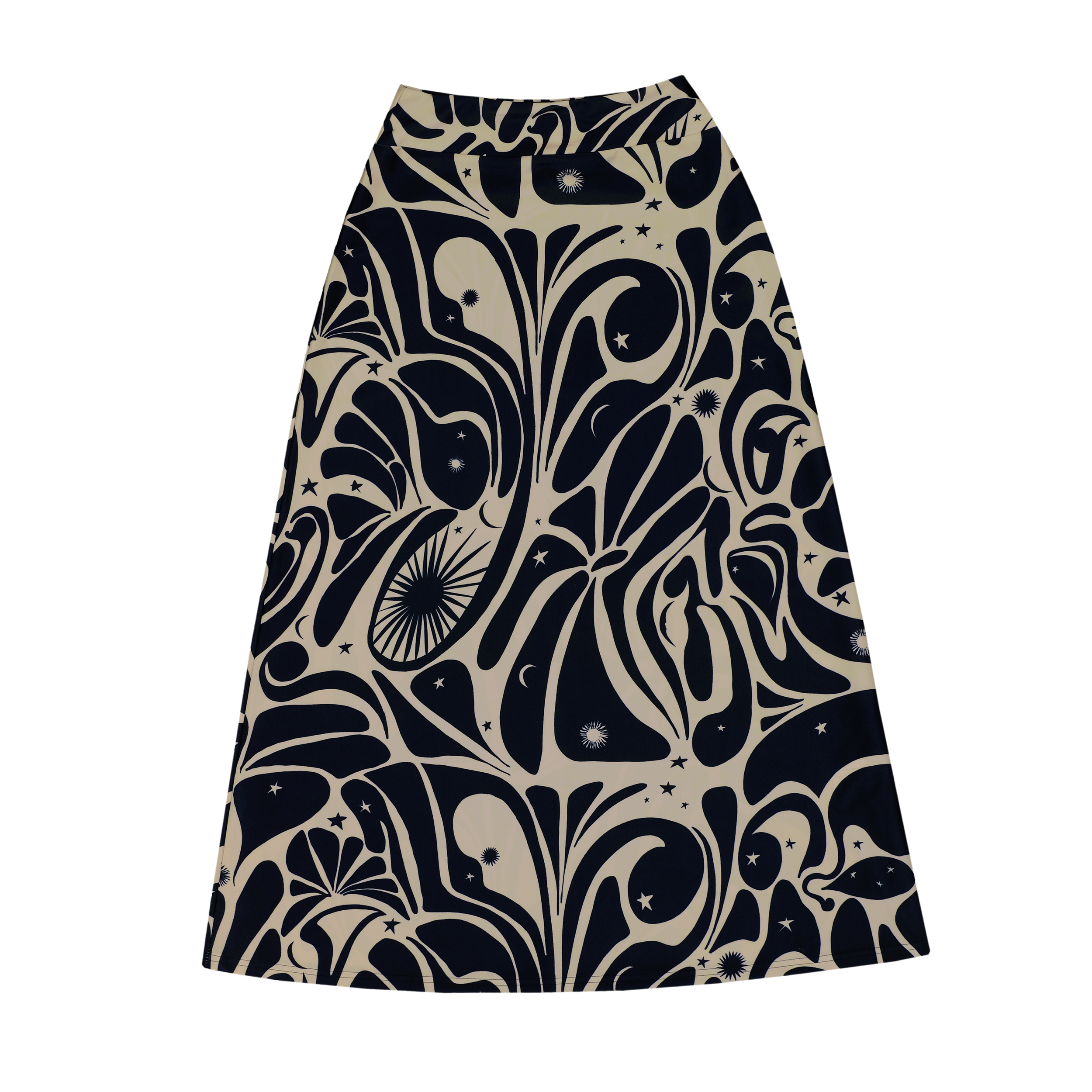
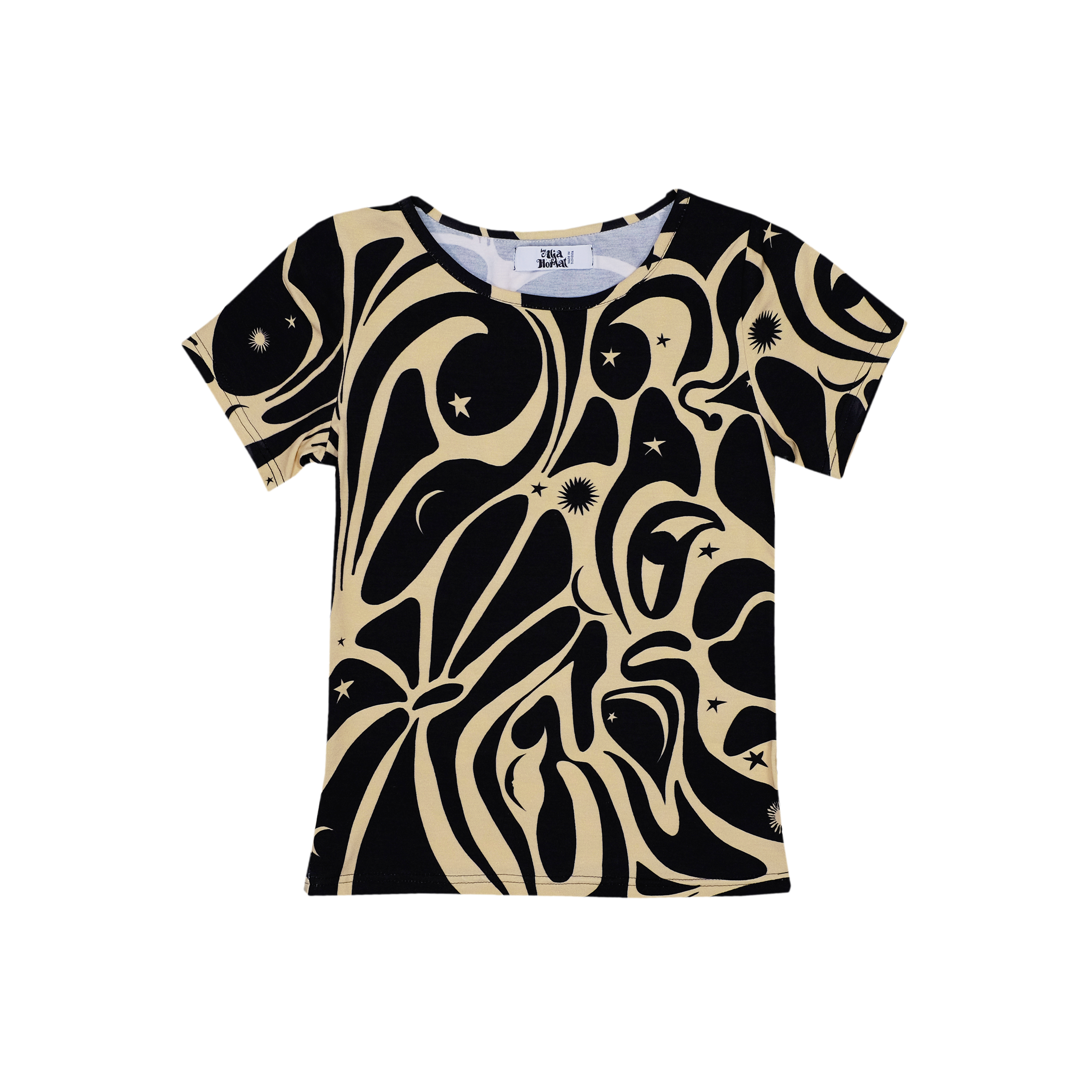
AGE OF AQUARIUS
Second print of the collection is called Age of Aquarius,
after The 5th Dimension song “Age of Aquarius”
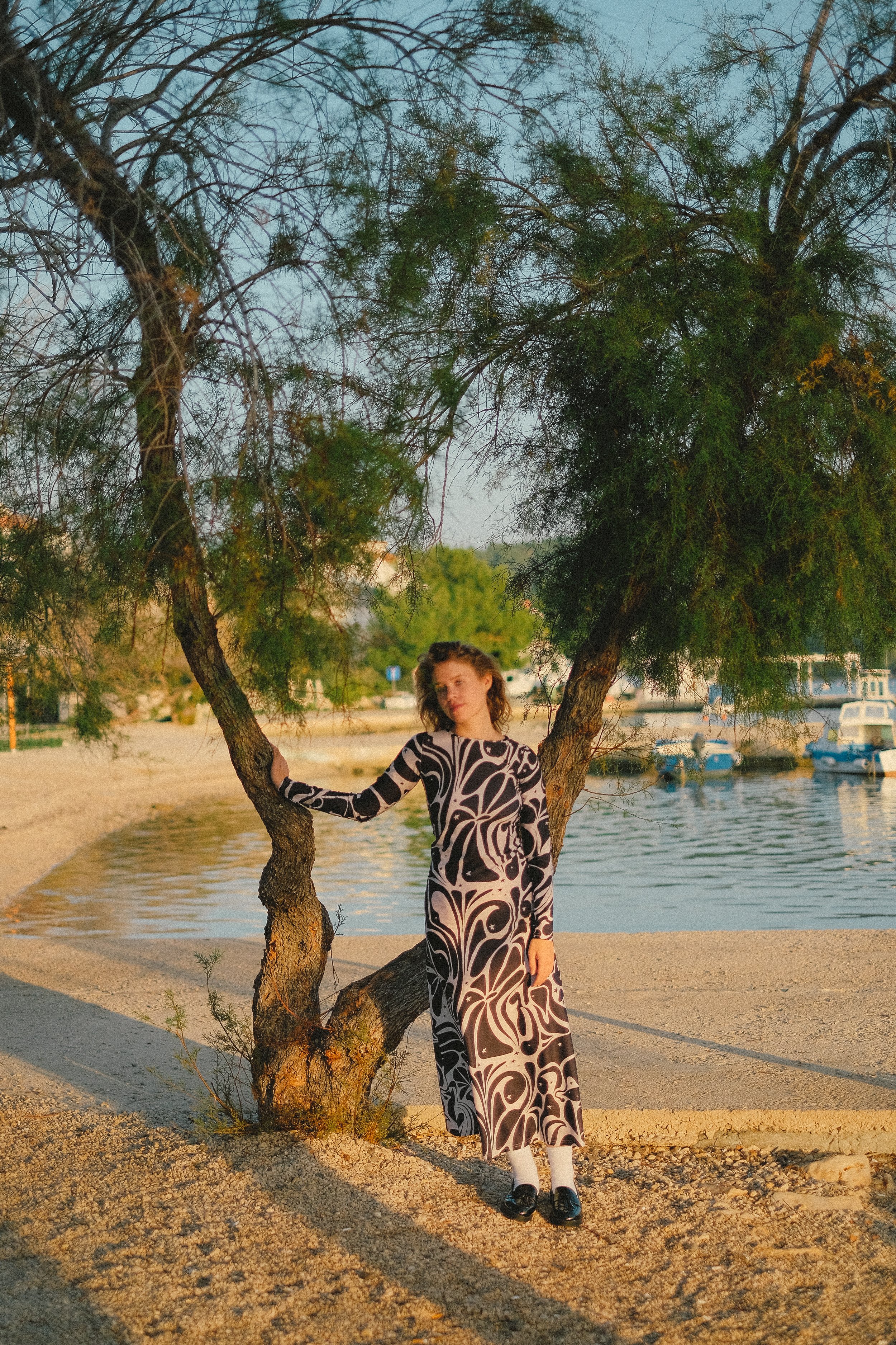
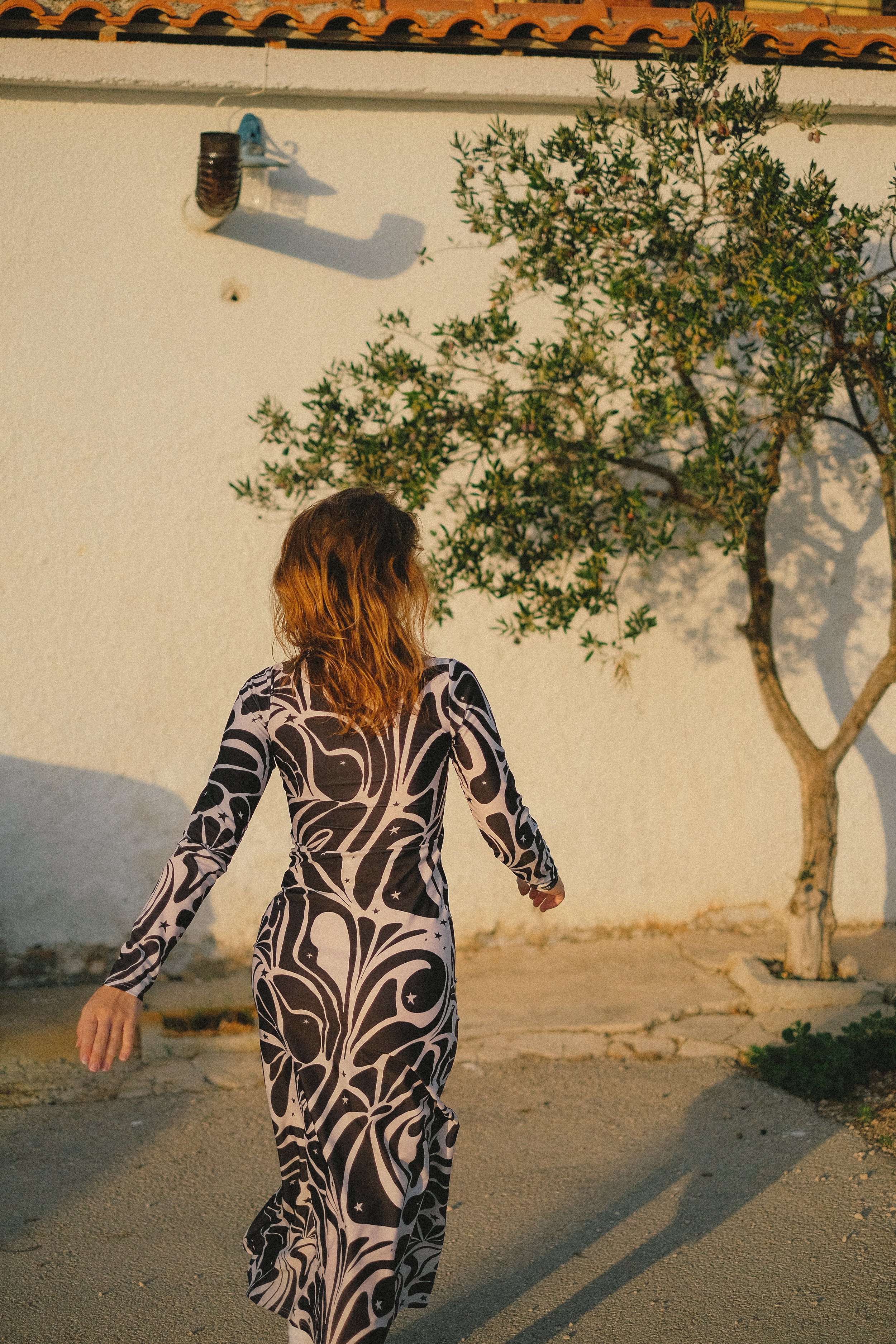
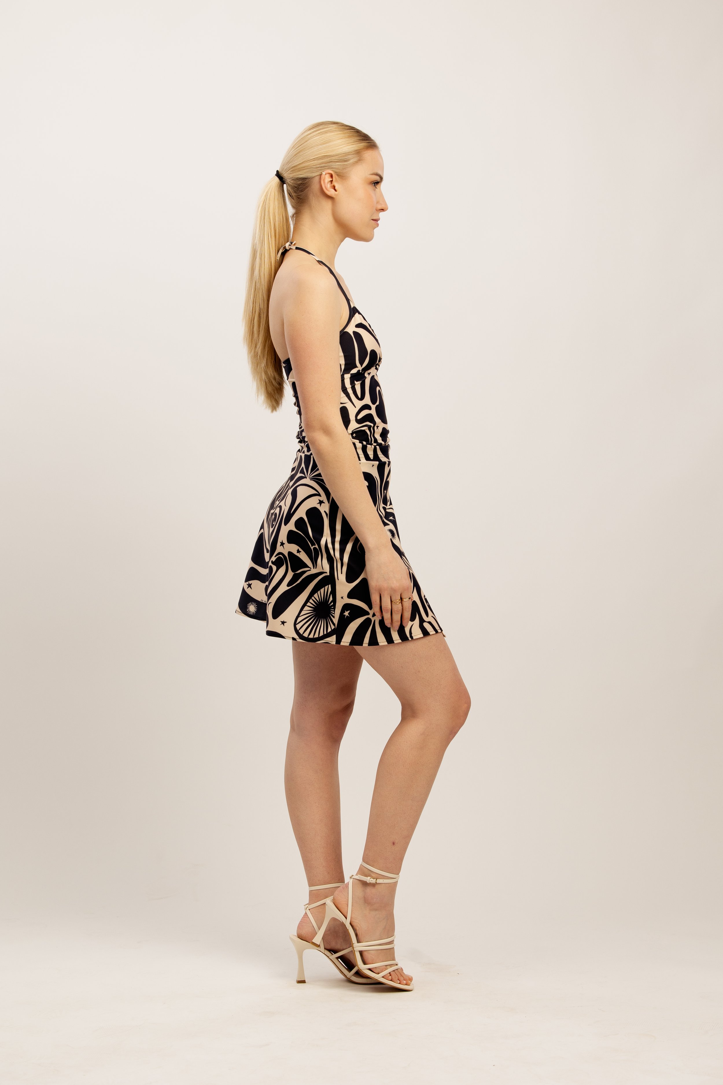
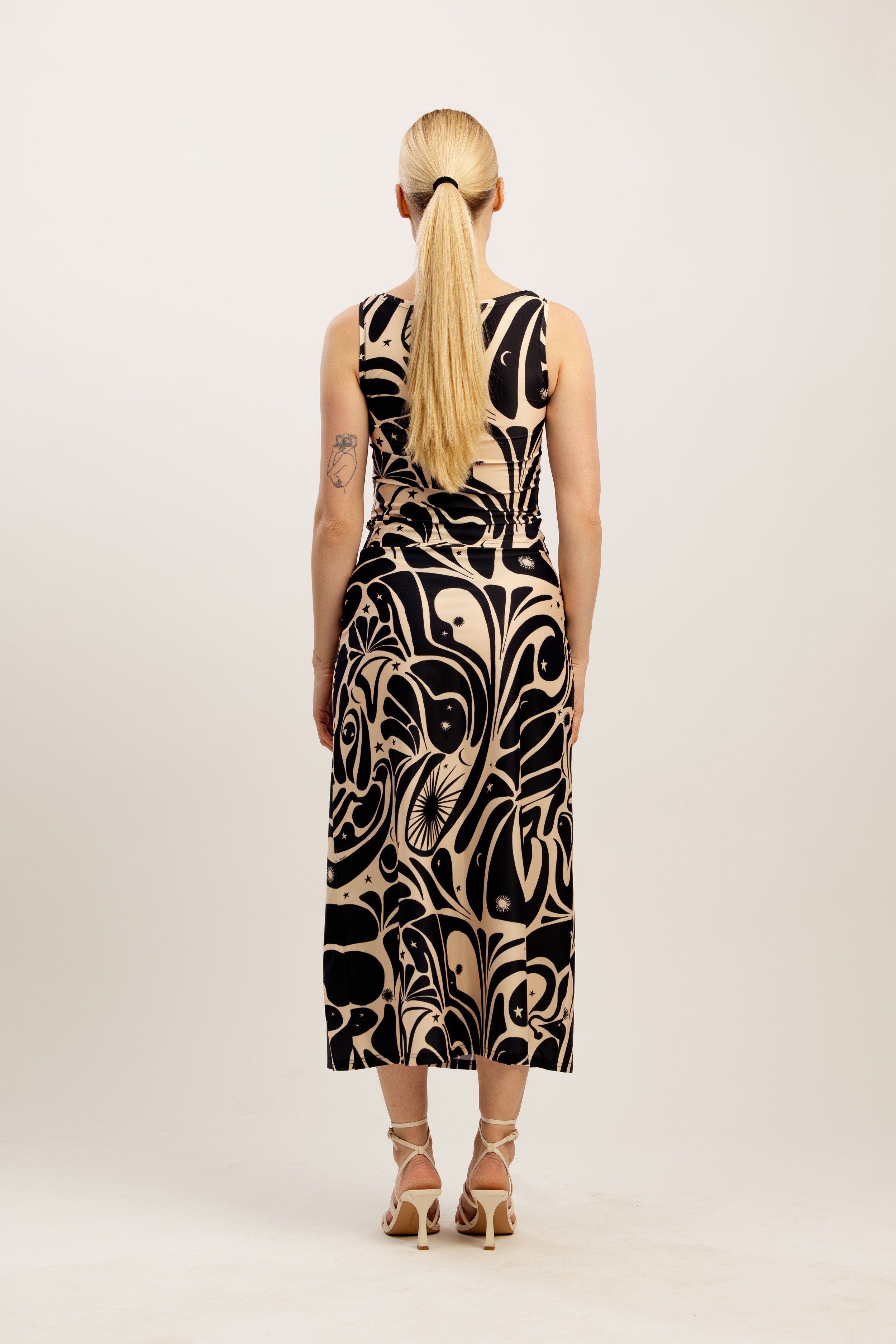
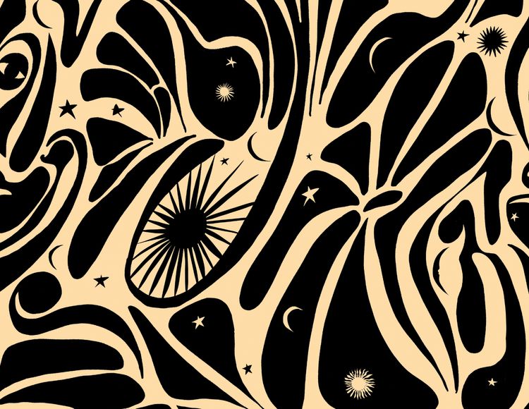
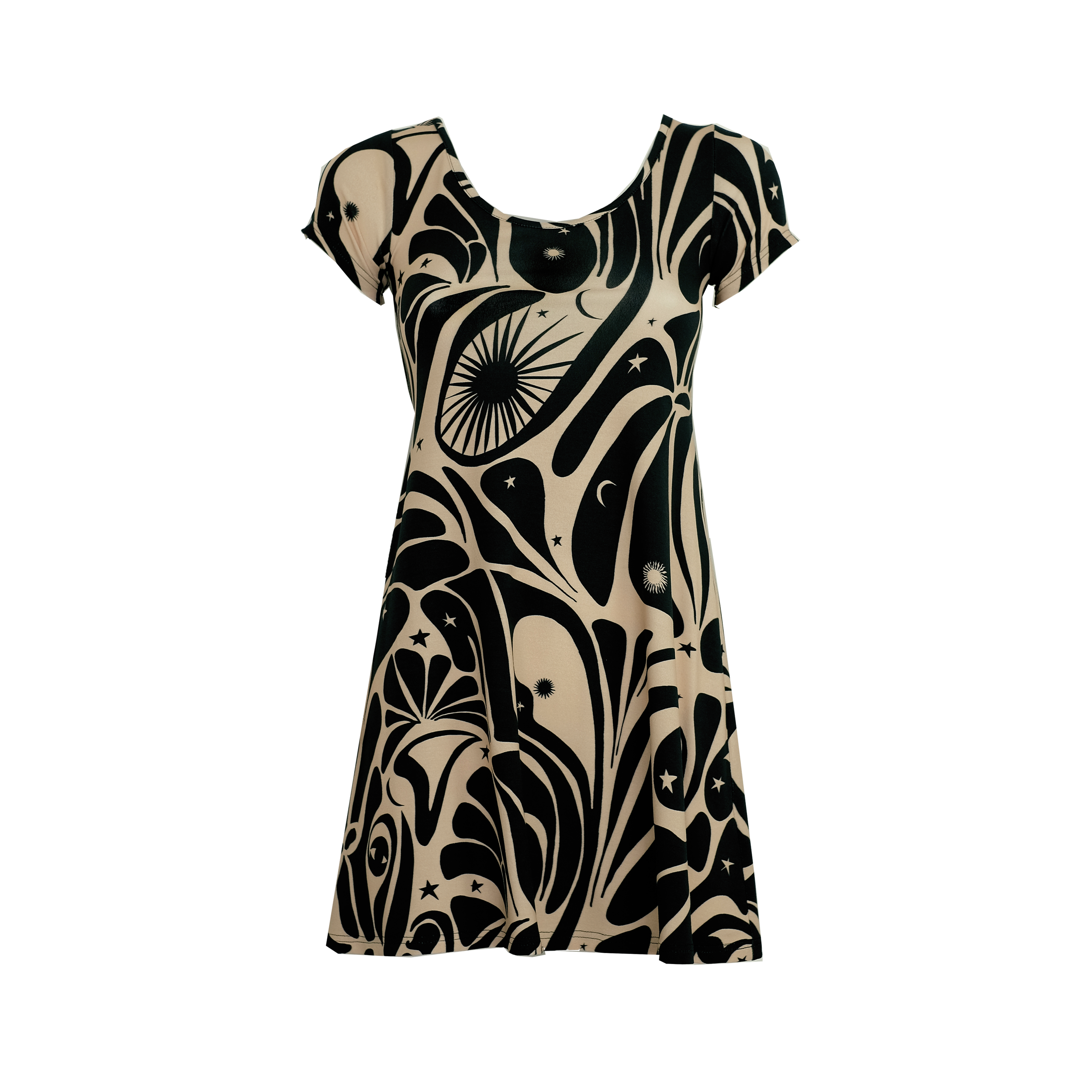
Age of Aquarius is the third print I created for the collection. I wanted to have one print in the collection that has a broader appeal and is more “simple” than the rest of them. This is also why I decided on a black and beige colour palette. “Lola” and “Penny Lane” prints are super colourful, “Little Wing” is calmer, but still quite colourful.
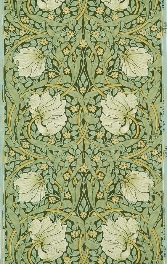
The “Age of Aquarius” print was inspired by the Art Nouveau & Vienna Secession. Art Nouveau is an international style of art, architecture and decorative arts and was popular between 1890 and 1910. It was inspired by natural forms of plants and flowers, and works also have a sense of movement. The style had its roots in Britain and became popular with floral designs of William Morris (who I’m a big fan of) - I’m pretty sure you’ve seen his works! (see below)
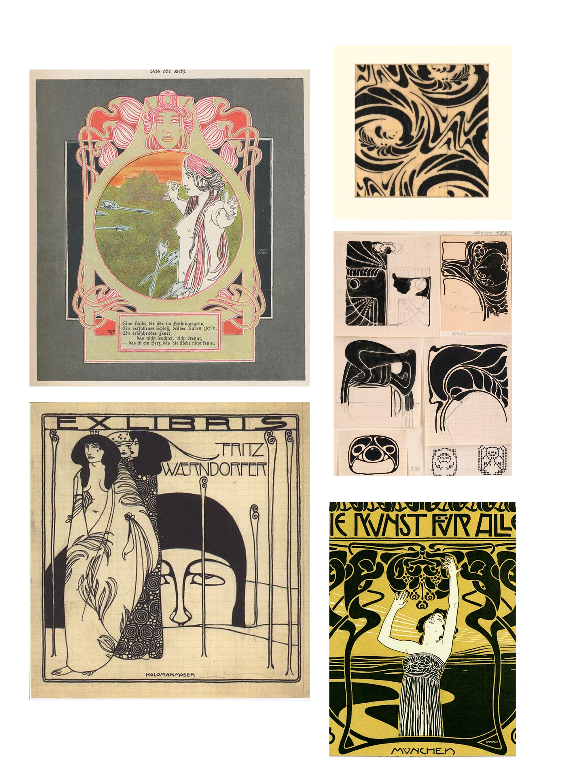
I actually loved Koloman Moser’s works, he was part of Vienna Secession movement and he inspired this particular design. He was an Austrian artist and had a great influence on twentieth-century graphic art.
The Vienna Secession is an art movement that is closely related to Art Nouveau and was formed in 1897 by group of Austrian artists, including Koloman and Gustav Klimt.
See some of his works below.
I wanted the print to be mystical and magical and resemble the mysteriousness of the universe and stars.
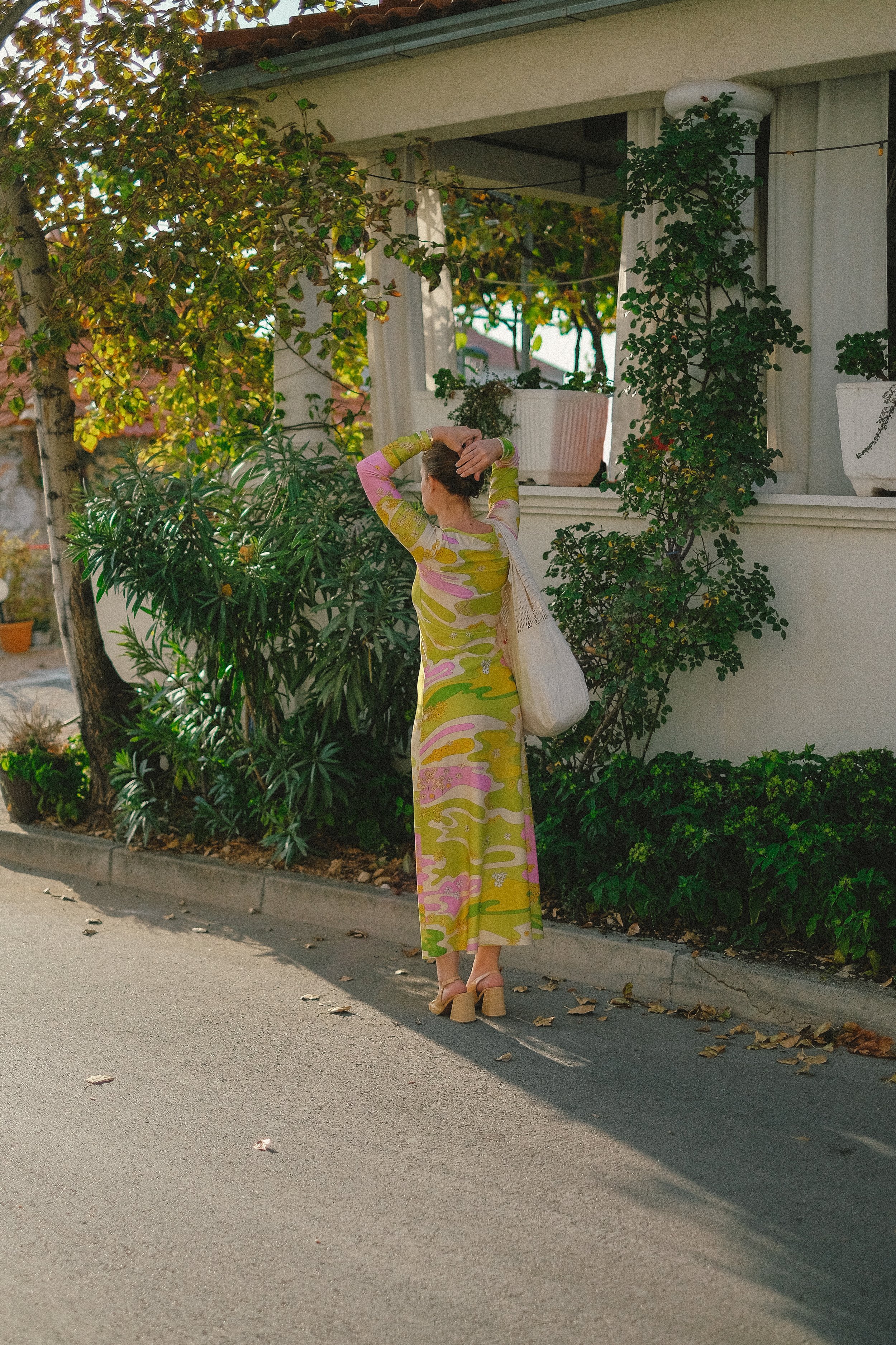
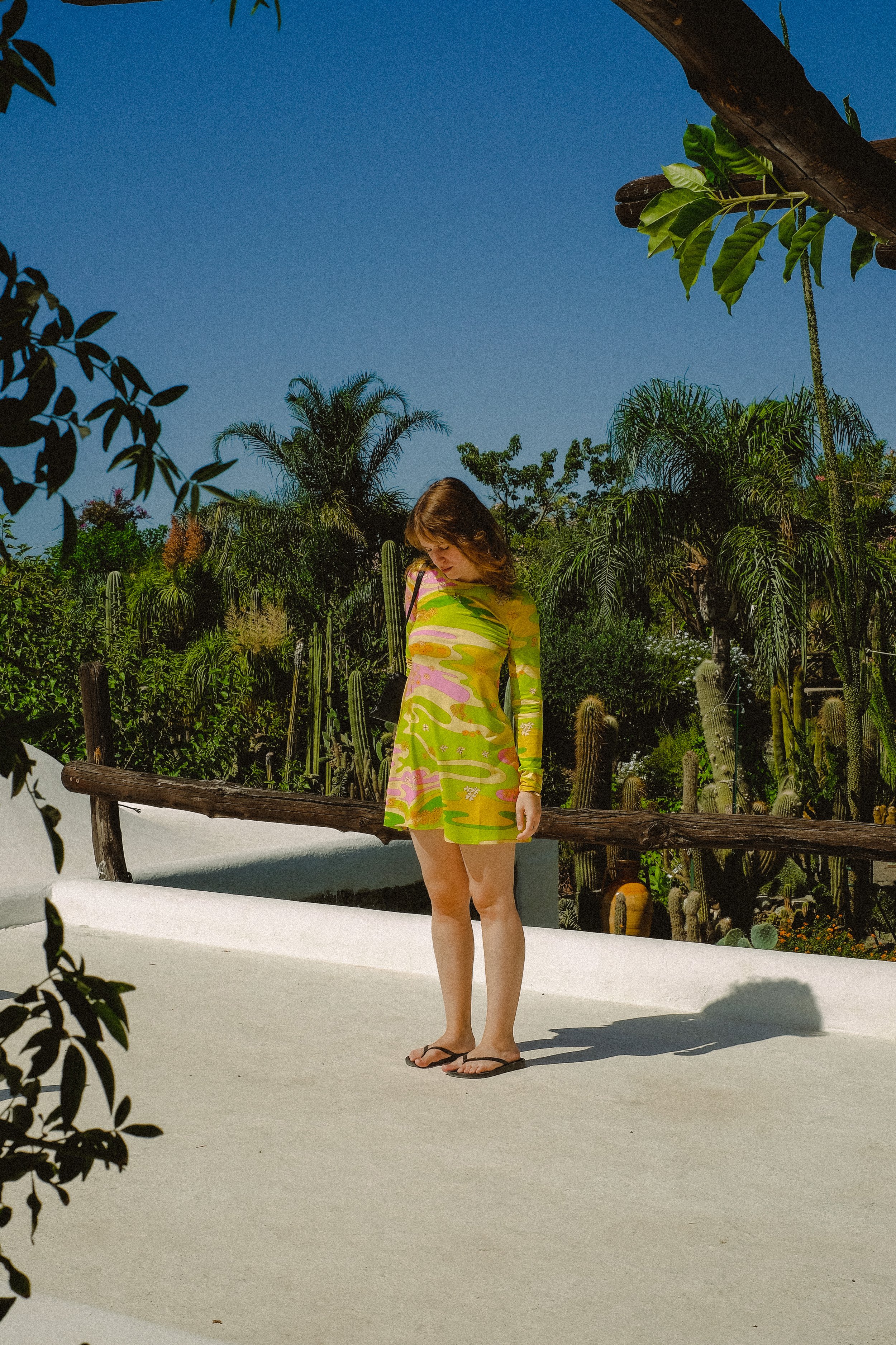
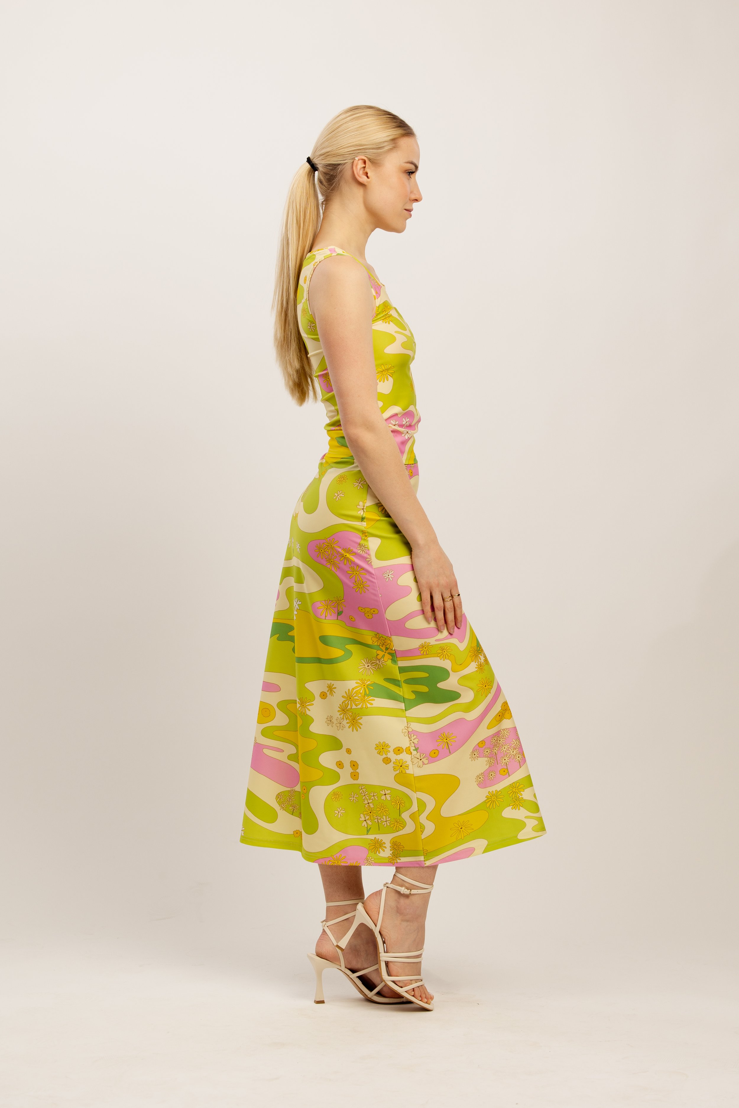
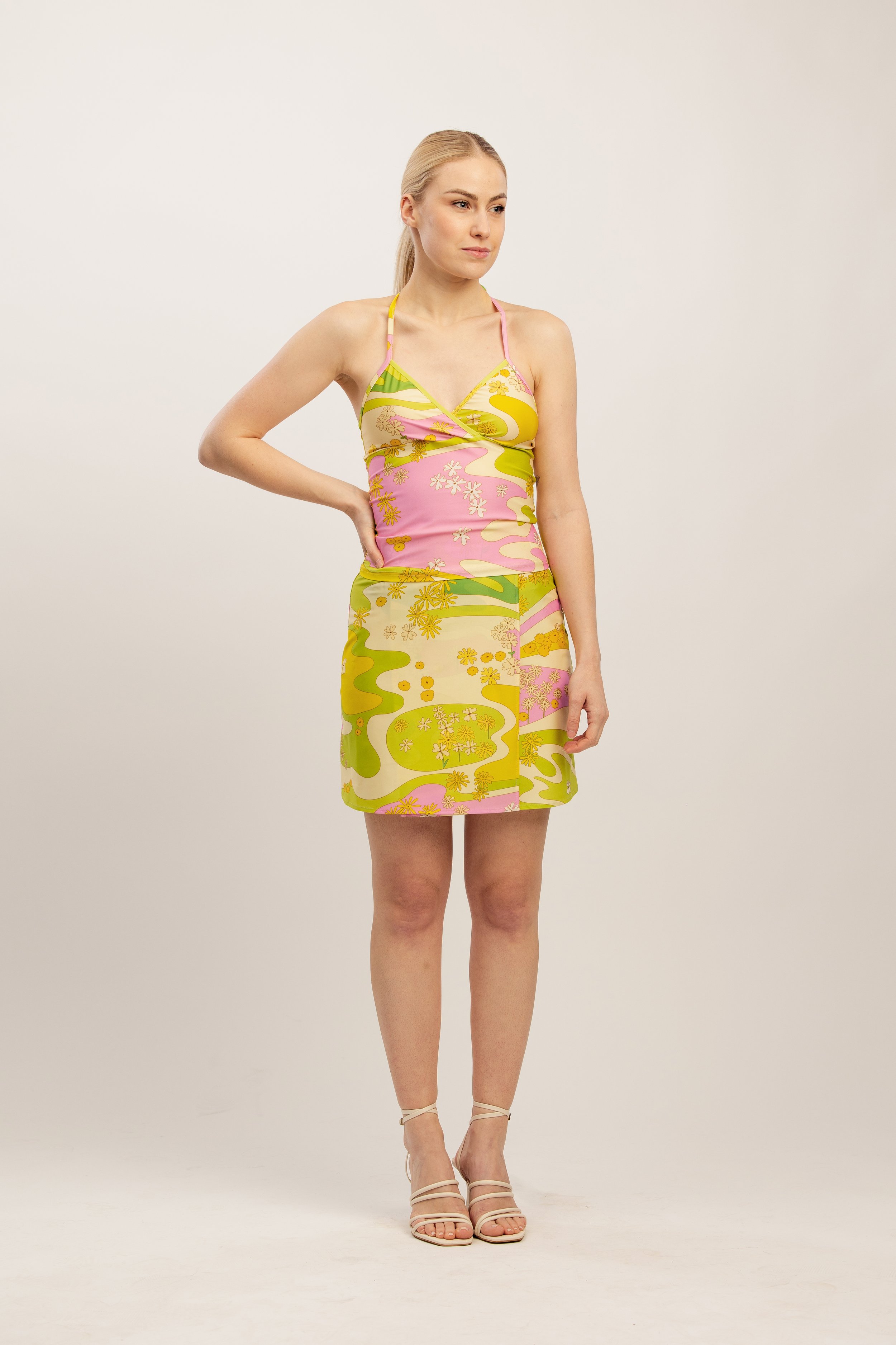
LOLA
Third print of the collection is called Lola,
after The Kinks song “Lola”. Buckingham Nicks also
has an amazing song called “Lola”
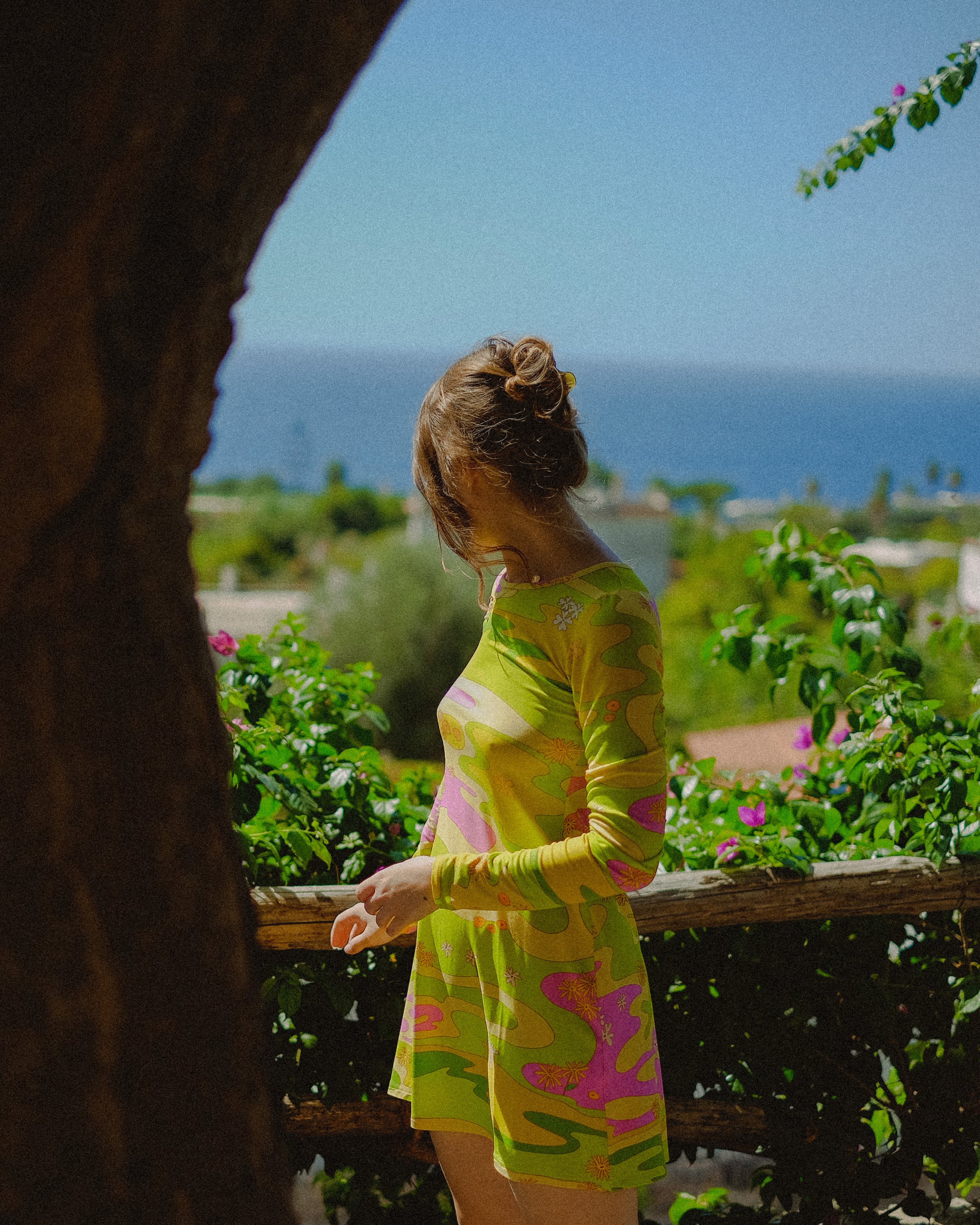
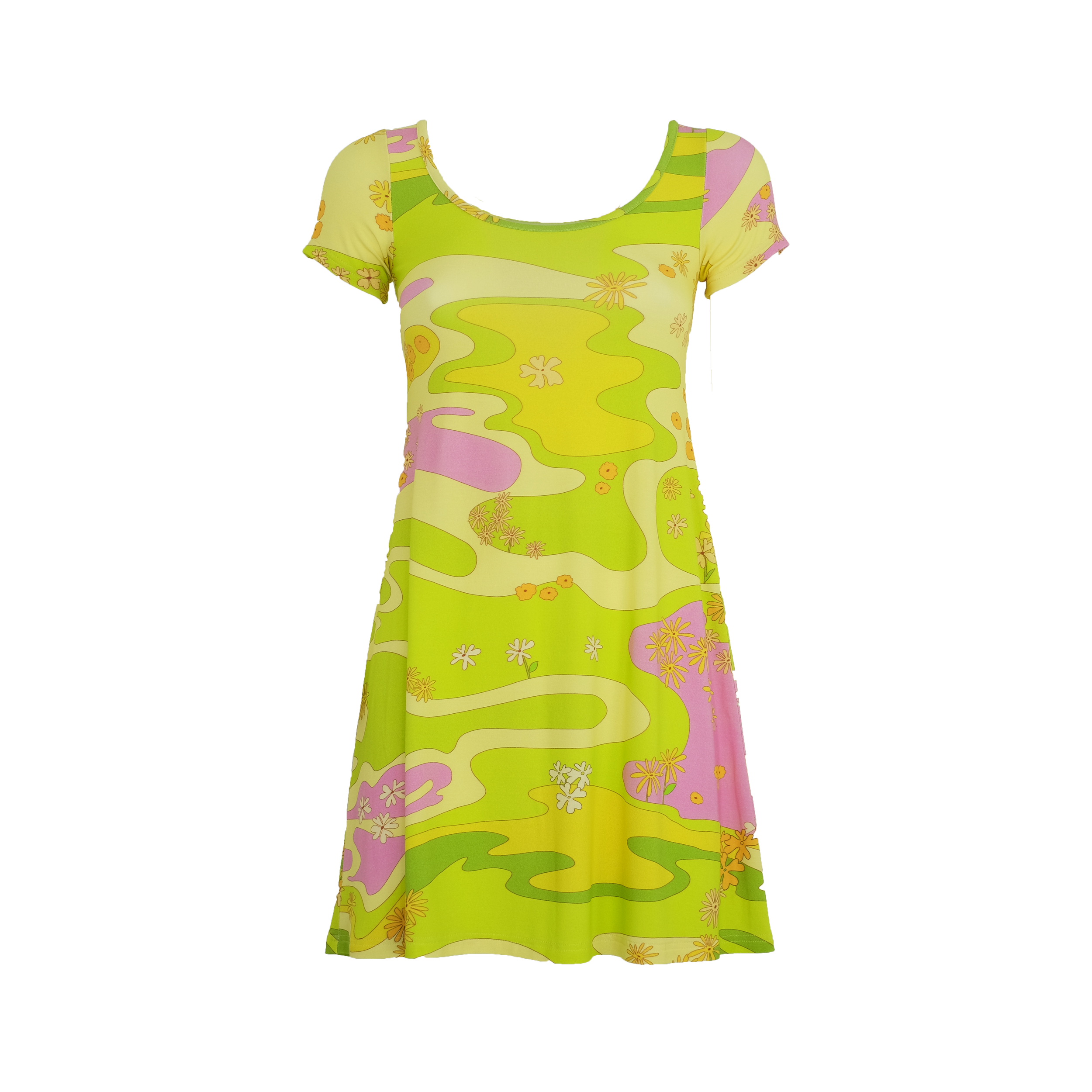
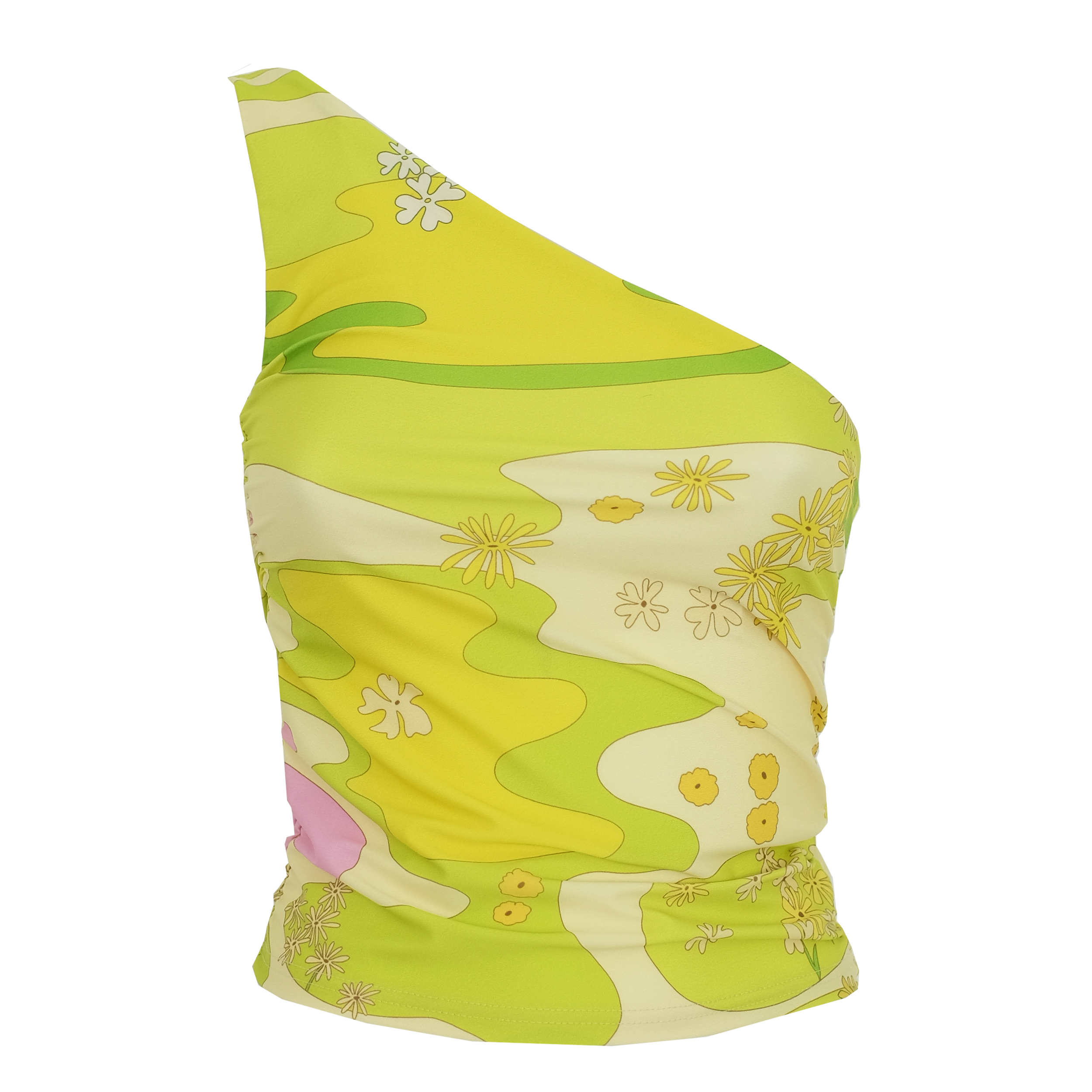
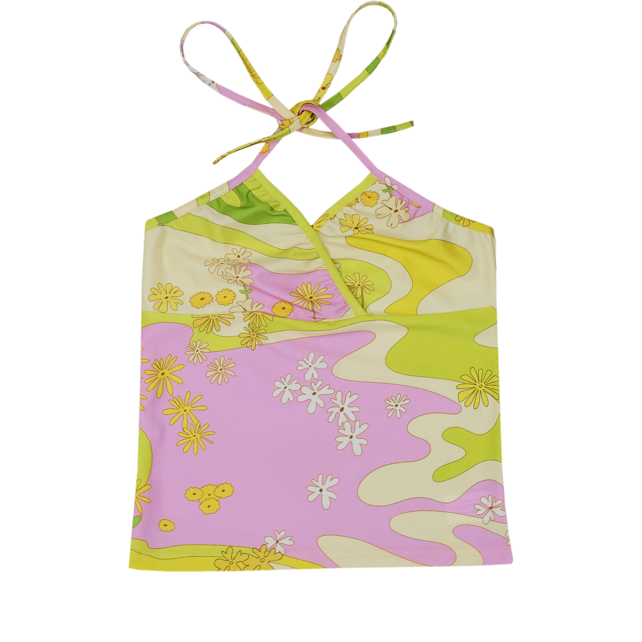
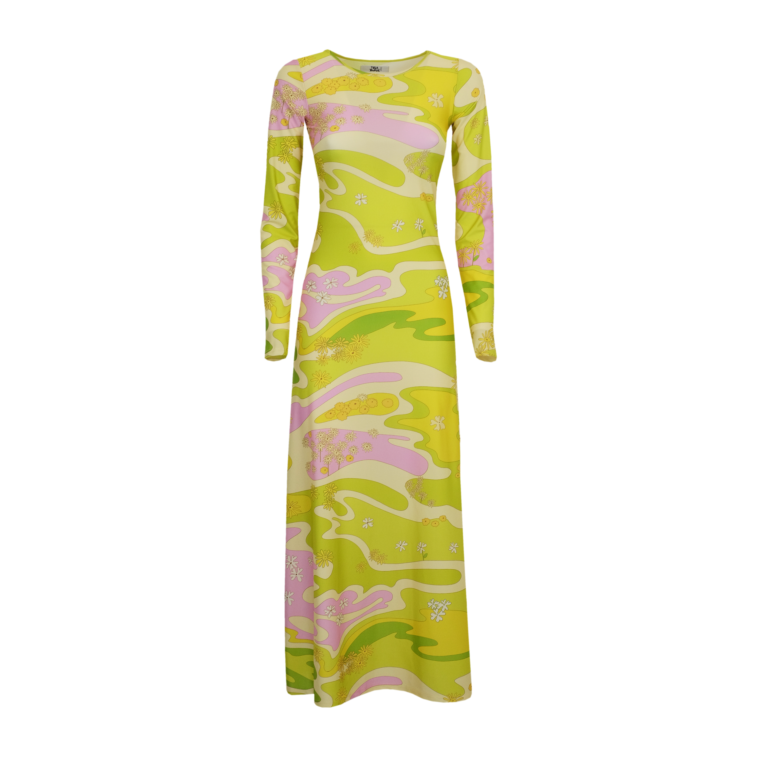
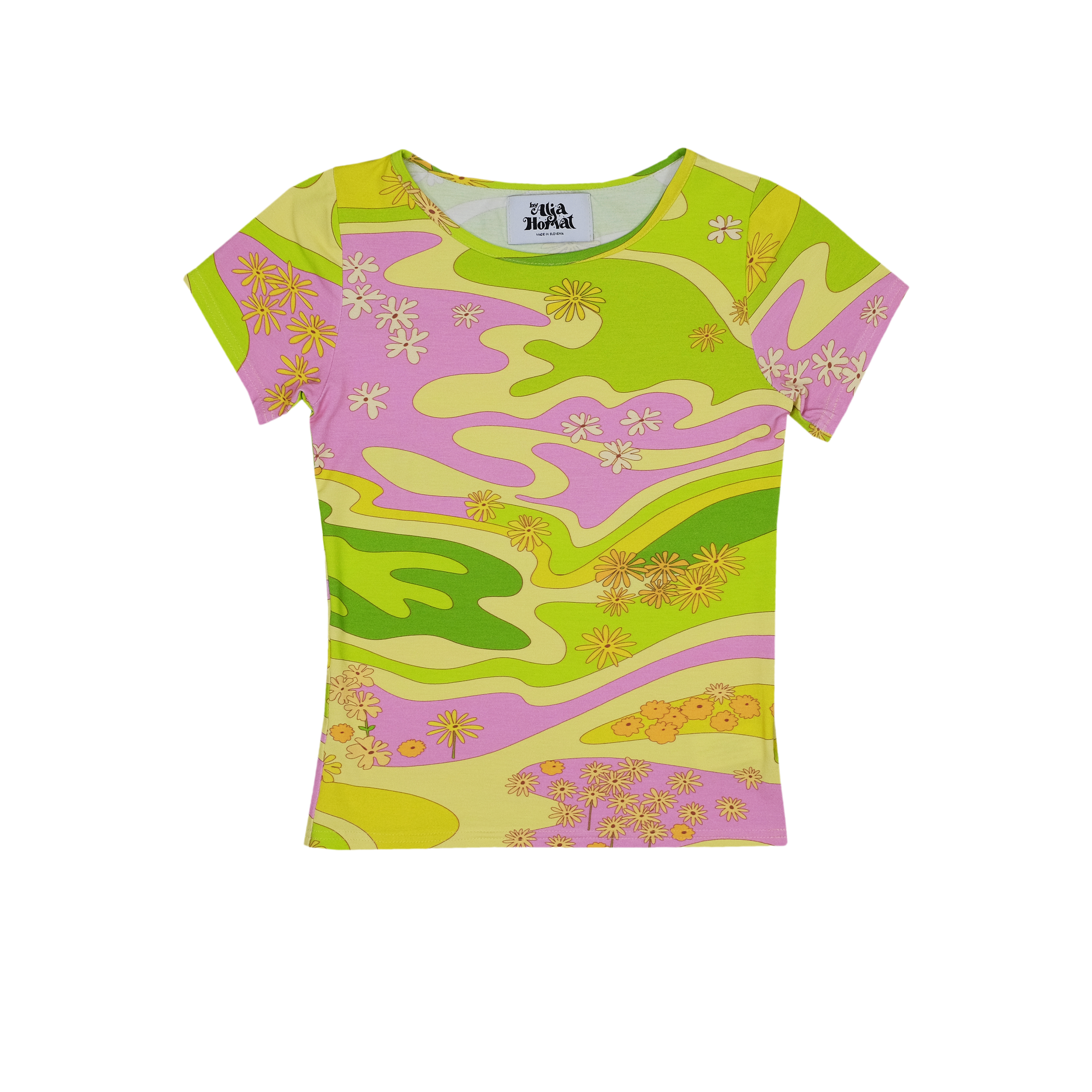
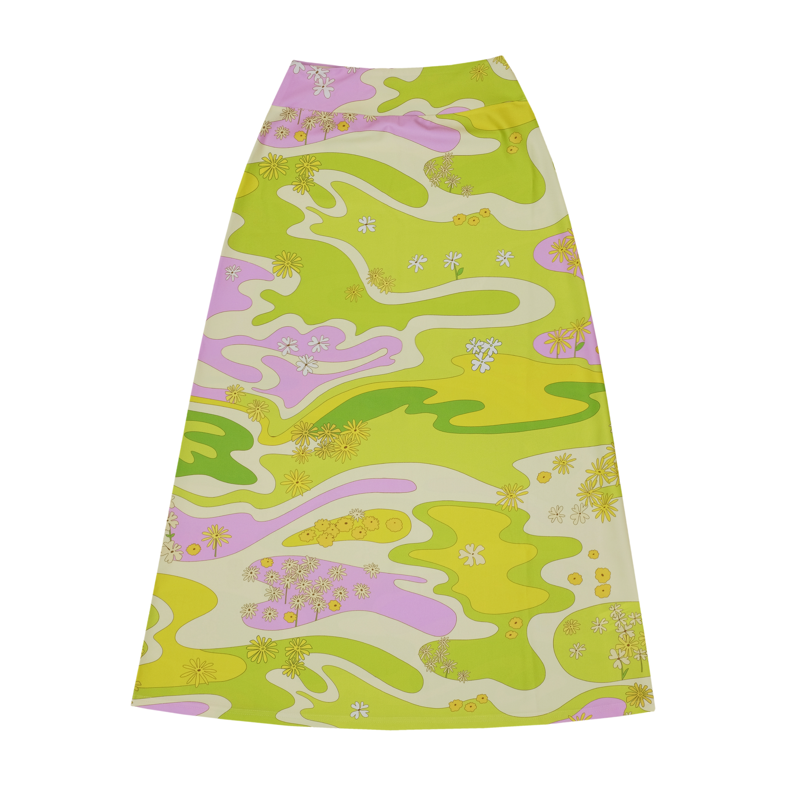
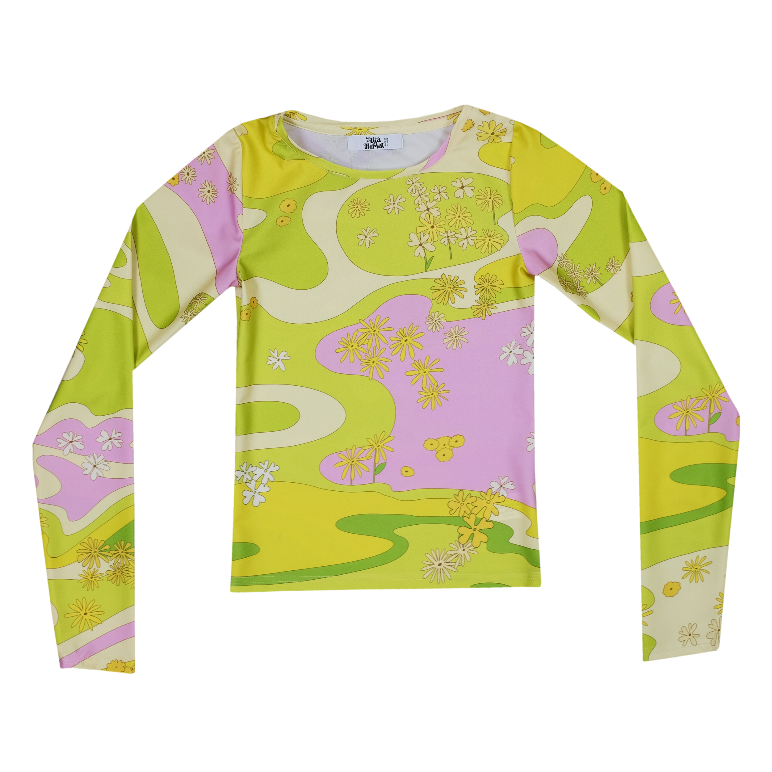
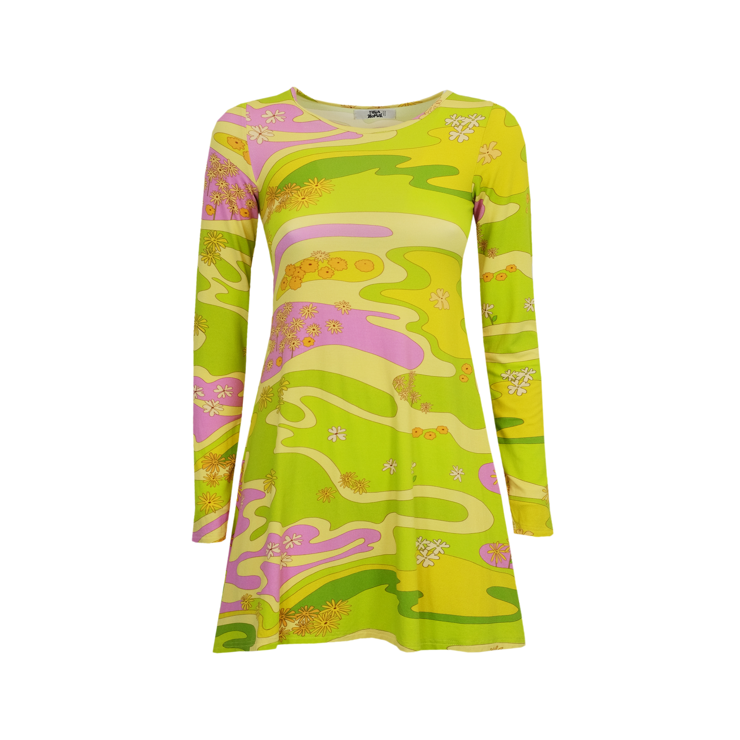
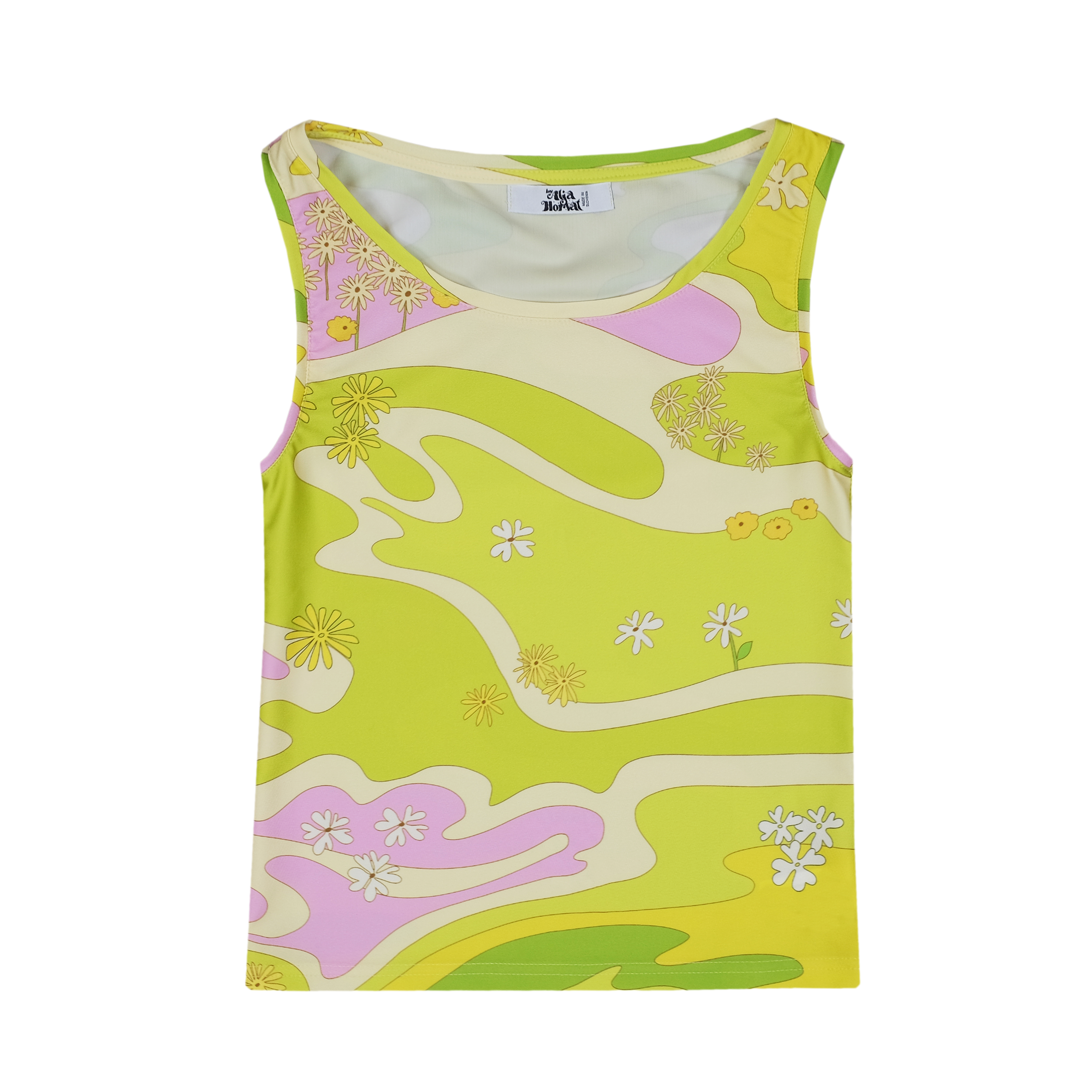
Lola is another print that I’ve reimagined. This print was created after the illustration I created for my solo exhibition that I had during the summer in Ljubljana. It’s very similar, but in a completely different colour palette (see picture below). As with print “Penny Lane”, I also wanted “Lola” print to resemble the spirit of the sixties and seventies. The original illustration was in yellowish colour palette, but the print that ended up in collection is green-pink. I loved the yellow version that I’ve created for my solo exhibition, but it didn’t translate well to the clothes.
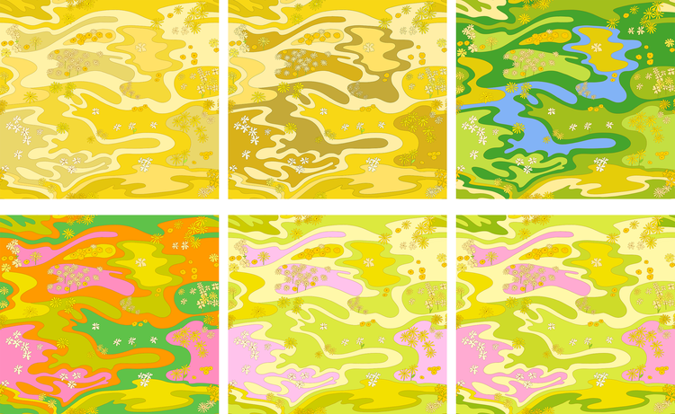
As you can see below I went through many color changes for this print and had a extremely hard time deciding with which colour option I should move forward.
I started with yellow colour palette as I thought it was fitting for the summer, but later realised it looked too much like a “camouflage” print when on clothes. I added green and blue colors to the yellow version but it wasn’t working out and then tried something completely different with very bold and bright oranges, pinks and greens.
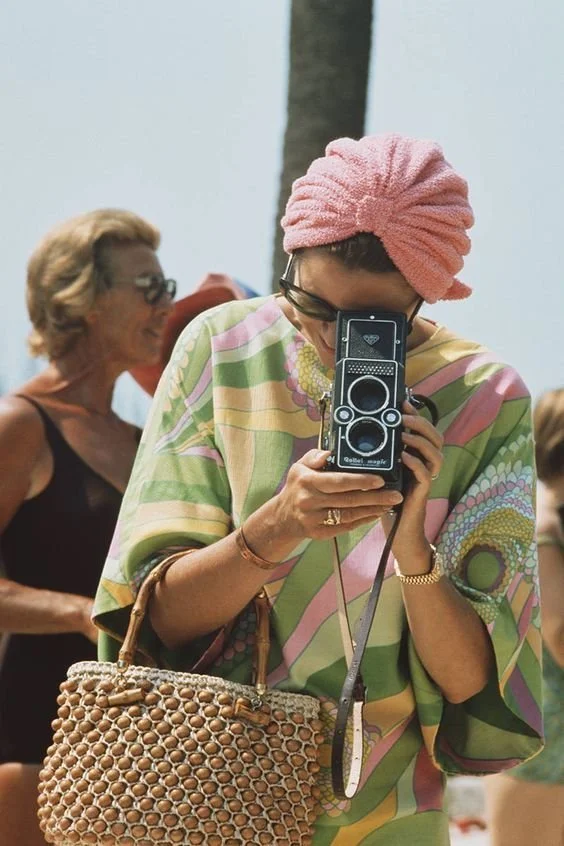
I knew I wanted to do something with the green colour and stumbled upon Grace Kelly’s photo on Pinterest again after a long time, and realised, that adding pink to the green will do the job. (scroll down).
The main inspiration for colour palette of the “Lola” print was this photo of Grace Kelly, taken at a 1972 swimming competition event in Monte Carlo. I was always obsessed with this photo and her fabulous outfit. I wanted to create a perfect summer print and I think these colours are a perfect match.
Another inspiration was the nature. I wanted to create an abstract scene of a garden. The song I was playing a lot while creating this print was “I Feel Free” by Cream and this song always gave me psychedelic vibes, the same vibes the “Lola” print gives me. I can definitely imagine a young woman in the 60s wearing the dress with “Lola” print and dancing to this song.
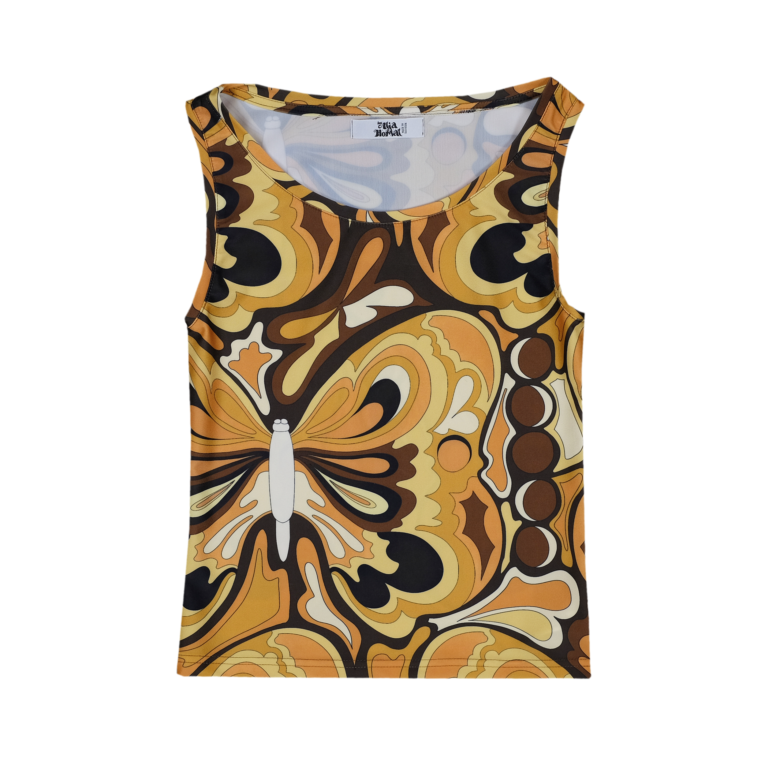
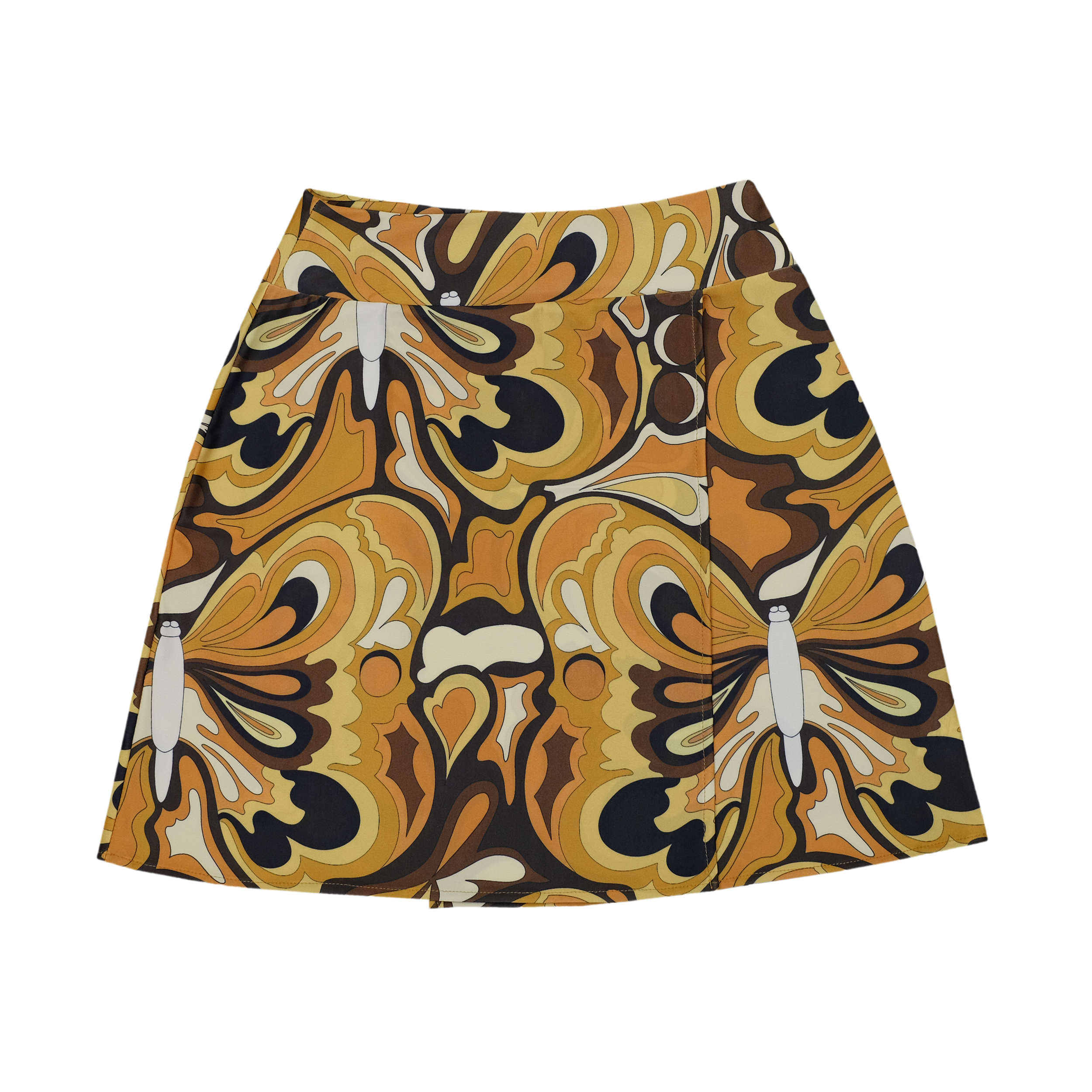
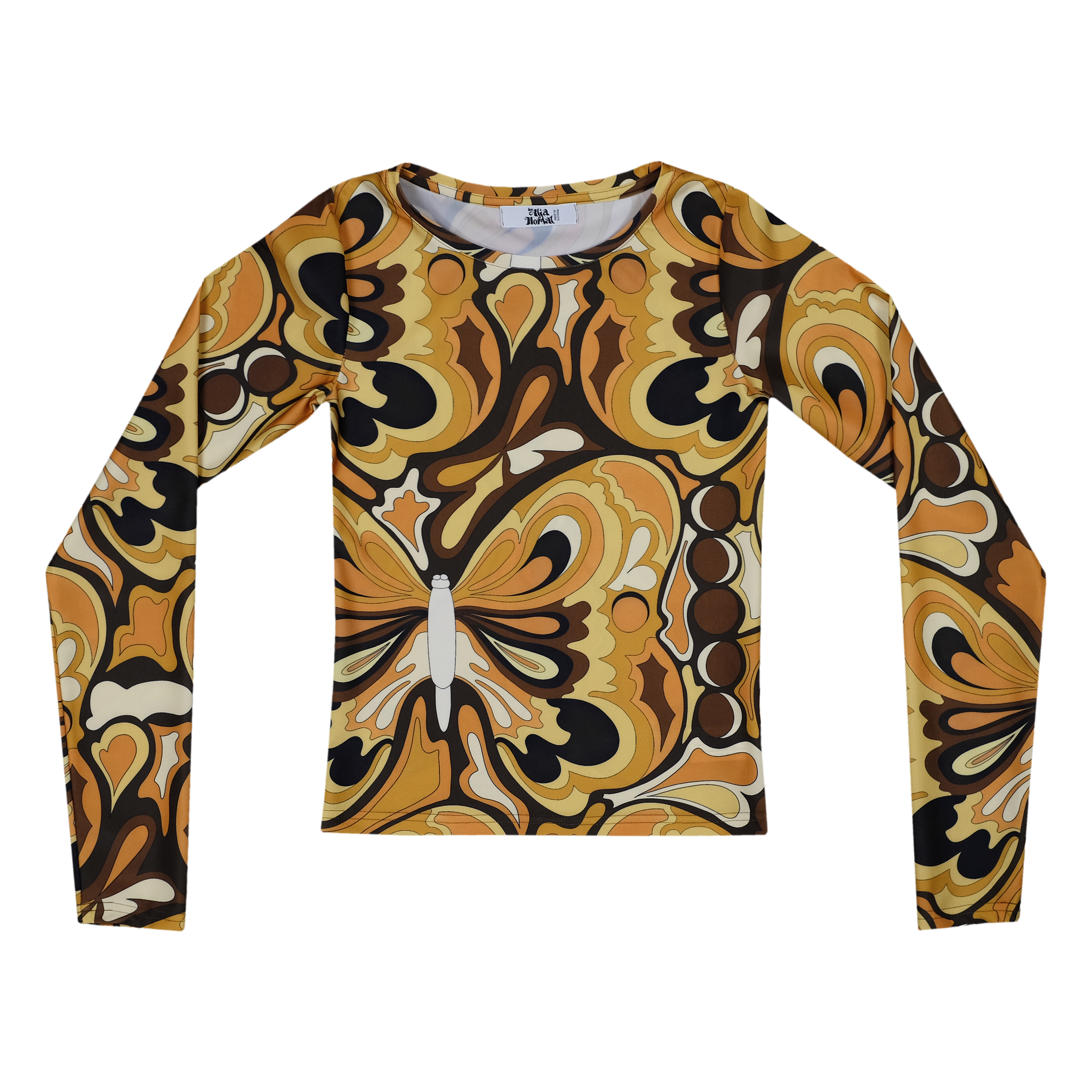
LITTLE WING
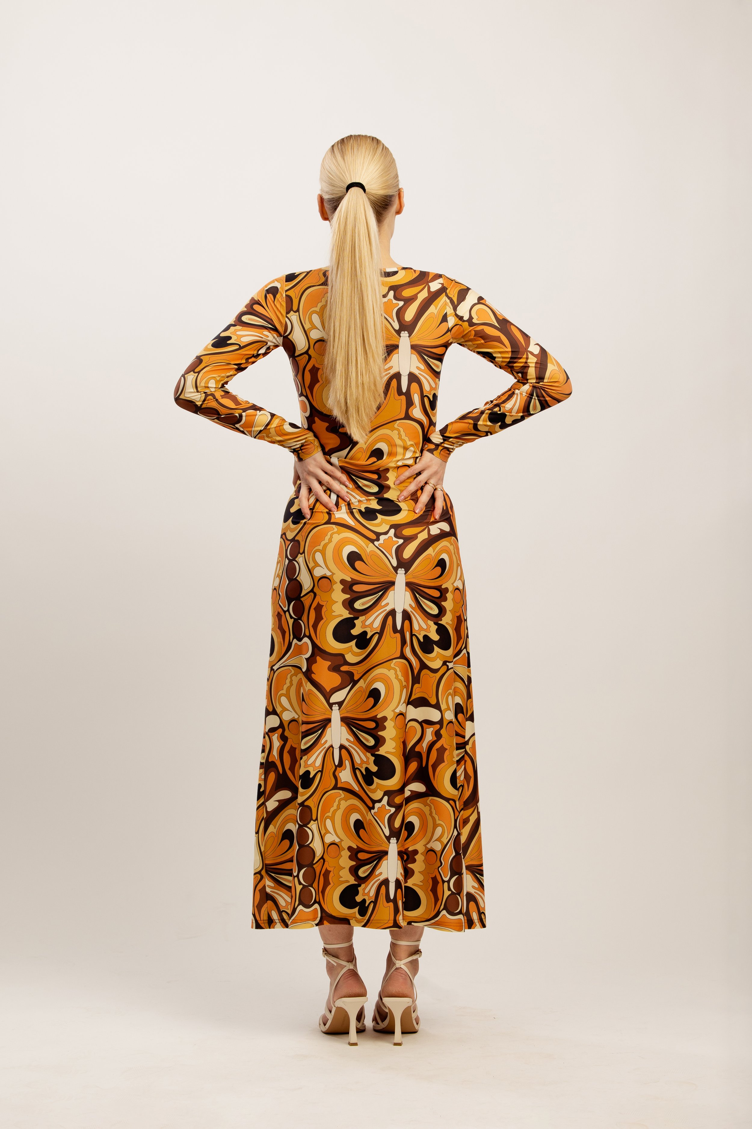
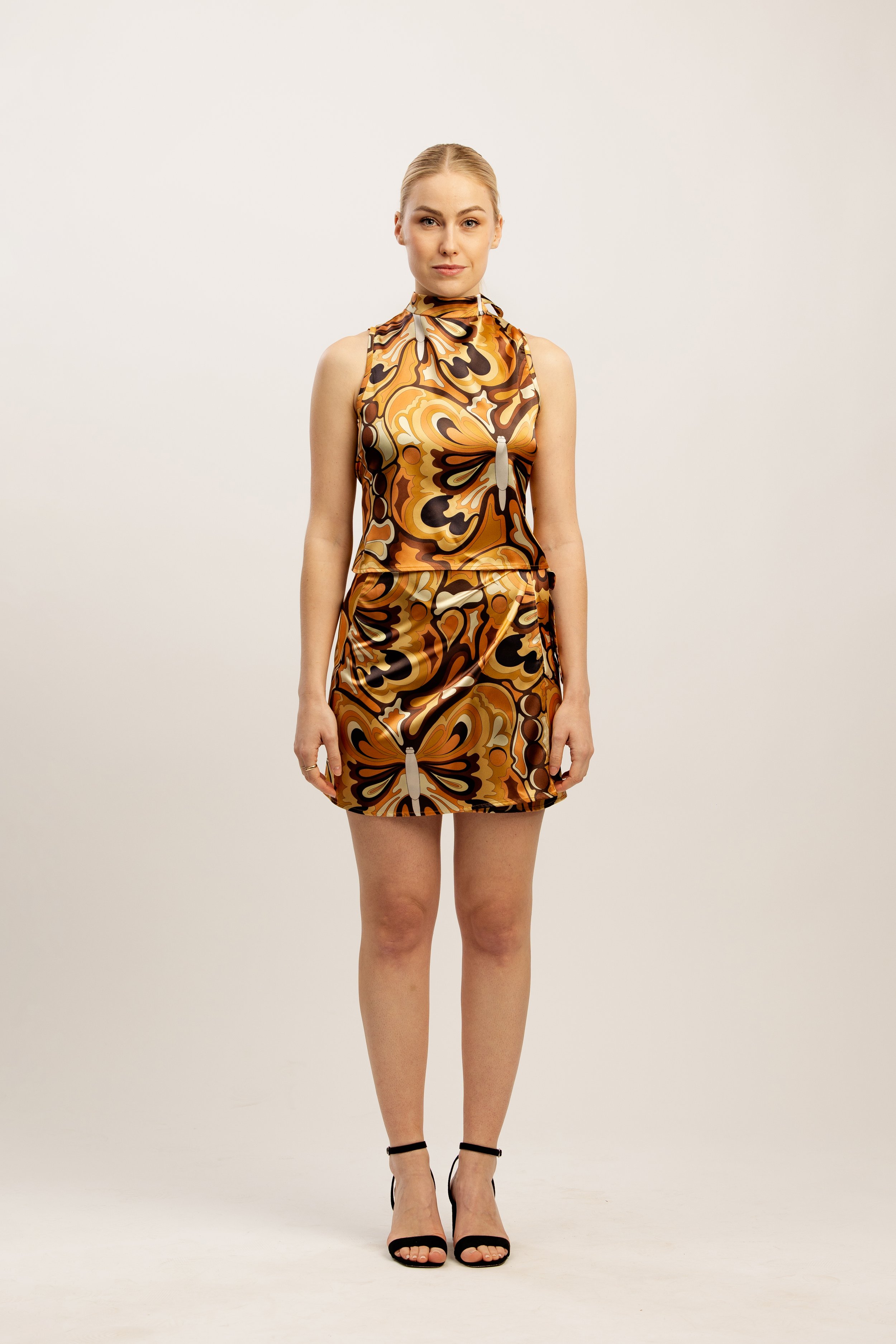
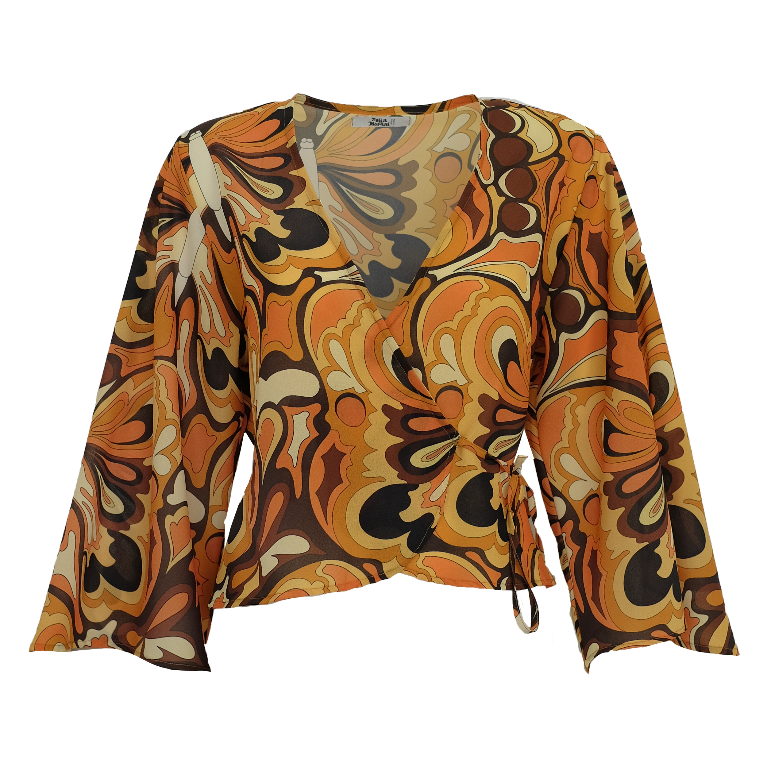
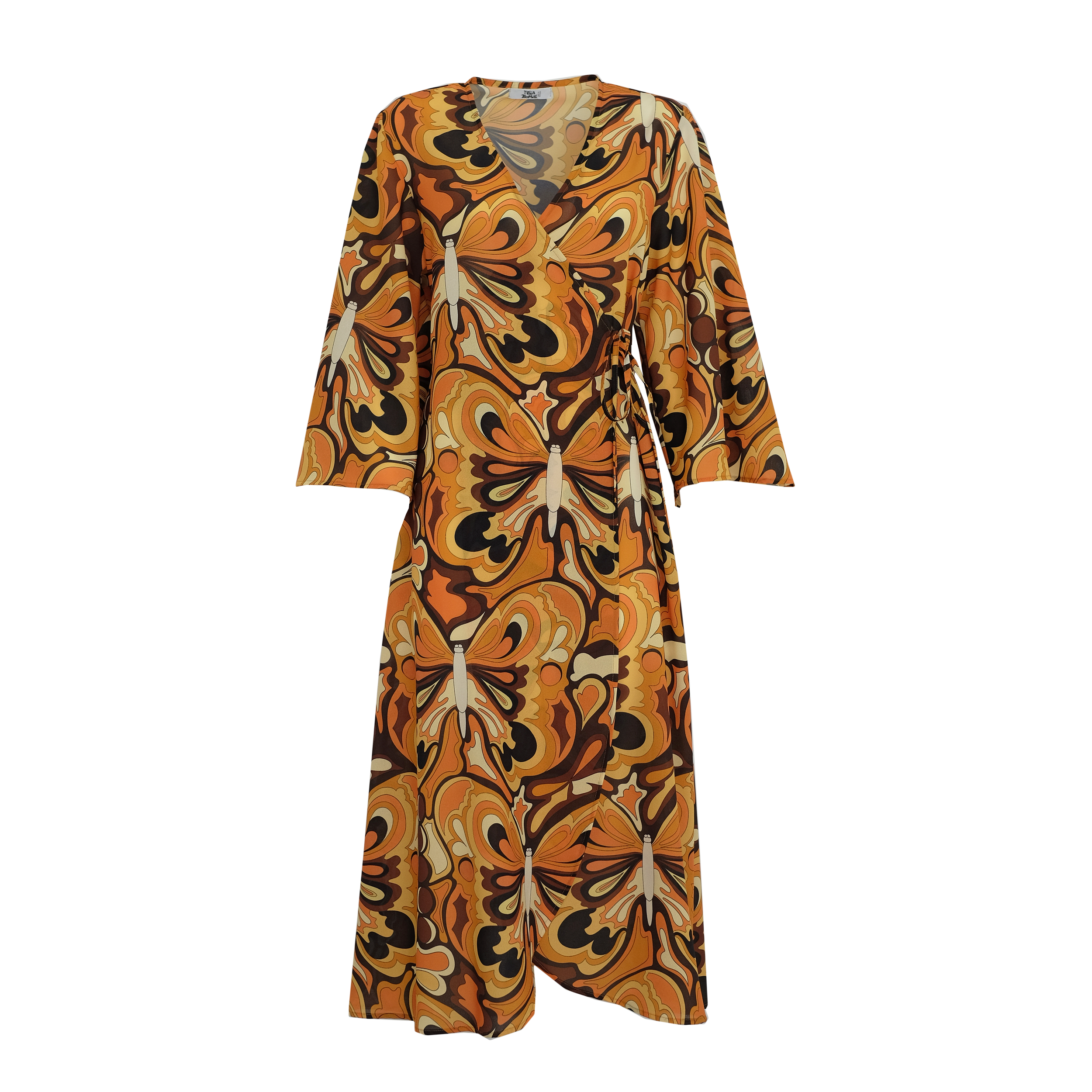
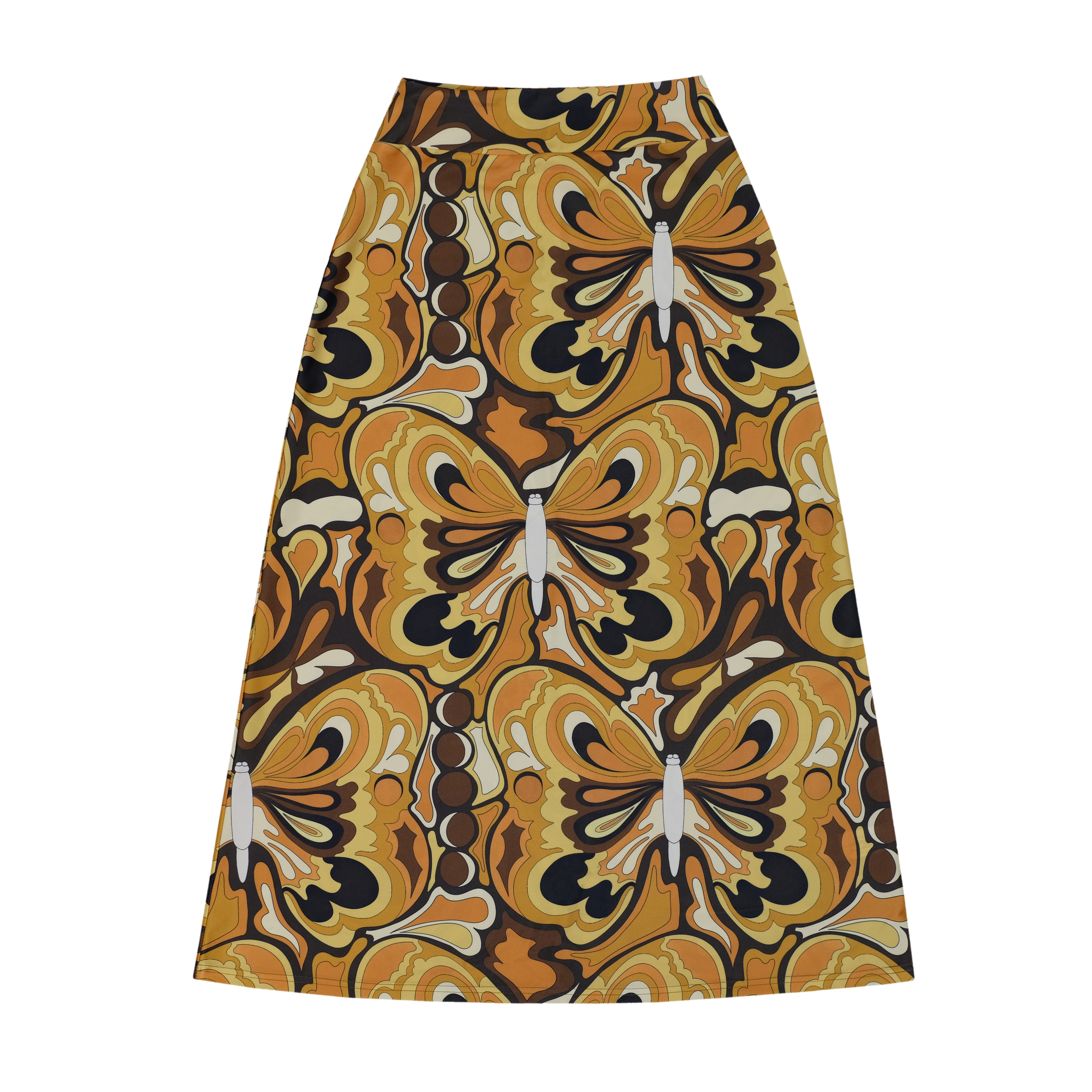
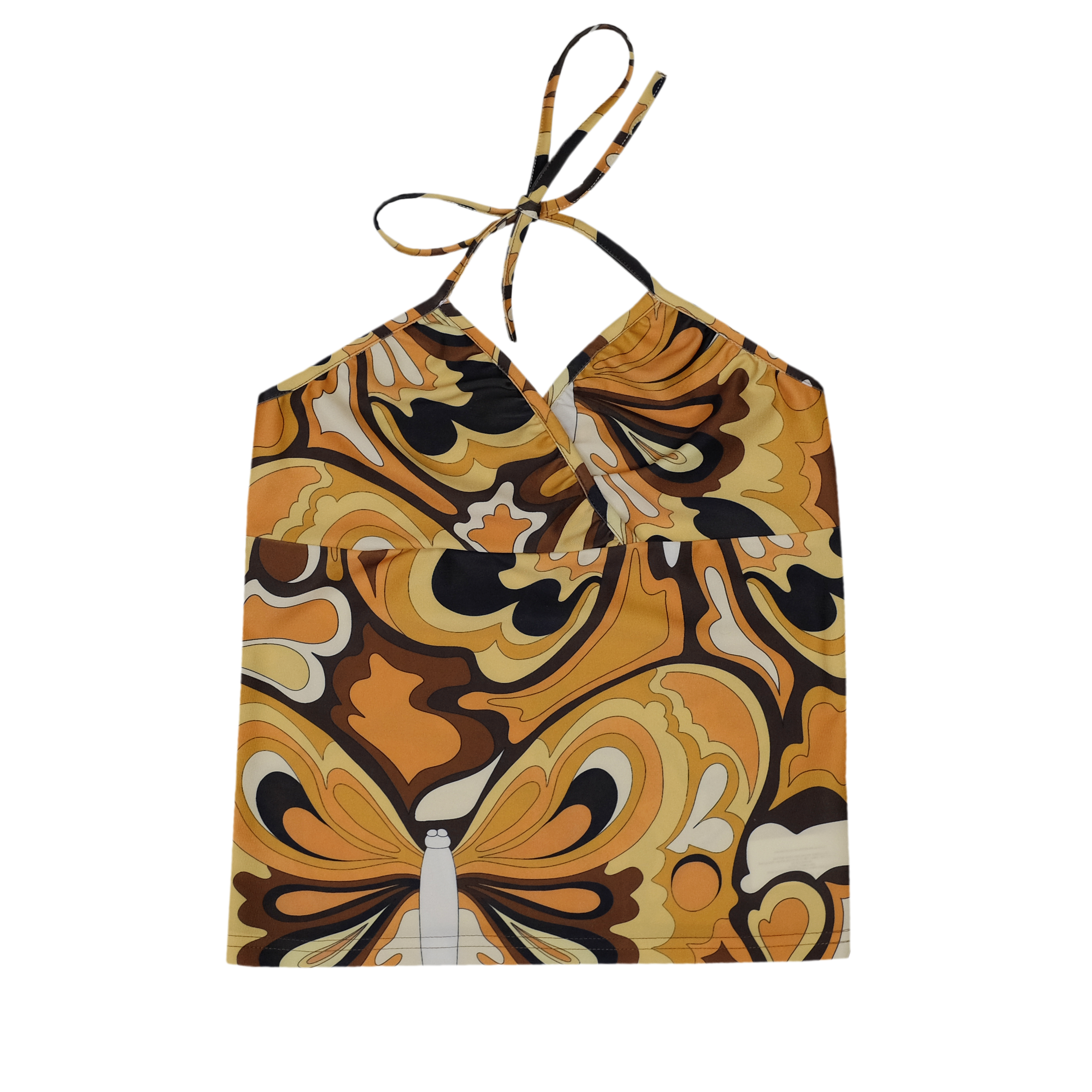
Fourth print of the collection is called Little Wing,
after Jimi Hendrix song “Little Wing”
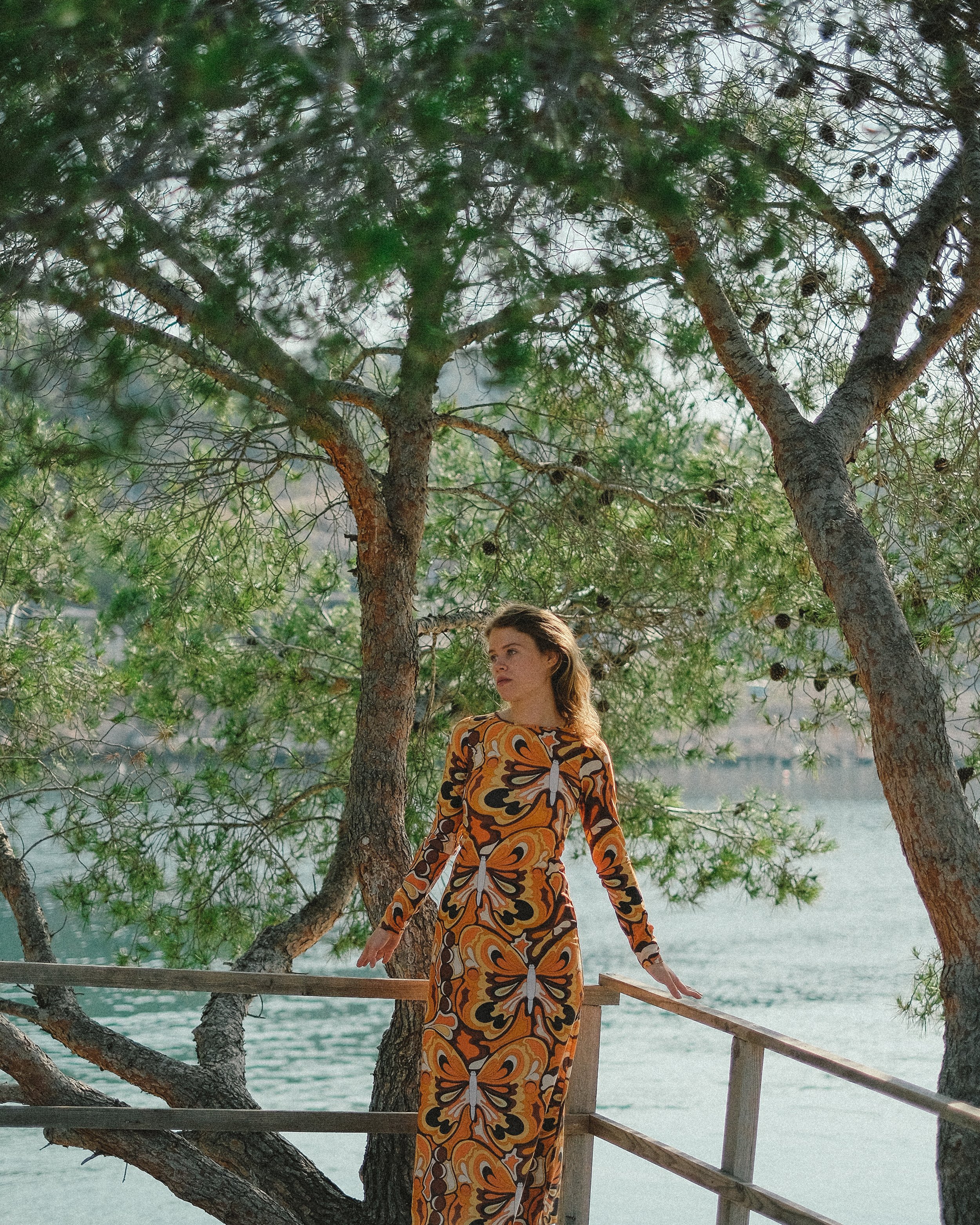
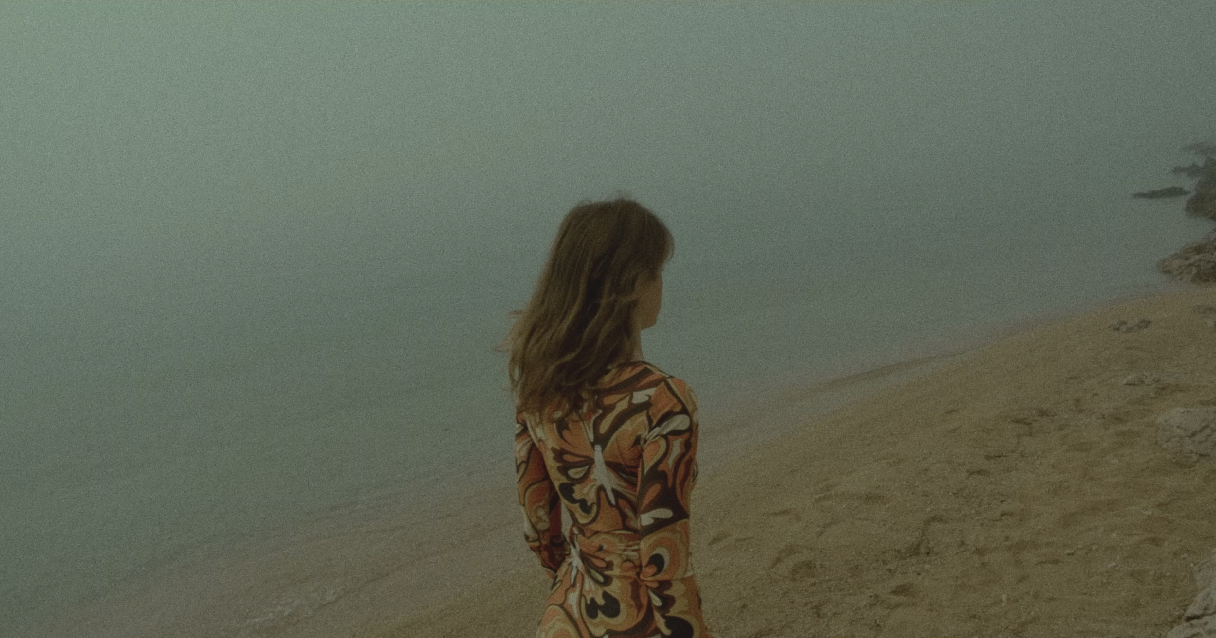
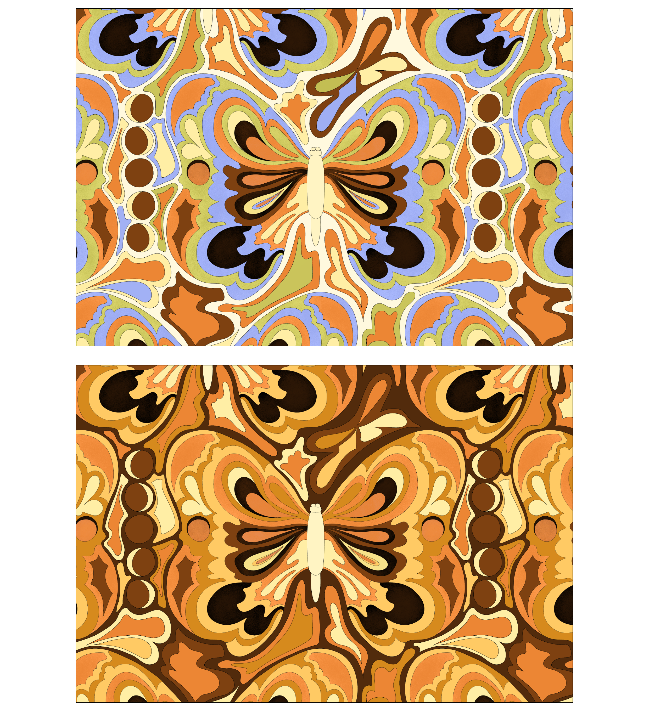
Little Wing is the print I’ve created while on vacation in Naples, Italy. To be particular, this print was created while we were waiting for the plane back home. We had around 12 hours to wait and I had nothing else to do and I knew I needed a last, fourth print for my collection. That was in the middle of September. We were sitting outside, and I had a sketch of butterfly already done, so I created an outline and added colours. The version I finished at the airport is the orange-blue-green version.
Because “Lola” and “Penny Lane” prints are super colourful, I wanted this print to be more calm, but to still resemble a spirit of the sixties and the seventies. The first colour version was orange-blue-green, but I later, after consultation with Niko, agreed, it needs to be more monochromatic and “earthy”. This print was actually the last one I created.
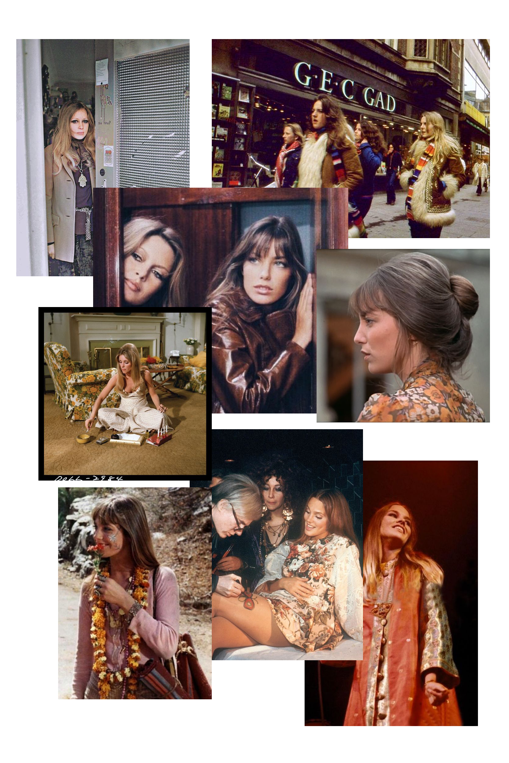
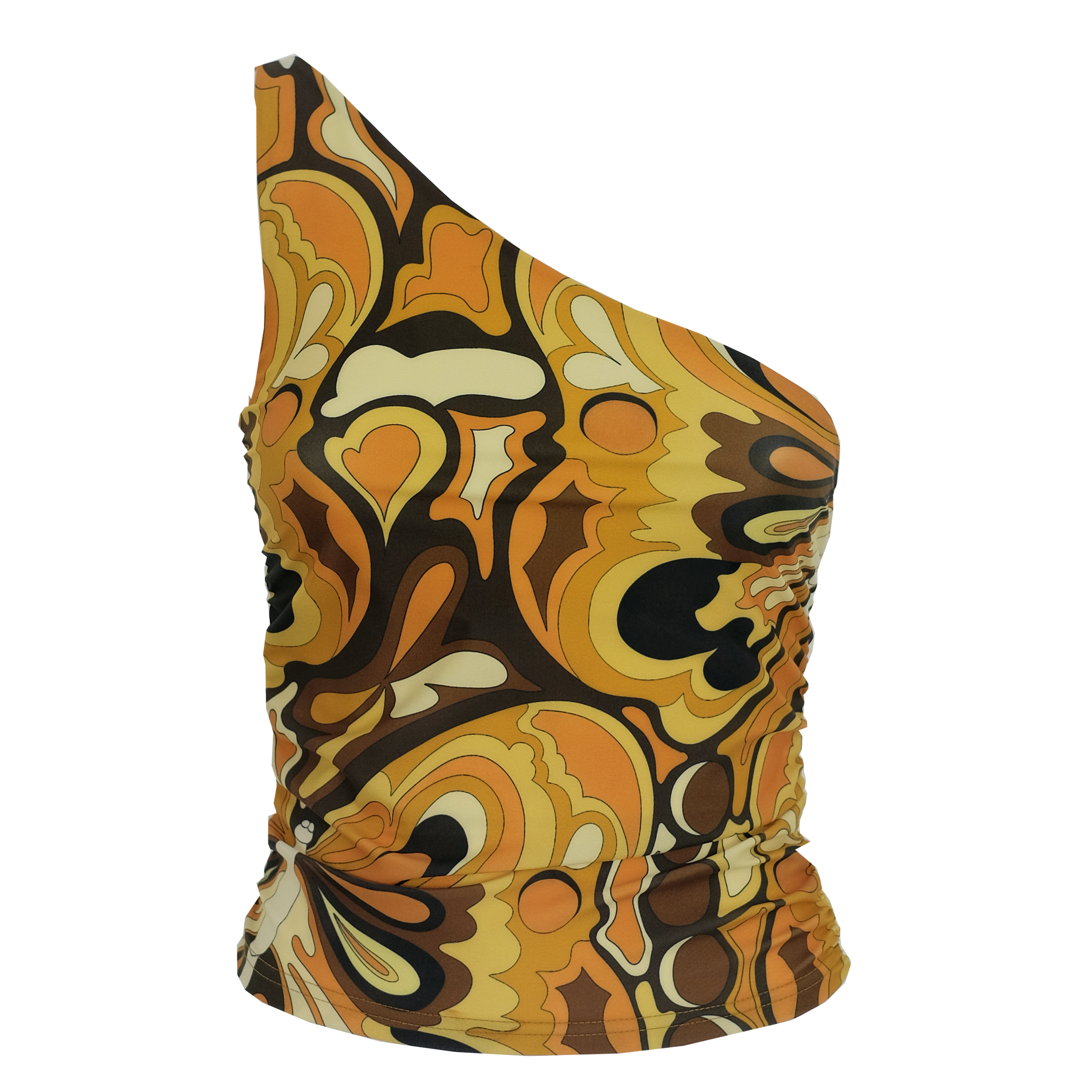
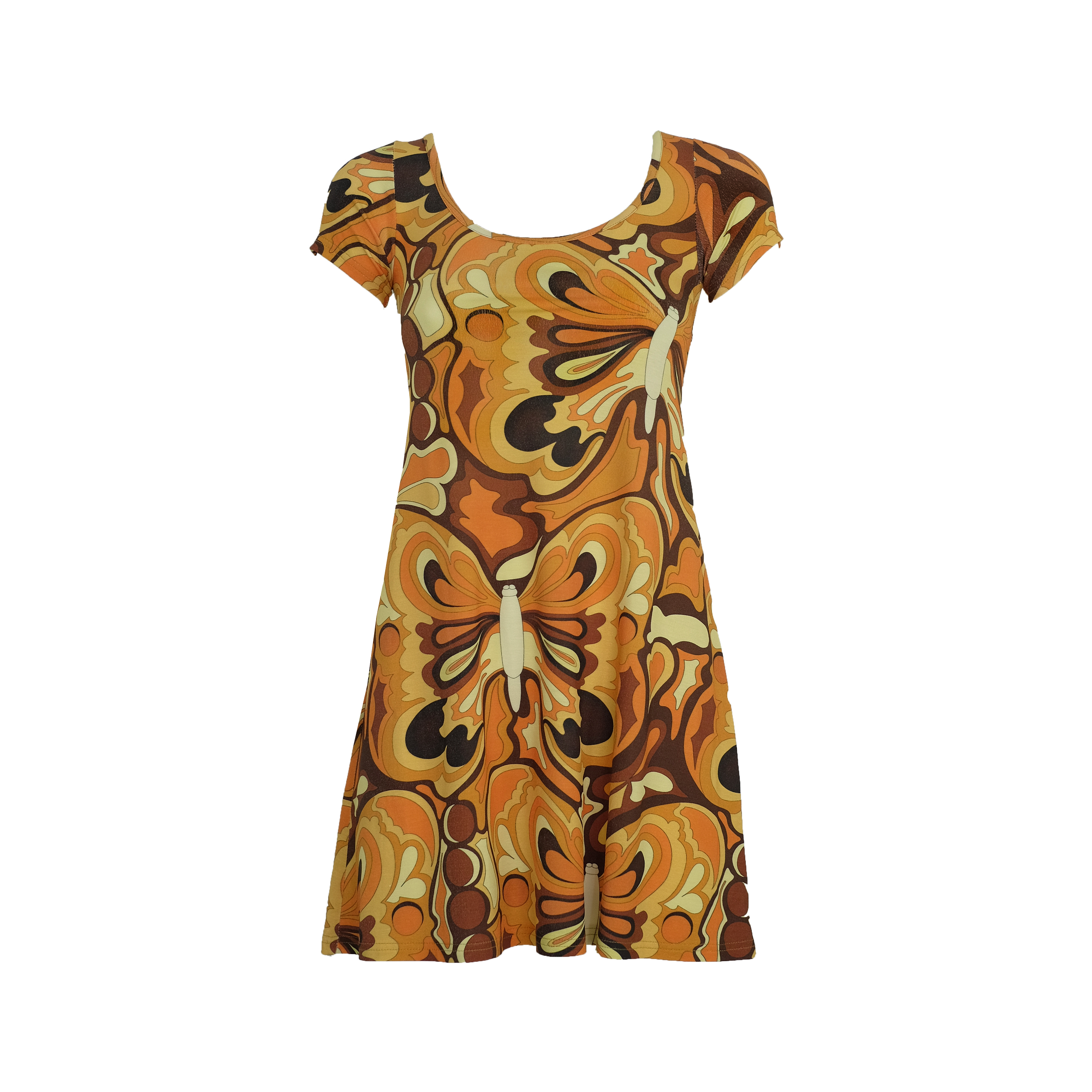
I think I made the right decision with going forward with the brown colour option, as it perfectly captures the spirit of the seventies. Below you can see some of the photos and what I was trying to capture with this print.
I wanted to invoke nostalgia and bring back memories, even if you didn’t grew up in the 70s and are only influenced by that decade. I was always fascinated with the seventies fashion and their use of colours. We could argue that 70s were the most stylish decade.
Regarding the inspiration for the design, butterflies were always these magical creatures for me. I remember being 5 or 6 years old, hanging out with my childhood friends in their backyard and we were looking at butterflies and being amazed at how beautiful they are.

