CeliaB x Alja Horvat collaboration
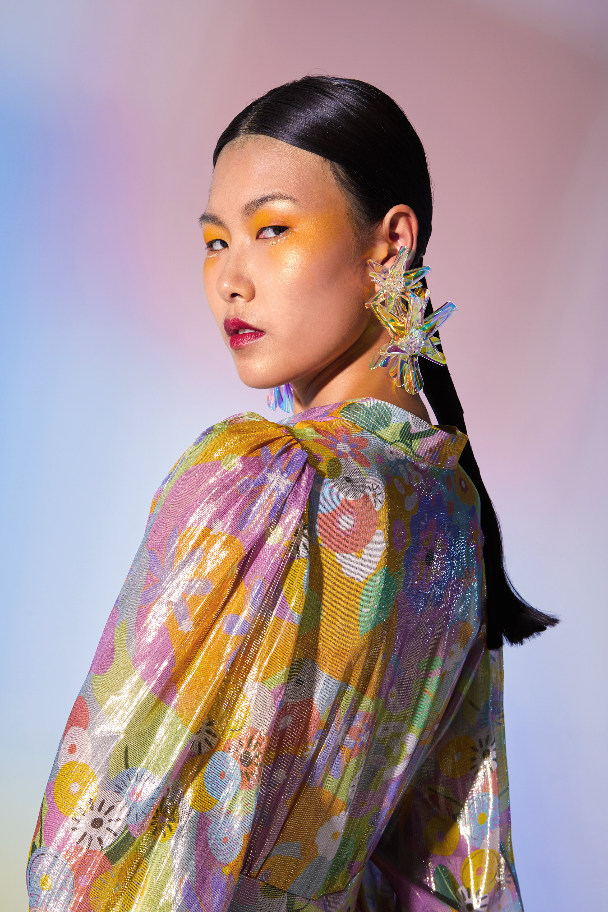
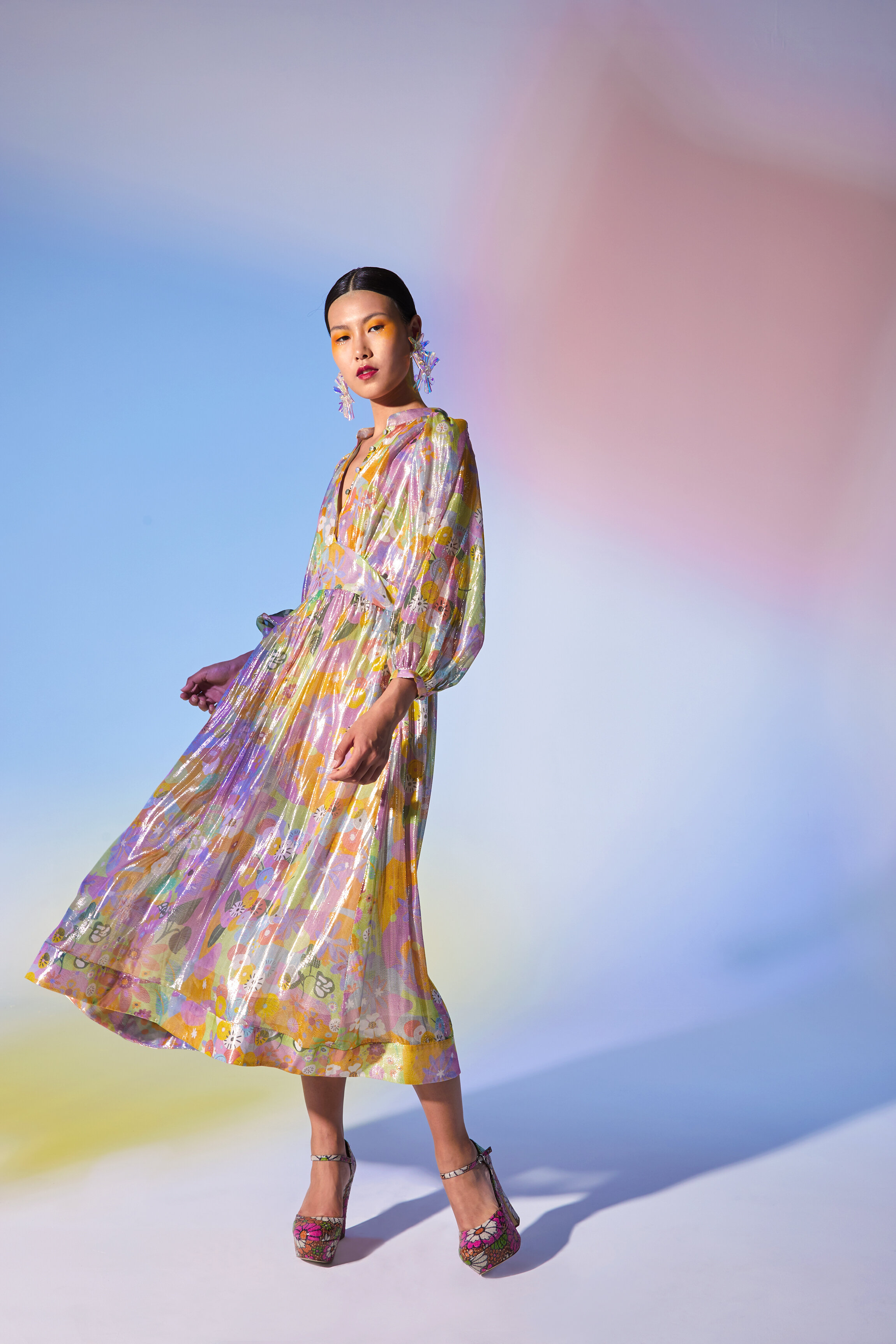
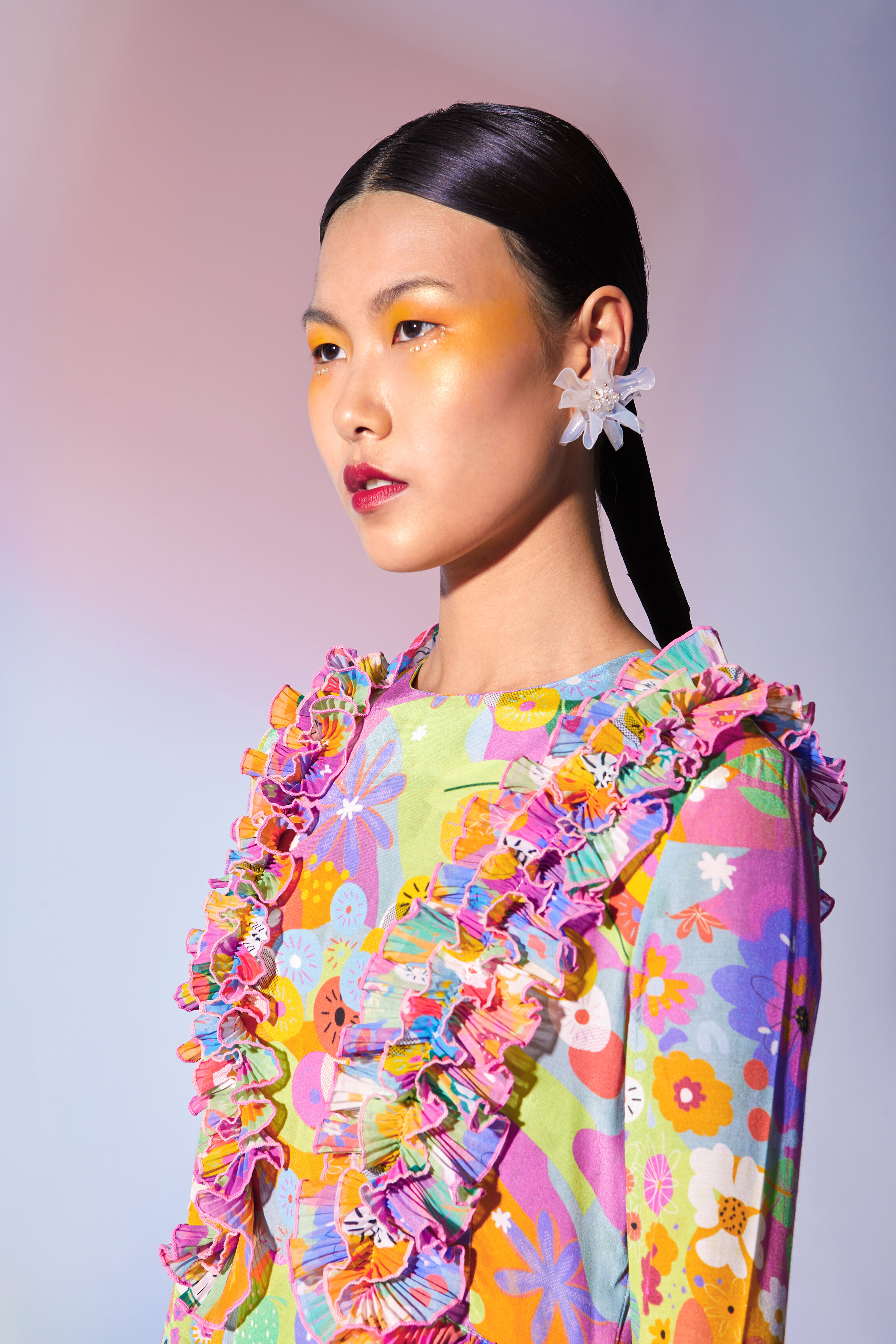
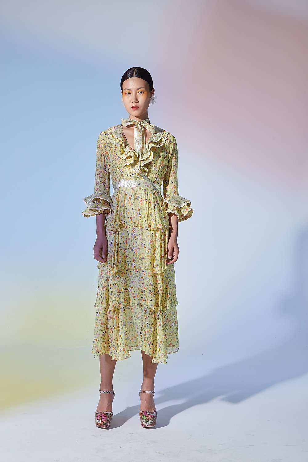
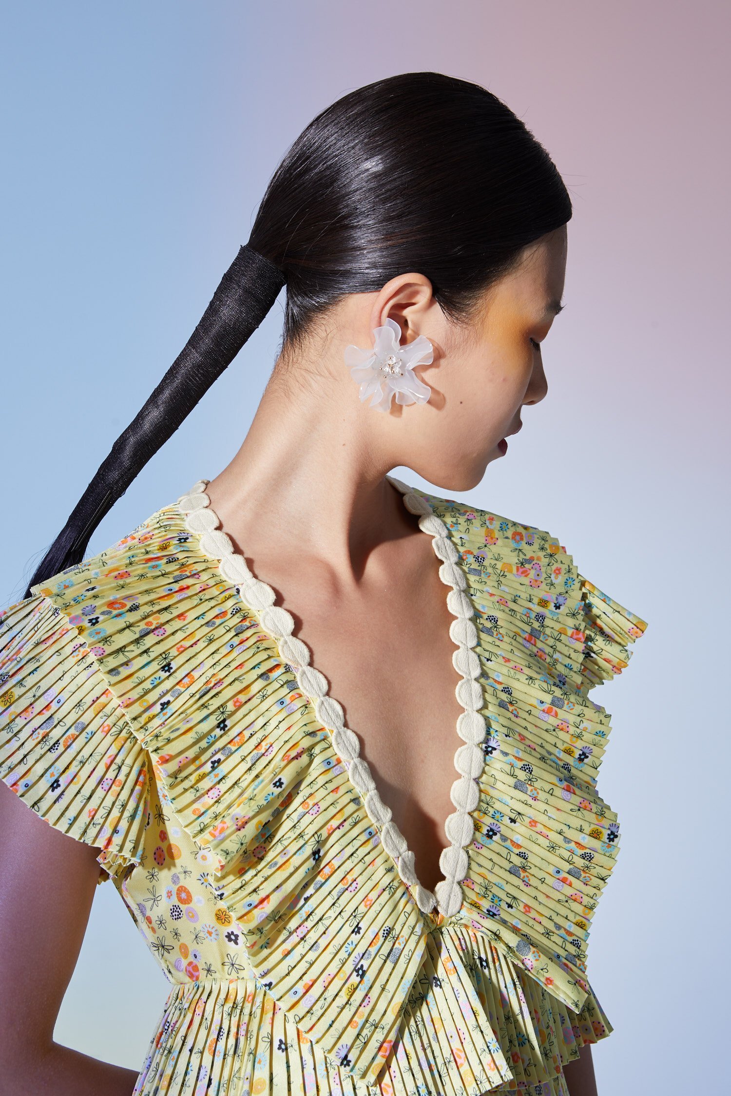
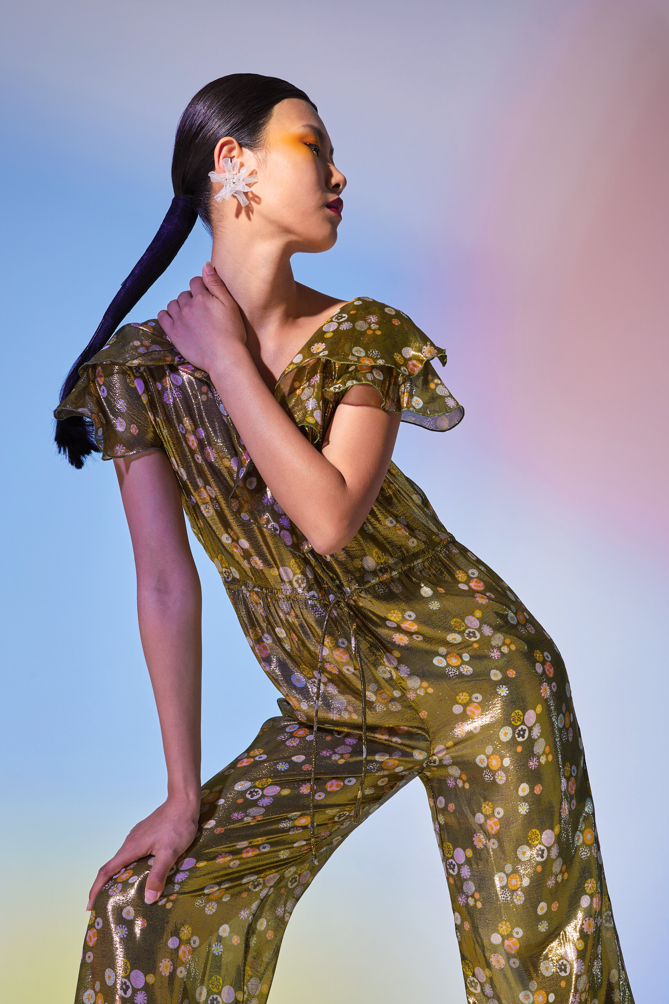
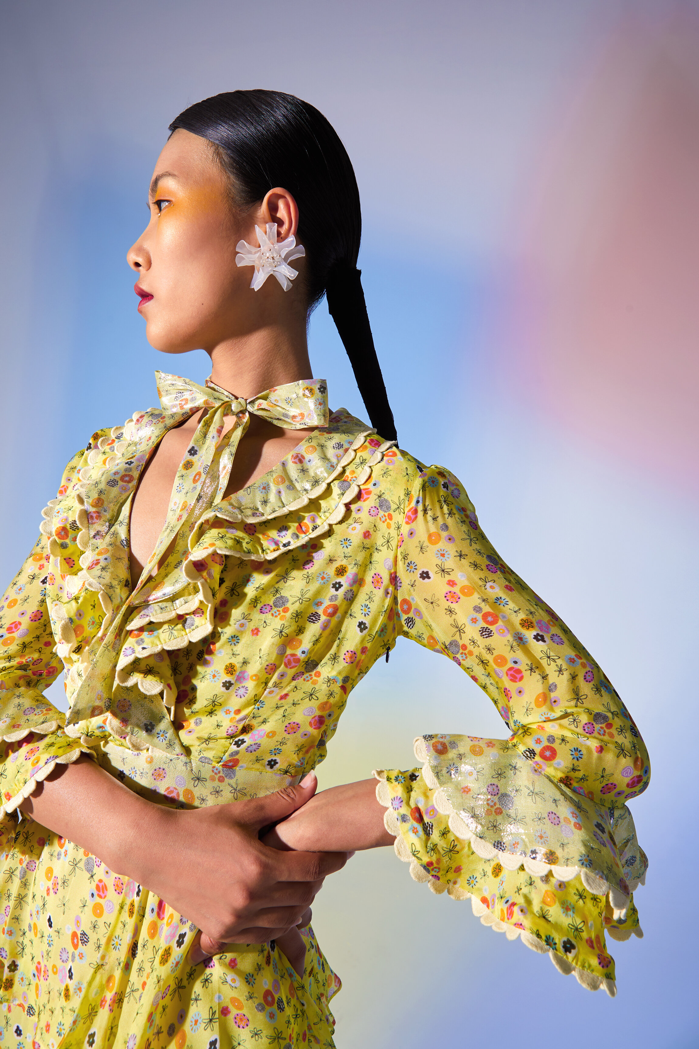
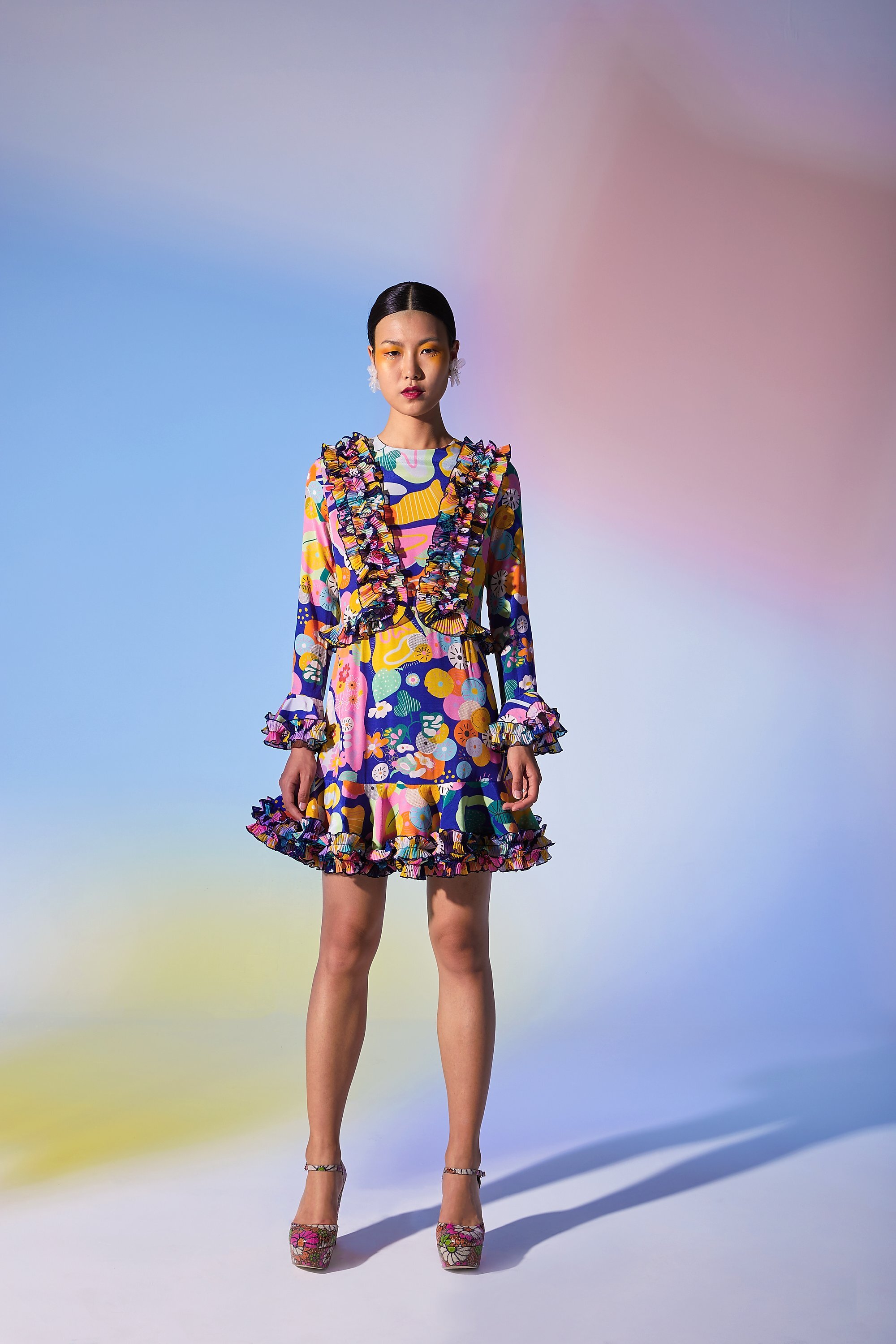
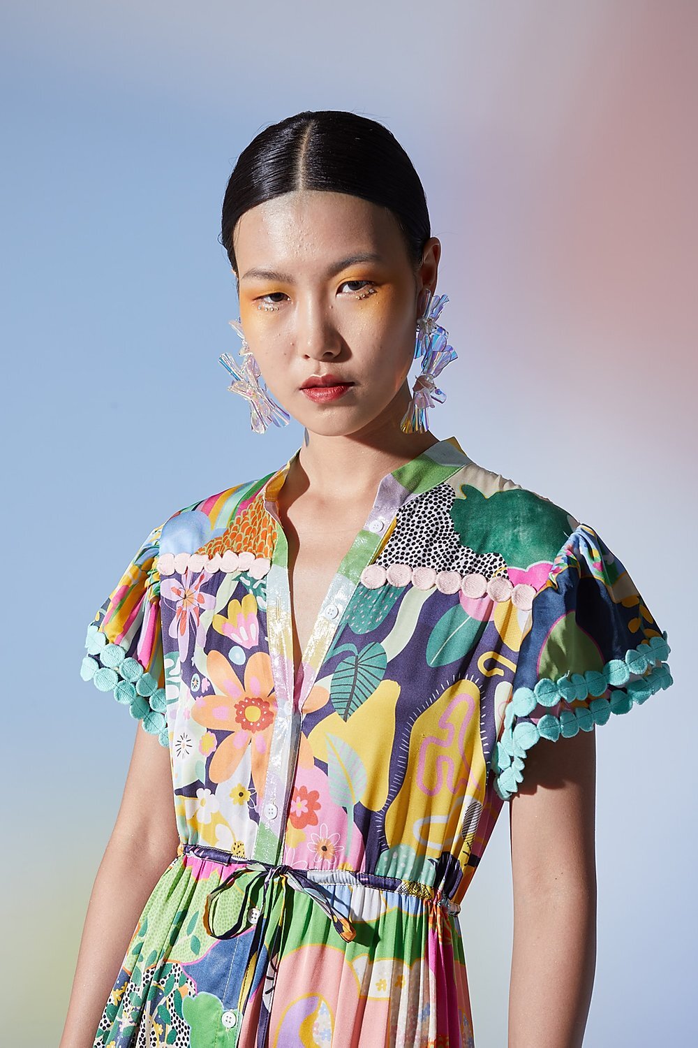
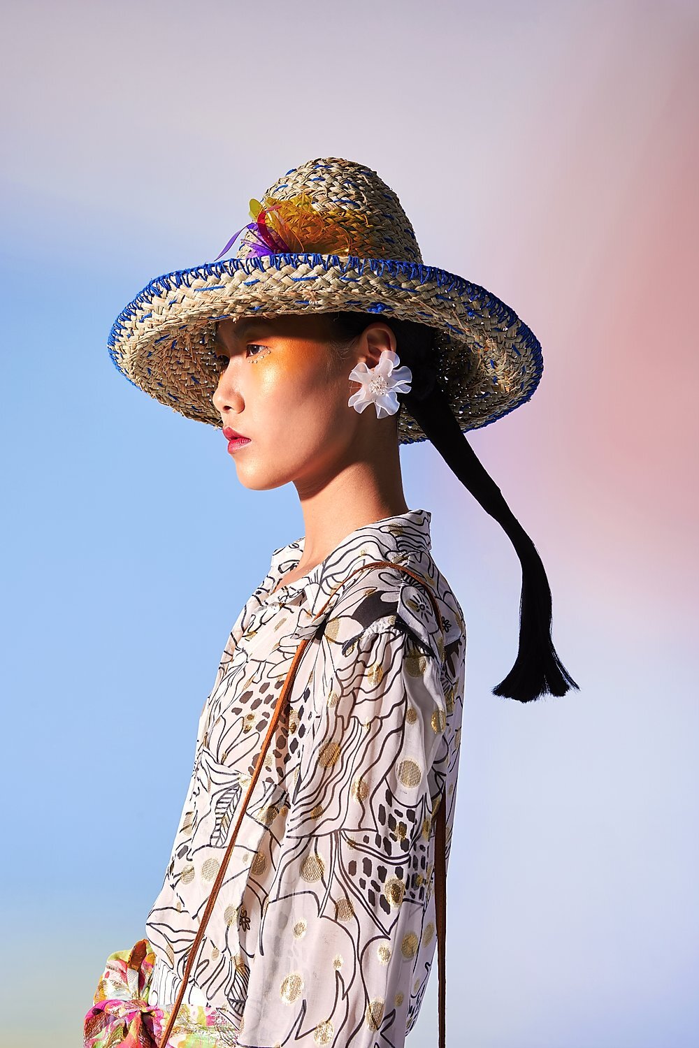
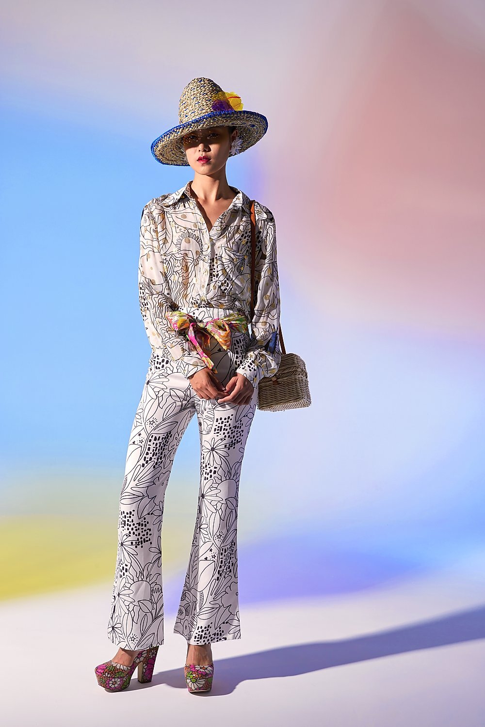
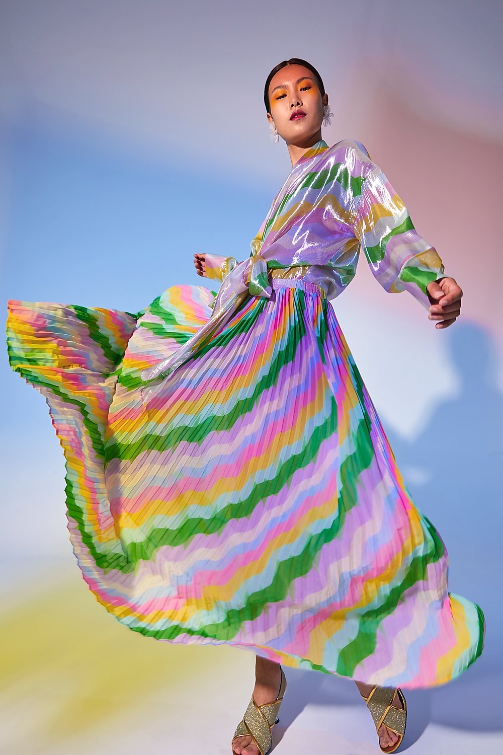
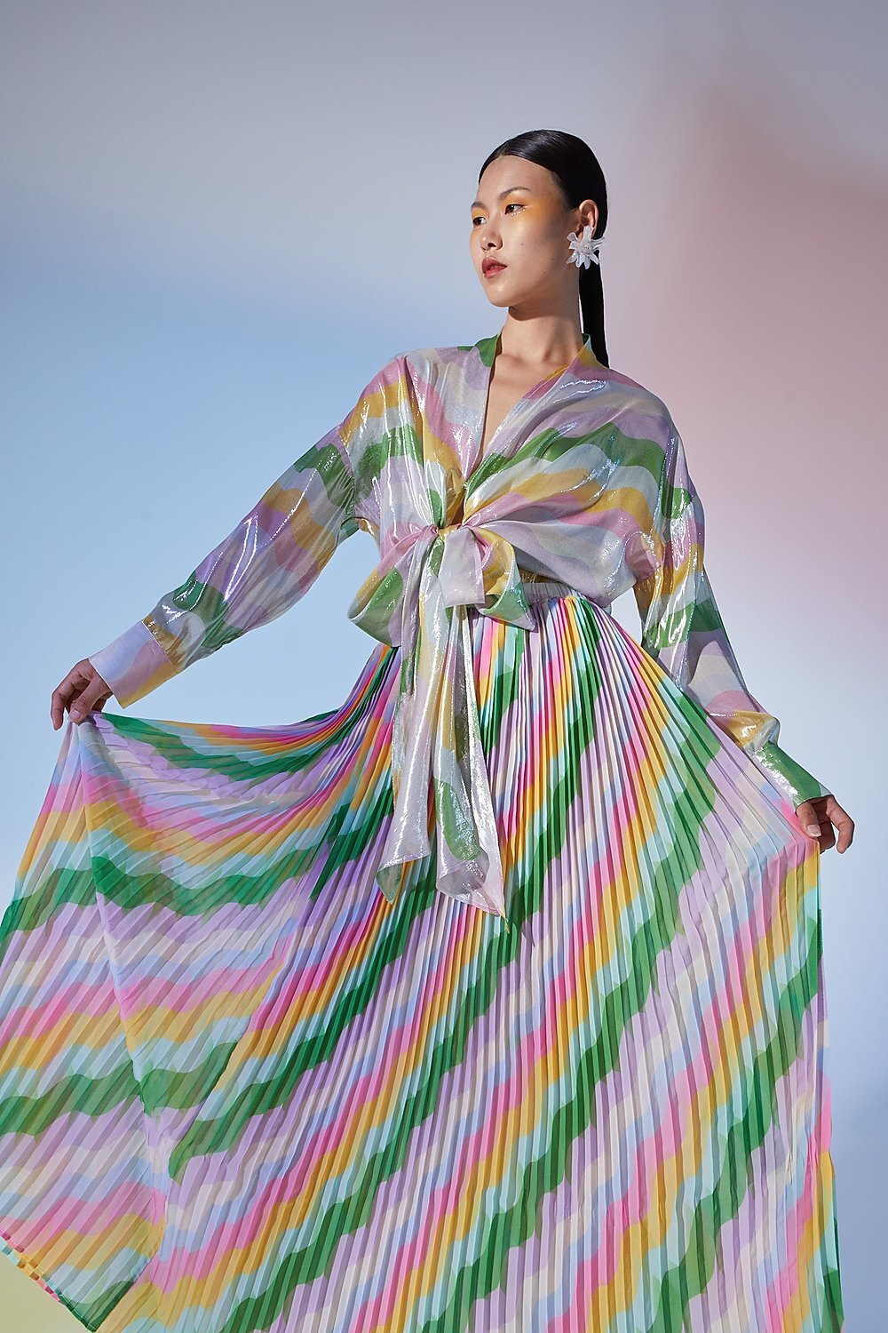
Alja Horvat collaborated with CeliaB on her 2019 collection called “Voyager of the Sea”. She created various colourful textile prints for Celia’s clothing, which can be purchased here.
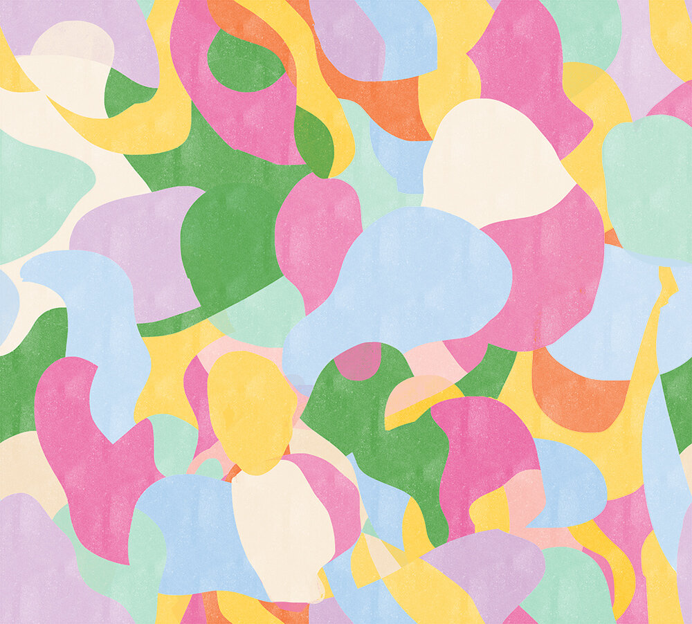
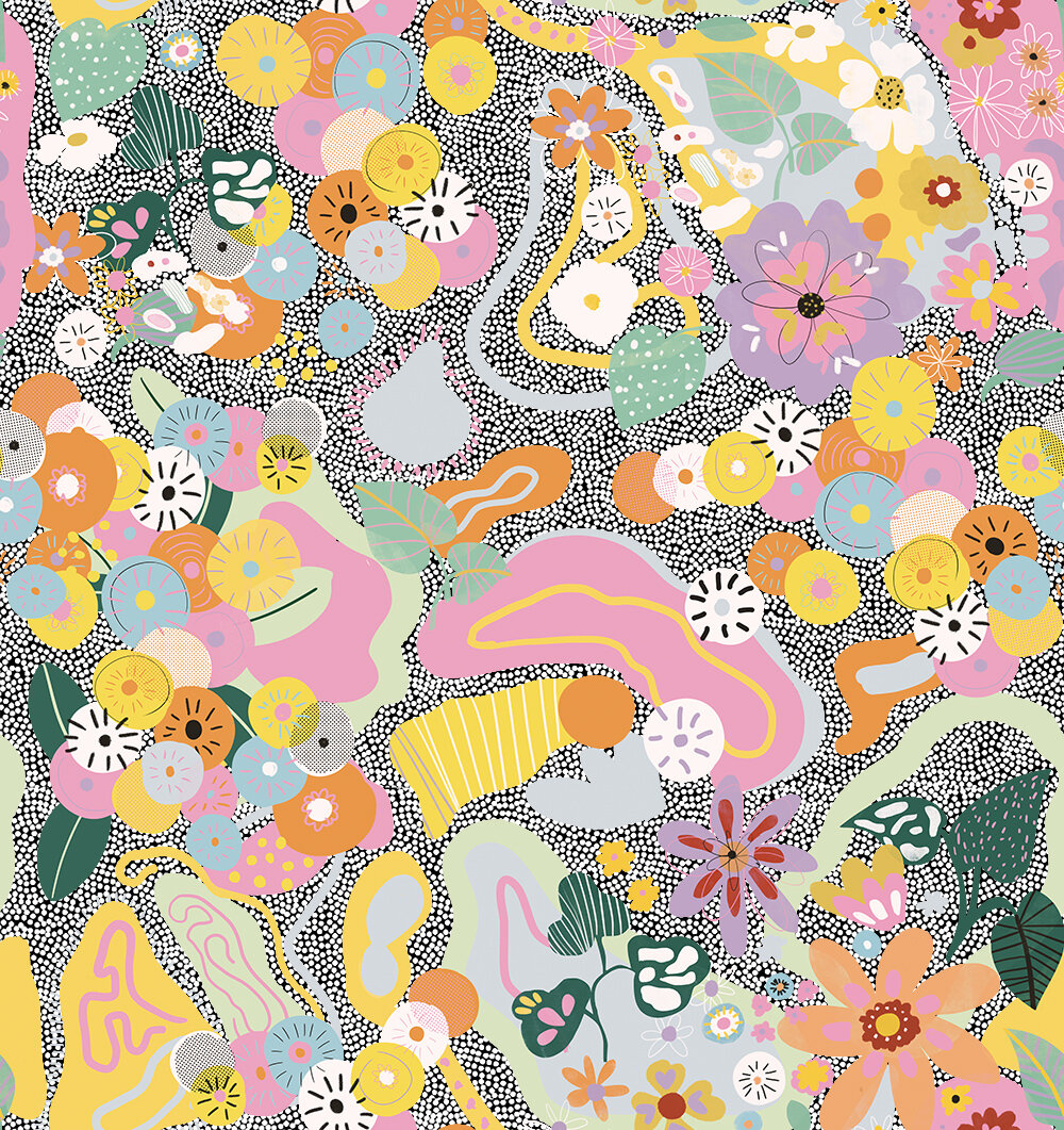
On the left you can see the background for the pattern, which was later in the process changed a little bit. The idea was to mix geometric shapes with organic shapes, such as flowers, leafs etc. In the end I changed colours a little bit to match the flowers and leaf shapes which were created before this texture.
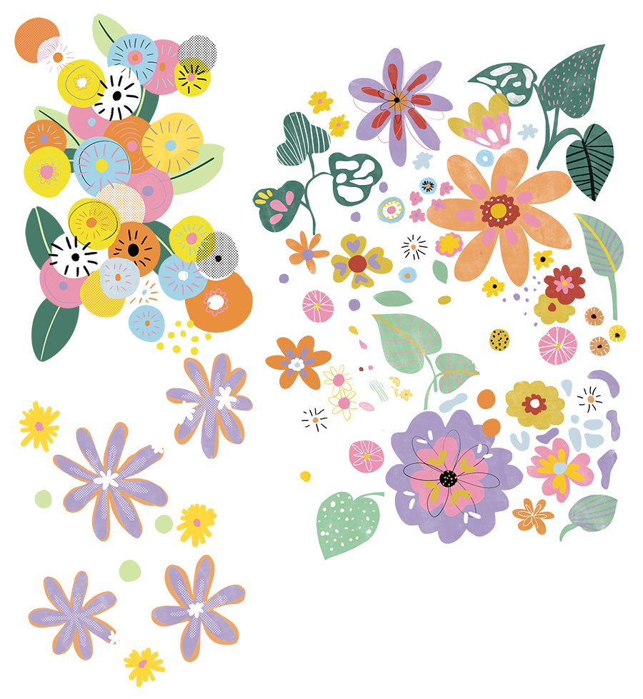
On the right are the shapes that were then added to the texture mentioned above. These floral and leaf shapes were actually made for a completely different pattern, but me and Celia decided to do something completely different with these shapes. The previous pattern was actually pattern with solid coloured background, but Celia wanted something more special, so we merged two different textures into one pattern.
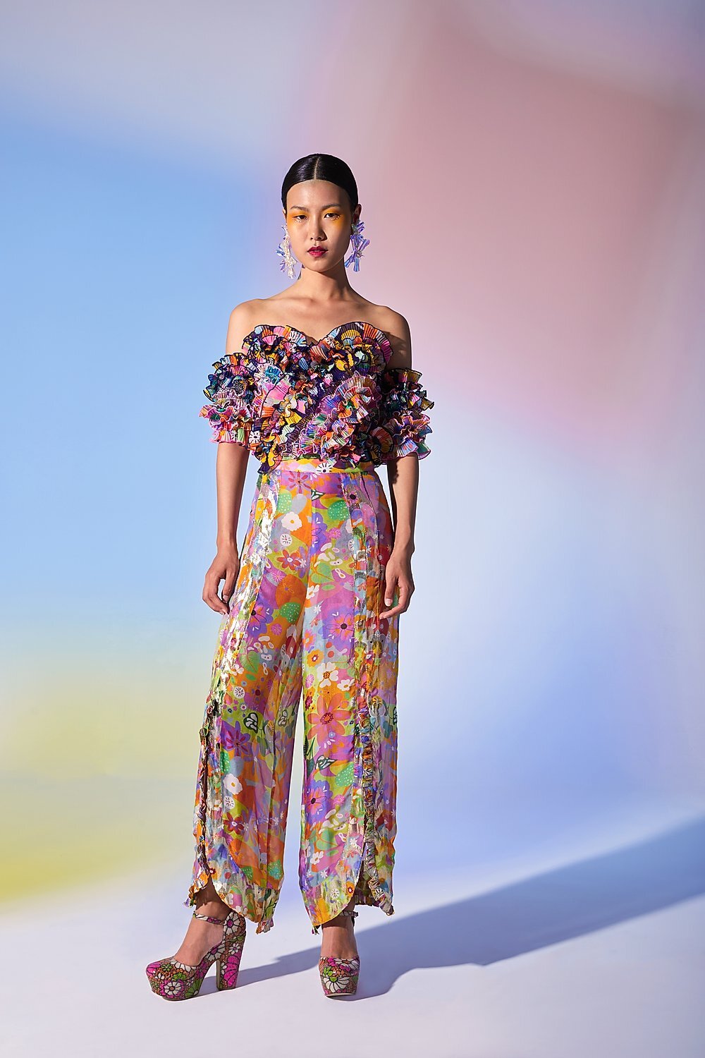
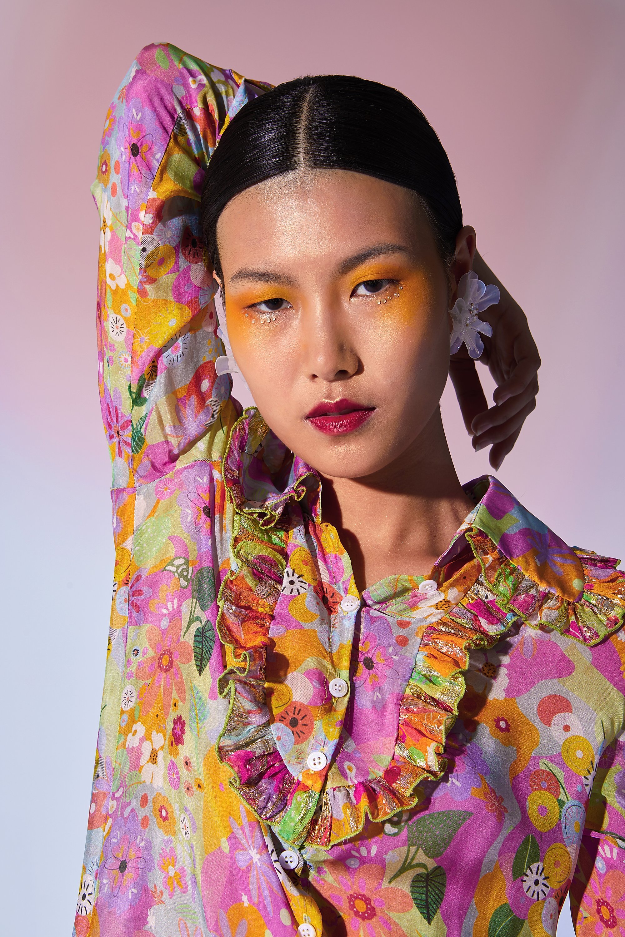
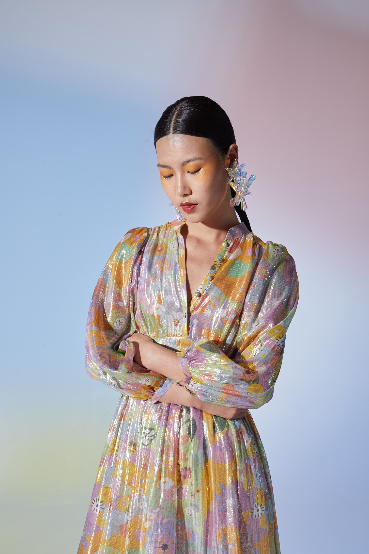
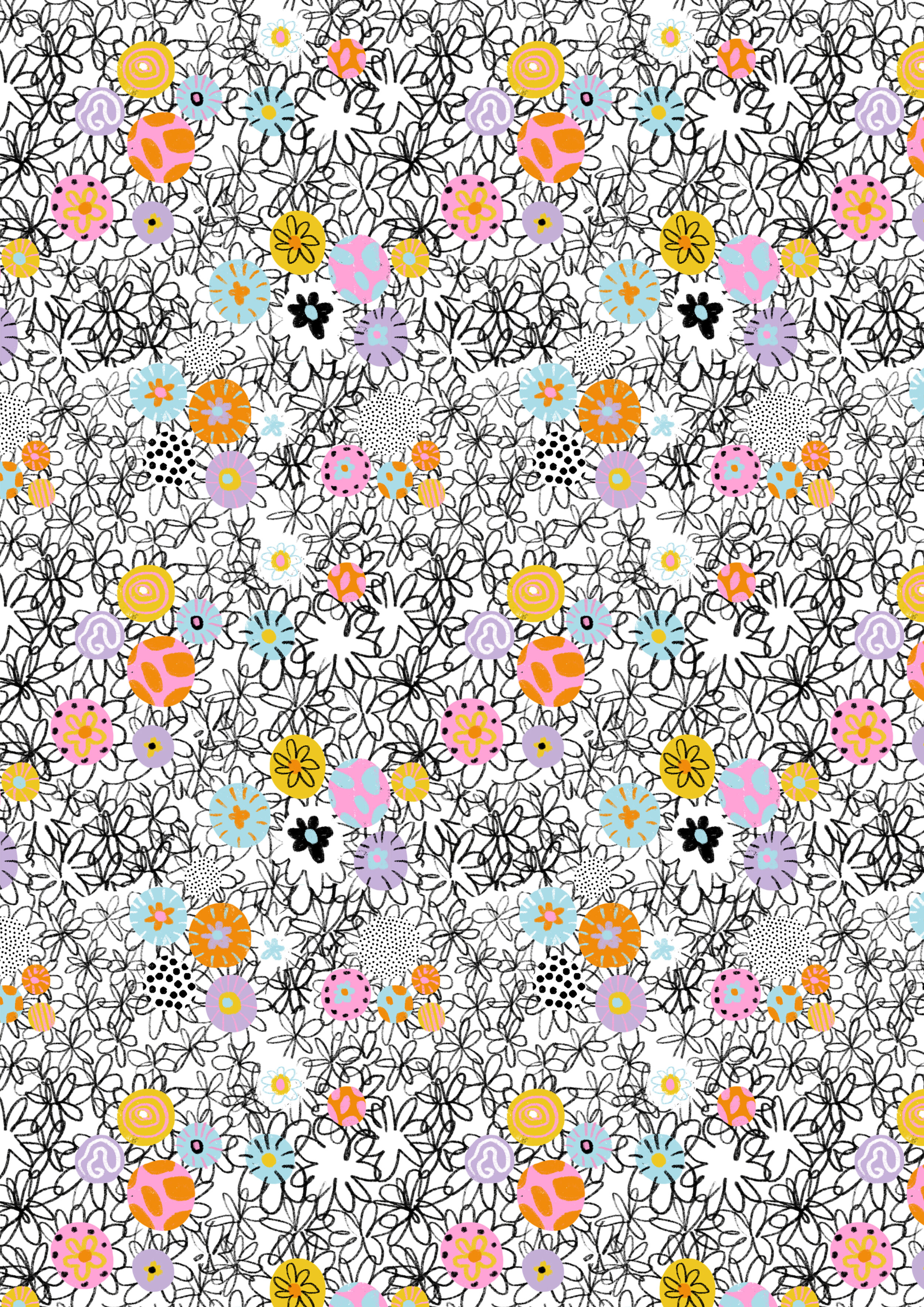
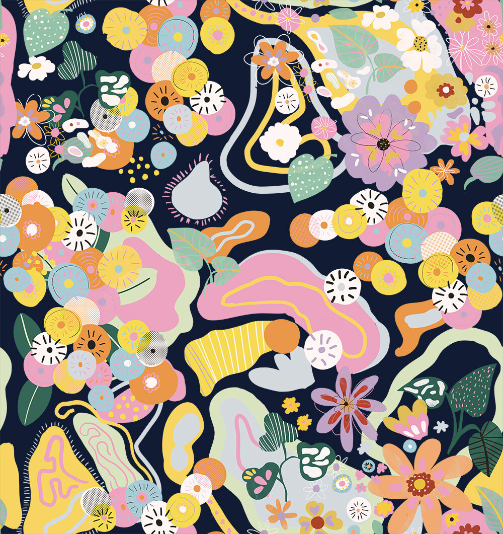
This is the final pattern, ready to be used on textile. As you can see the colours of the first pattern were changed a little bit to more “orange-magenta” colours, and the overall feeling is a little bit darker. All of the patterns are always made in a way so they can be “repeated”, meaning the top and bottom are matching as left and right side as well.
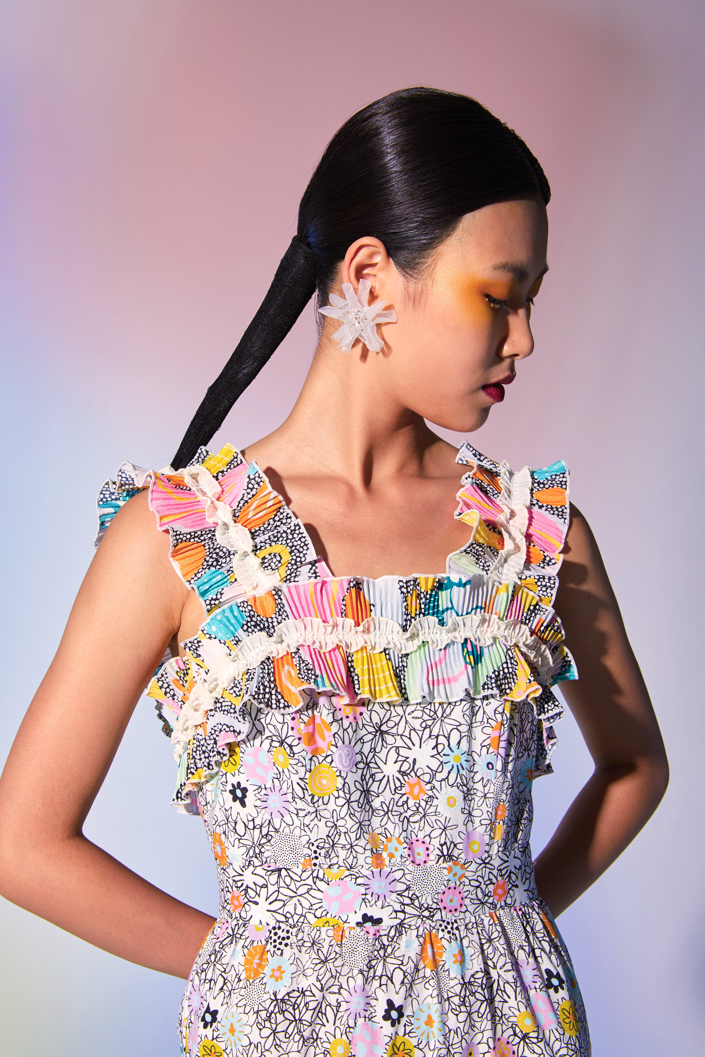
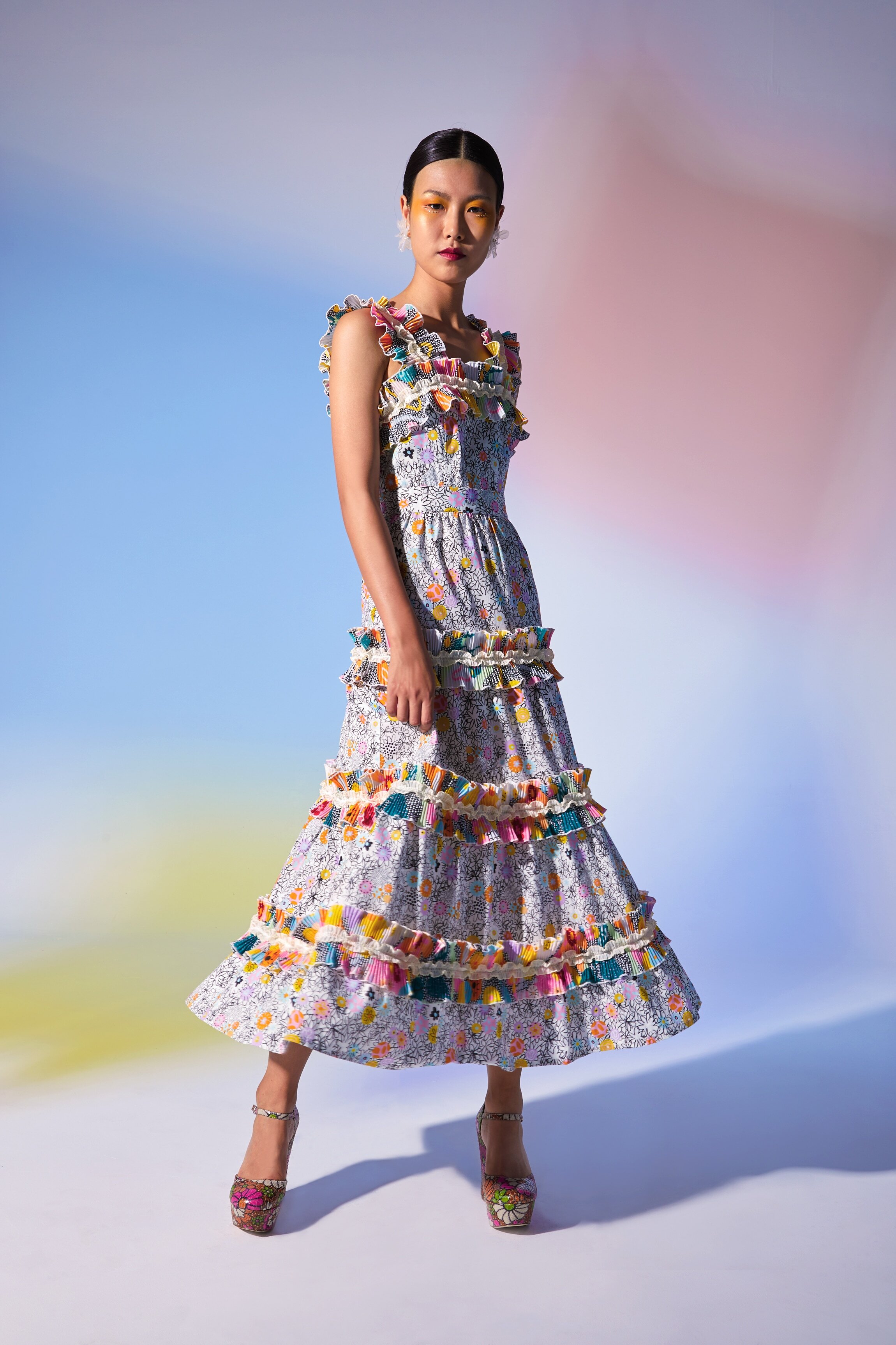
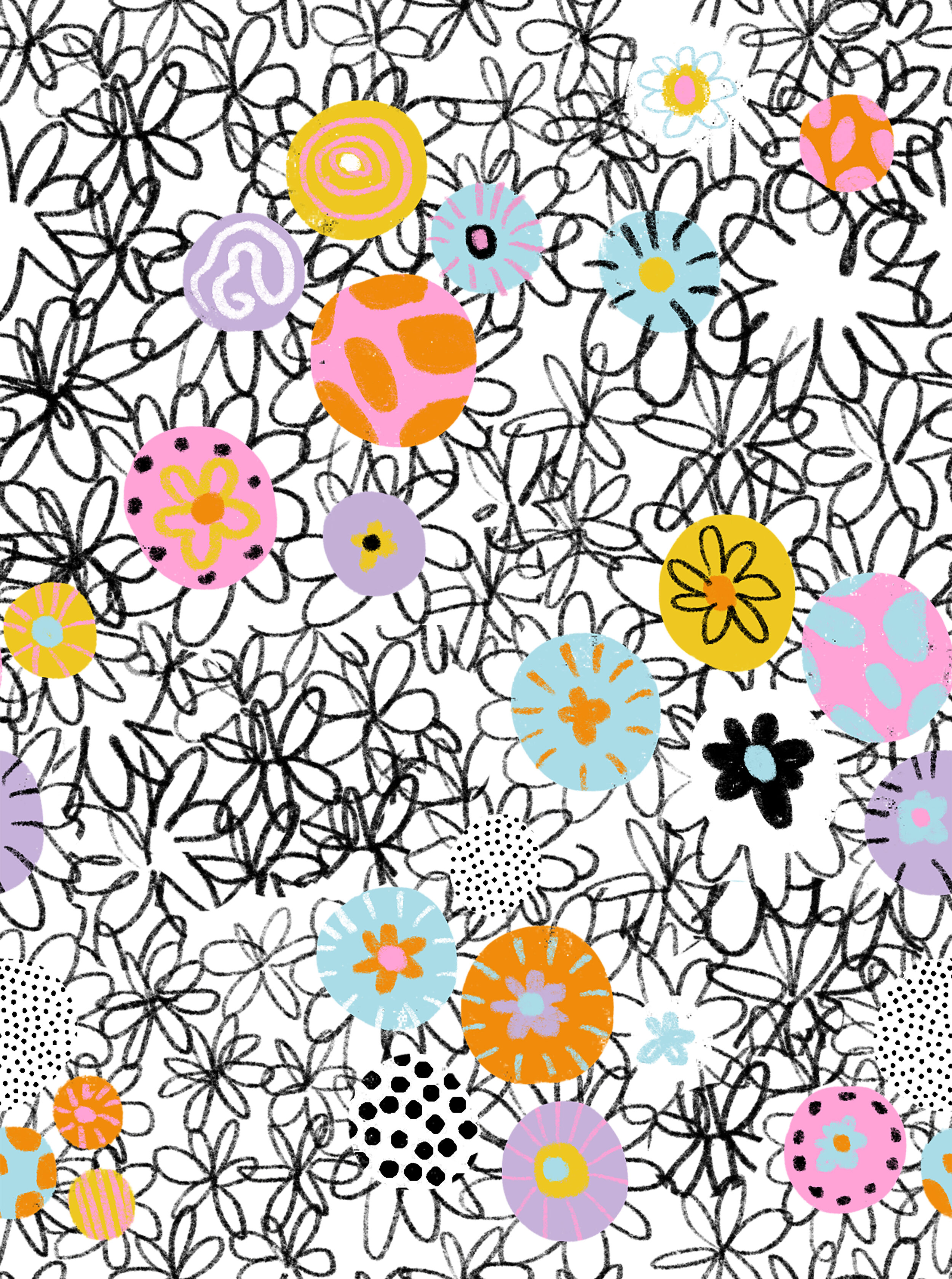
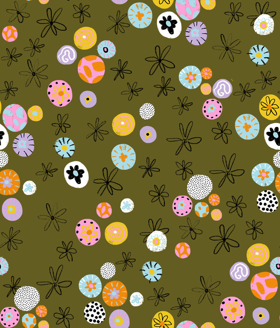
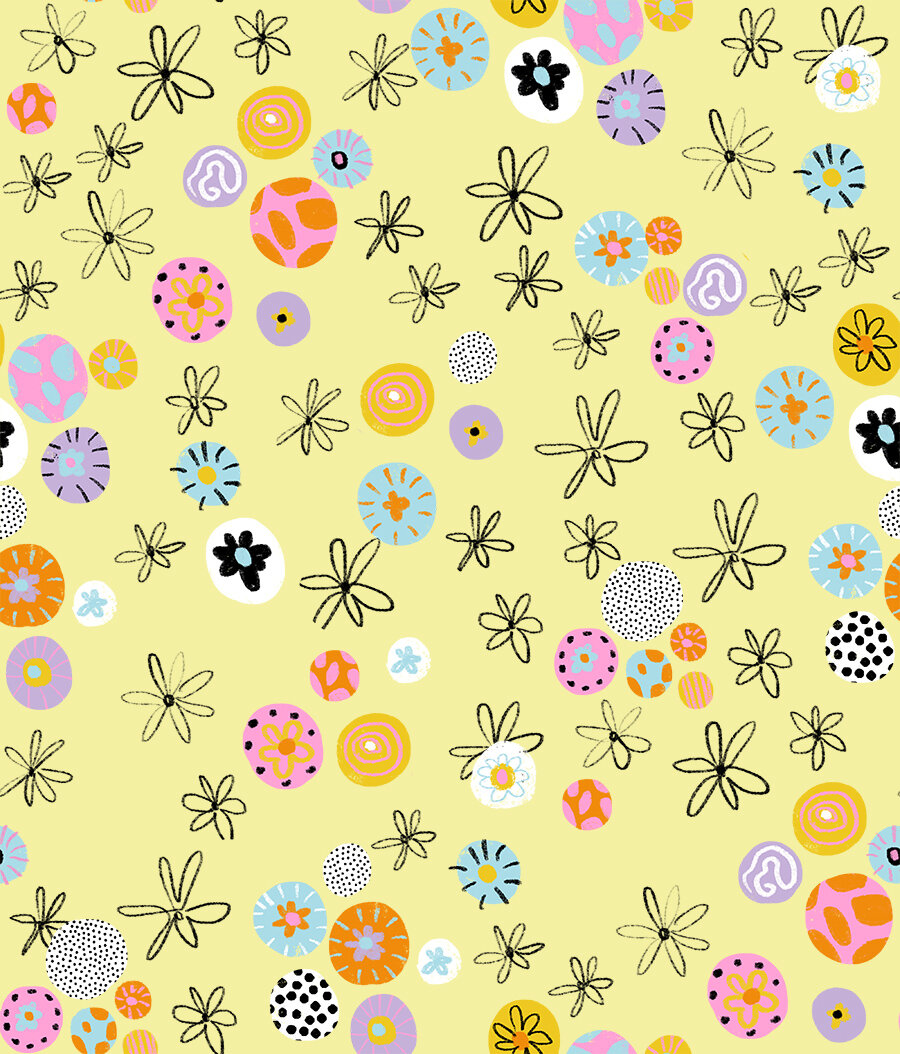
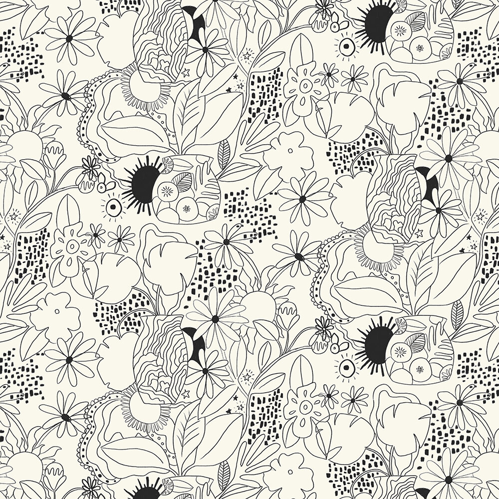
This one was one of the more simpler patterns from the collection, so you can mix it with other patterns. On the left you can see the pattern and on the right side there is a print made from the first image - repetitions. The black and white floral print was made in Procreate, while all the others pattern were made in Photoshop.
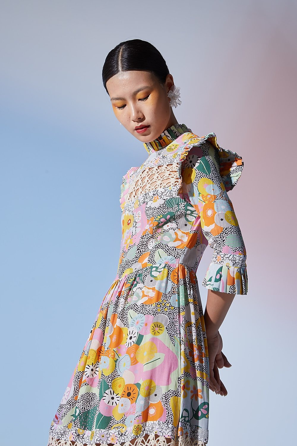
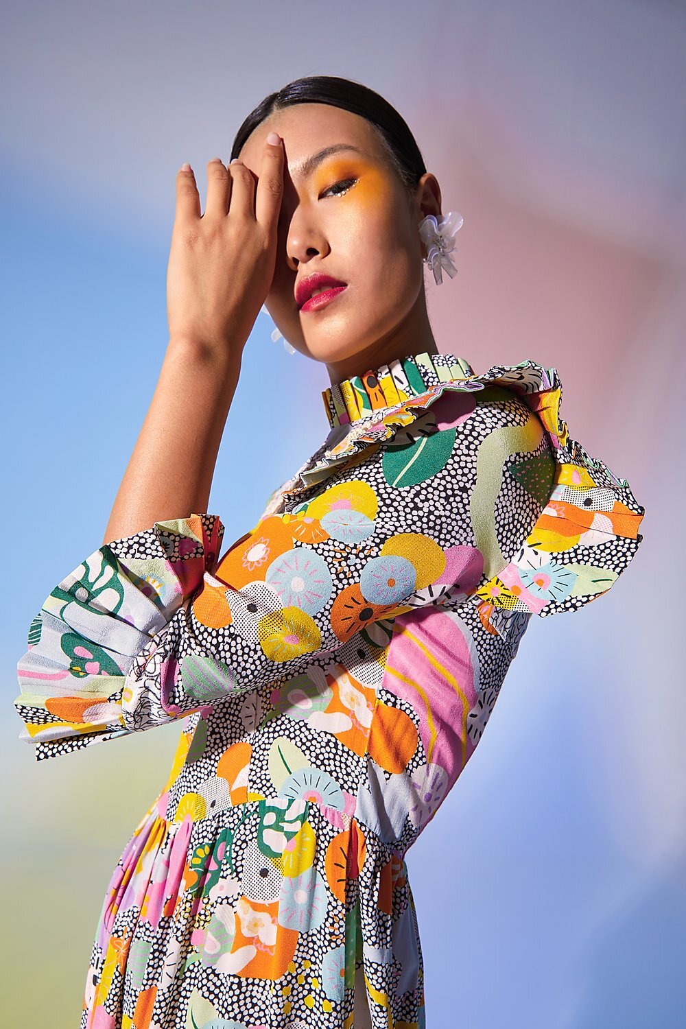
If you look closely you will realise that this pattern is actually the pattern above, but much more simpler version. The colored “flowers” are the same as in the pattern above, the only thing different are the colours of the backgrounds and the fact that the one above contains more lined art.
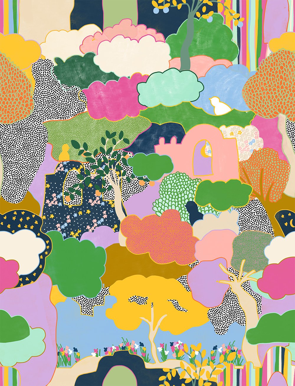
As you can see, these two patterns are actually the same, the only thing different is the background. If you’ll scroll to the top of the page and look closely, you’ll see that many elements from the first pattern were taken to create this two patterns. I prefer the second one with the dots, but I must say that the first one looks amazing on the first dress mixed with the landscape pattern (this dress is my fave from the whole collection!)
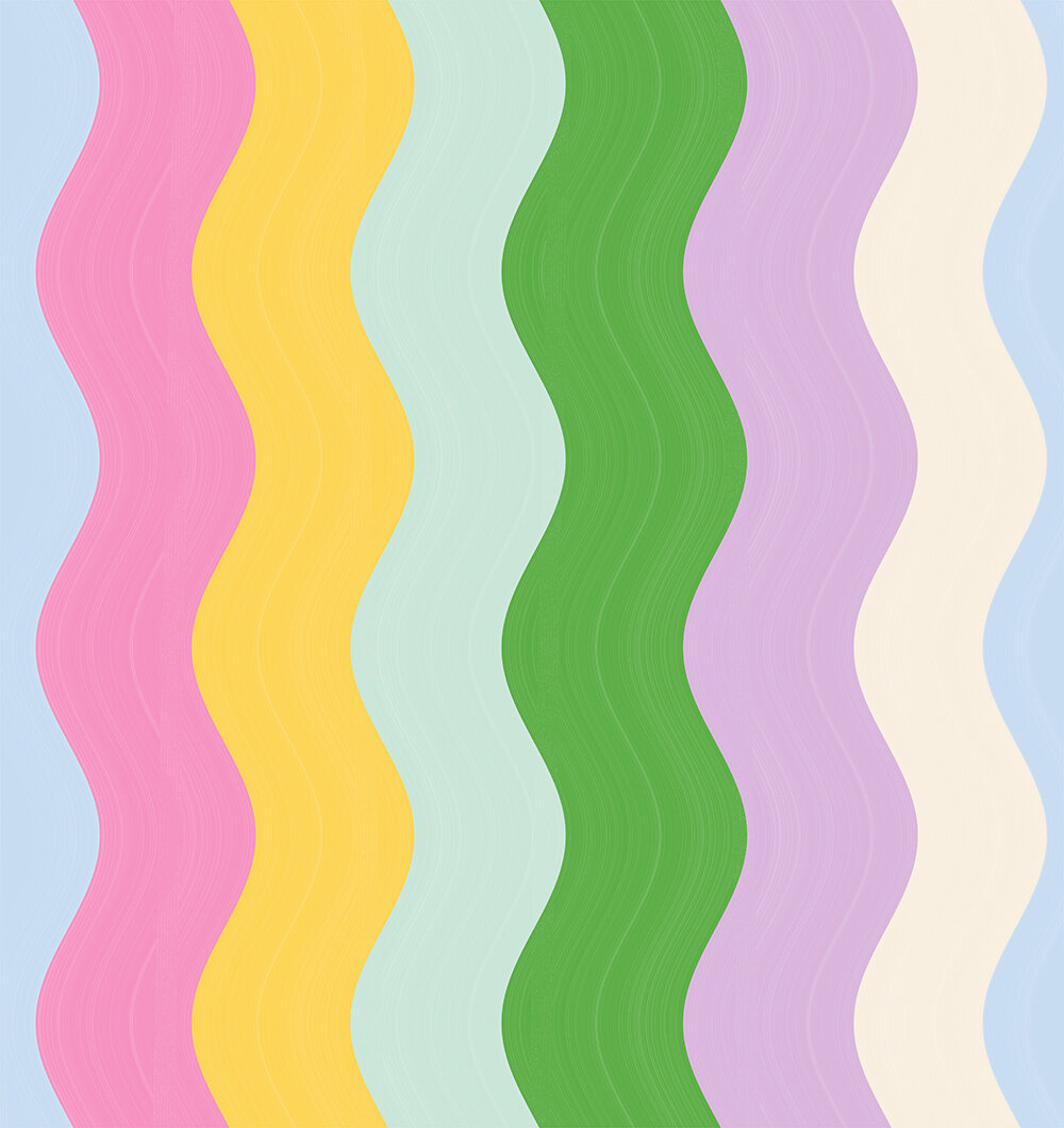
And these are the last two patterns from the collection! Both were meant to be more simpler than others and I must say I love both of them. To be completely honest, the stripes pattern was actually very hard to do. When you are making the repeat you need to mach the top and the bottom and left and the right side. In this case I needed to match all the lines and it was very hard, because they are curvy, but somehow I managed to solve the problem and the print turned out amazing. The colors for the stripes pattern were inspired by the landscape pattern.
Would you like to collaborate with me on a project?
